The network for creativity
Join 1.25M professional creatives like you
Connect with clients, get discovered, and run your business 100% commission-free
Creatives on Contra have earned over $150M and we are just getting started
Back to feedPost


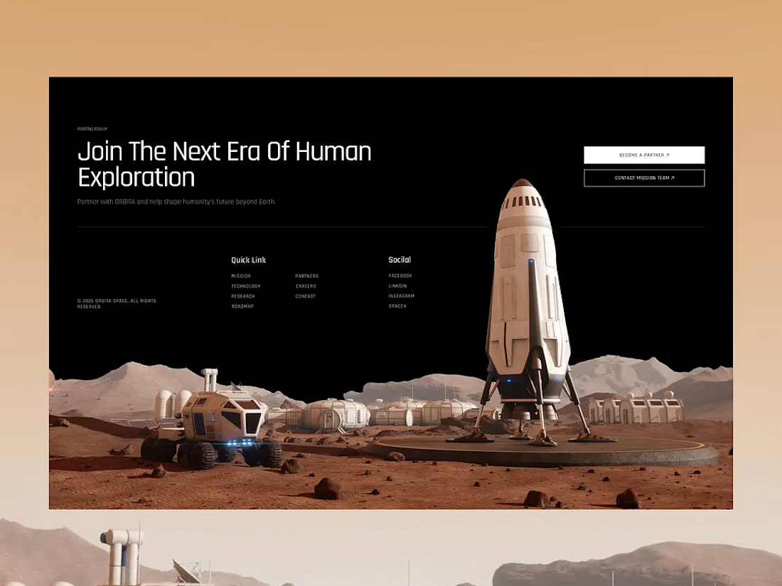

The rocket focal point gives the footer a strong visual anchor, and the restrained black-and-sand palette keeps the navigation feeling intentional. I’d only watch the small type contrast at the bottom on mobile.
The network for creativity
Join 1.25M professional creatives like you
Connect with clients, get discovered, and run your business 100% commission-free
Creatives on Contra have earned over $150M and we are just getting started

Challenges
View all


Related posts



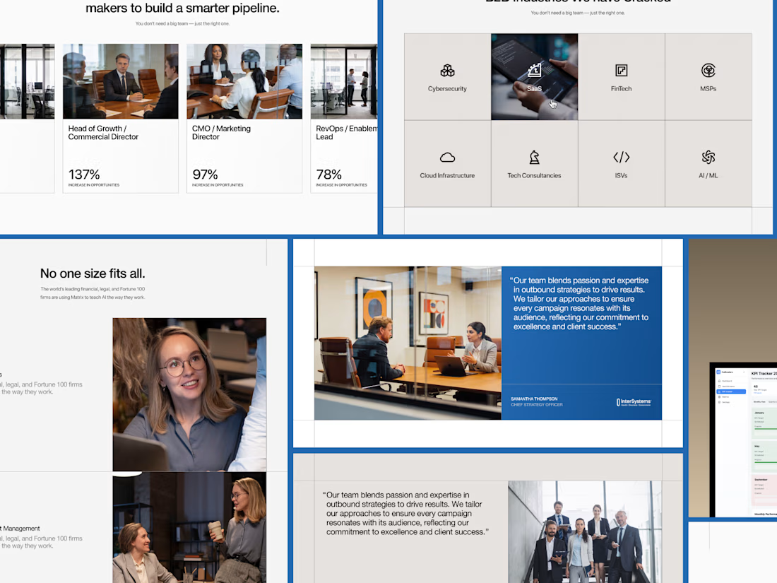
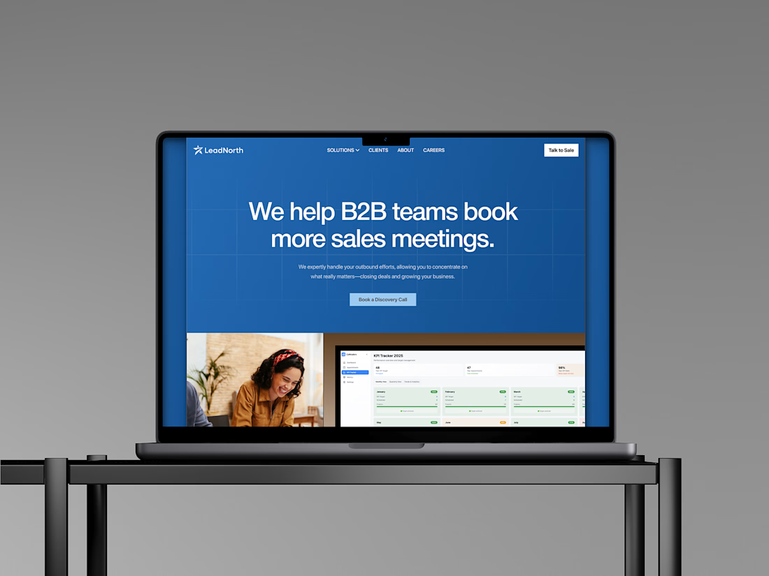
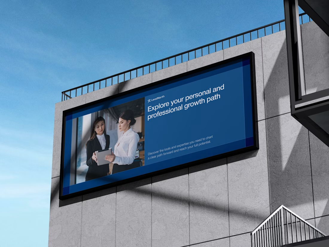
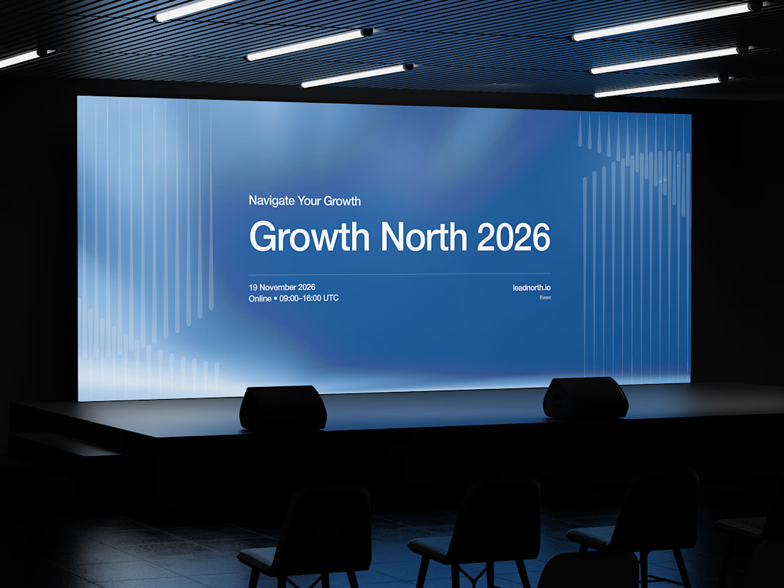


That saturated cobalt blue carries cleanly from the laptop hero onto the outdoor billboard and the Growth North 2026 stage screen.


the scroll recording felt too plain, so i had opus 5.5 make a launch film for eave. it used the real pages, wrote a storyboard and coded every frame
sound on 🔊

