The network for creativity
Join 1.25M professional creatives like you
Connect with clients, get discovered, and run your business 100% commission-free
Creatives on Contra have earned over $150M and we are just getting started
Back to feedPost

Designing Solar Energy for Every Screen
Solar energy data is often complex, technical, and difficult to understand quickly. This concept explores how that information can become simple, visual, and useful across both mobile and Apple Watch.
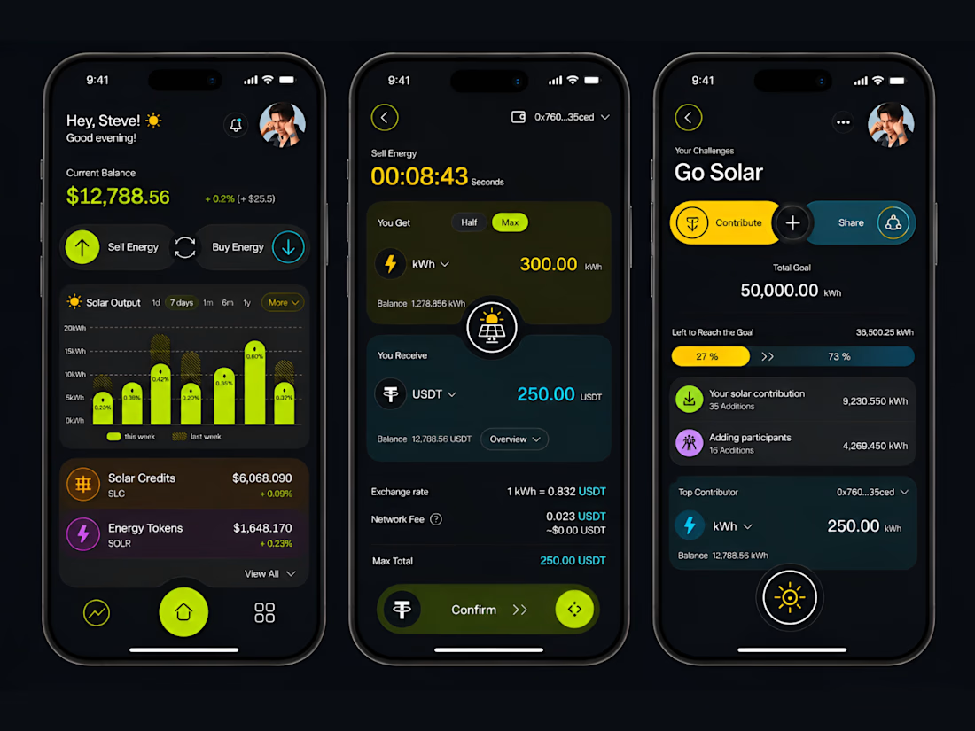
The iPhone experience gives users the complete picture. They can track solar output, monitor energy value, sell or buy energy, manage contributions, and follow sustainability goals.
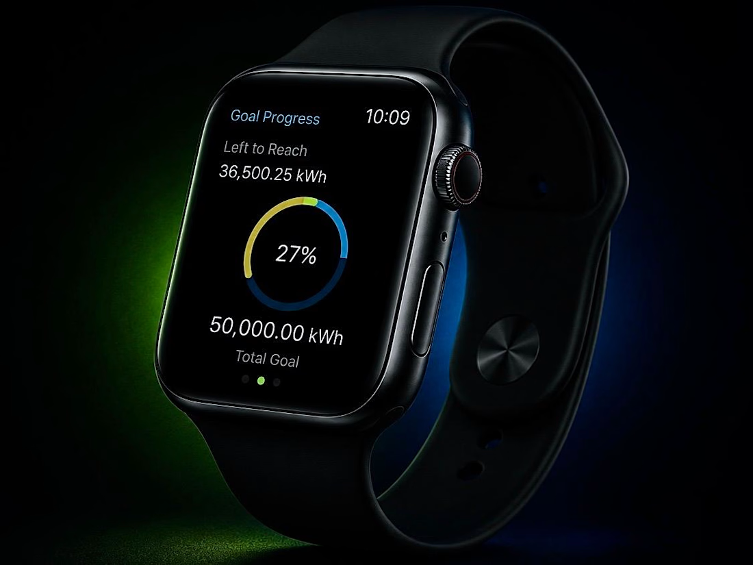
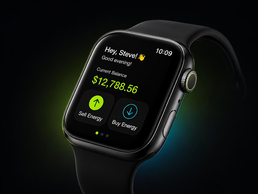
The Apple Watch version focuses only on what matters in the moment. Users can check their balance, view goal progress, monitor performance, and take quick actions without opening the full app.
The visual system uses a dark interface with lime, yellow, cyan, purple, and orange accents. Each colour has a purpose, helping users separate energy production, transactions, progress, and community activity without making the interface feel overwhelming.
The main UX principle was simple:
The phone is for understanding and management.
The watch is for awareness and quick action.
This creates a connected experience where renewable energy feels less technical, more personal, and easier to engage with every day.
#UIDesign #UXDesign #ProductDesign #AppleWatch #WatchOS #MobileAppDesign #SolarEnergy #Sustainability #CleanEnergy #Figma #InteractionDesign


Love the colors 👏
thanks
The network for creativity
Join 1.25M professional creatives like you
Connect with clients, get discovered, and run your business 100% commission-free
Creatives on Contra have earned over $150M and we are just getting started
Trending

Claude
Claude has entered the design space. How are you using it?

Contra University
Learn from expert creatives how to earn more using next-gen AI tools.
Brand Design
The best brand designers are on Contra. Scroll to see what's trending in brand design. What are you building?
creativeaiflow
Creative AI workflows are evolving. What tools do you use, and what are their strengths and weaknesses?
freelancerlife
Freelancer life is wins, pivots, and everything in between. What’s yours right now?






Related posts


The way the watch rotates as the collateral piece is a smart touch, it makes the loan feel tied to a real object instead of just a number on a screen. What's the fallback for items that don't photograph as well as a watch?

Let's talk about designing for anxiety 🧘♂️
Lately, our team has been thinking a lot about how people feel when they first open a complex platform. Most of the time, they're slightly overwhelmed or anxious.
As designers, we often talk about beautiful layouts and good hierarchy. But none of that means much if the user feels lost or stressed out.
That's what led us to what I call calm design.
Our team has been paying more attention to the small things that make an experience feel safe. Here are some of them:
• softer copy;
• guided empty states;
• subtle feedback that lets users know they did everything right.
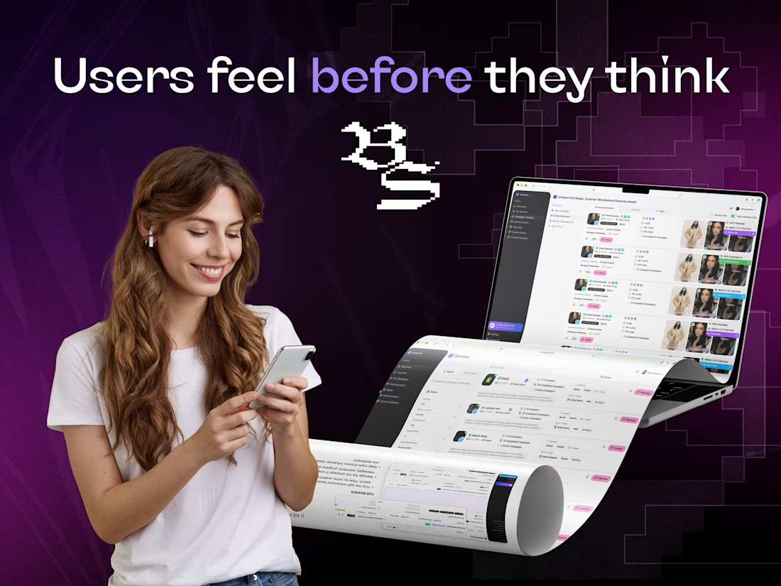
Social Tap is one of our projects where this was really put to the test. A platform for brands and influencers, with lots of features and two very different user types. Getting the emotional side of the experience right wasn't optional there.
At the end of the day, people might not remember what the interface looked like. They surely remember how it made them feel.
Do you think about the user's emotional state when creating a design? Would love to hear how you approach it 🪼


Wow! That's really interesting 😍


Small UX decisions often make the biggest difference. Which approach would you choose for an FAQ section?
✔️Ready-made answers to common questions.
✔️The option to ask a question via email or a contact form.
Or is a combination of both the better solution?

12 voted
67%
6 voted
33%
18 votes
Closed

Impressive design. The branding feels strong and consistent.