The network for creativity
Join 1.25M professional creatives like you
Connect with clients, get discovered, and run your business 100% commission-free
Creatives on Contra have earned over $150M and we are just getting started
Back to feedPost

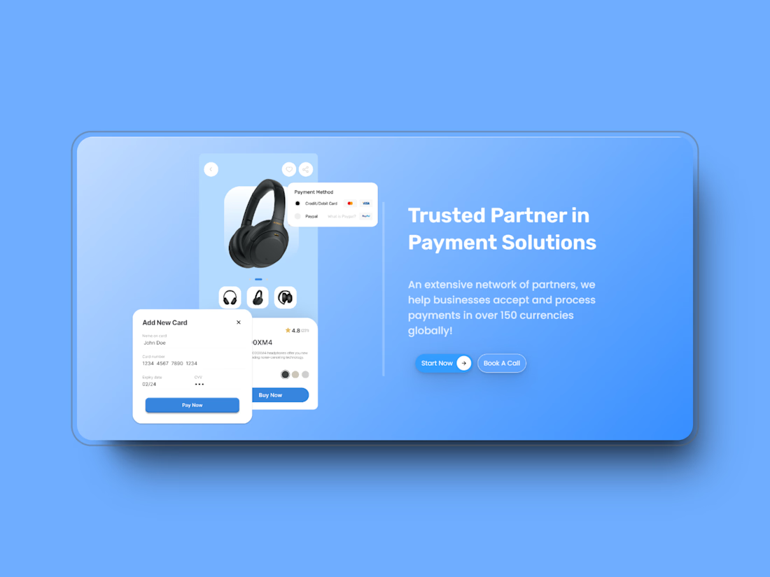
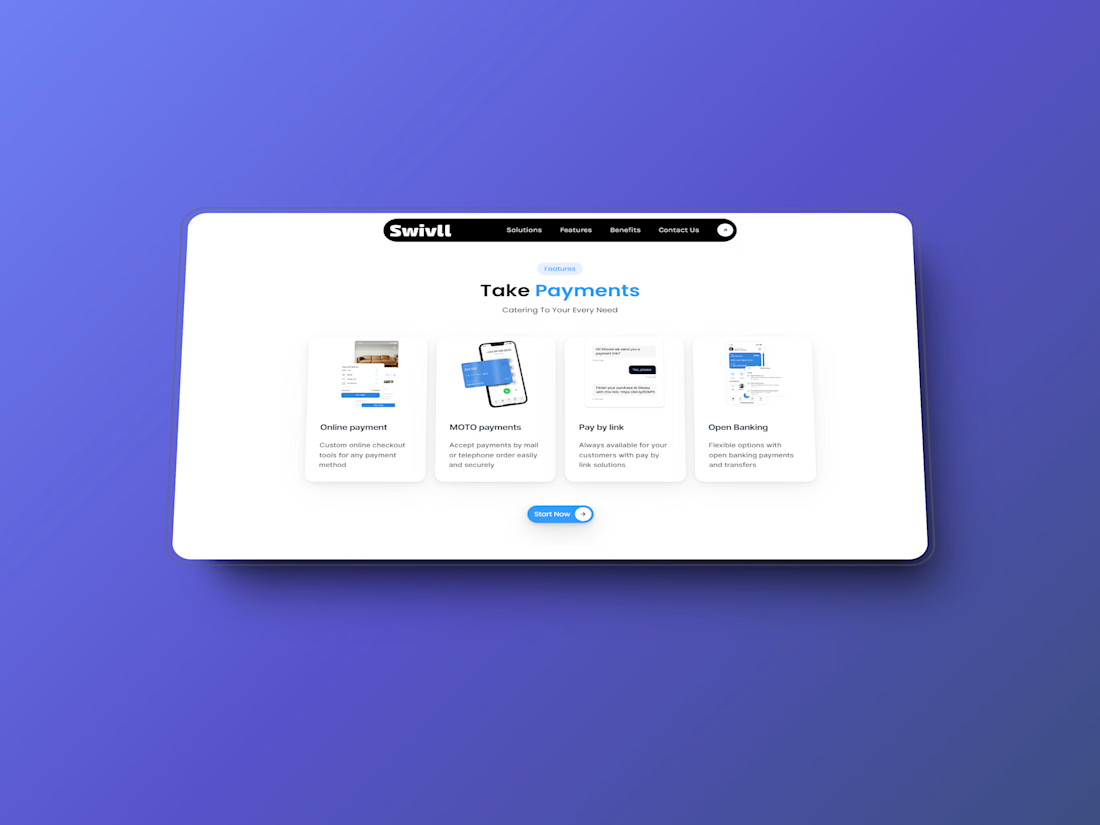
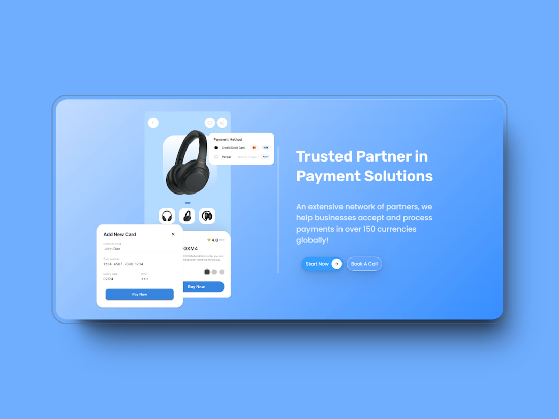
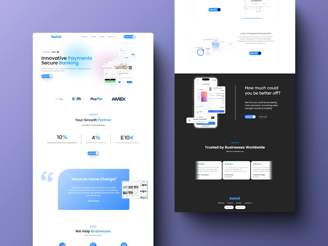
Payment Gateway Service Provider Website Design
Payment Gateway Service Provider's Website Design with Figma and Developed through Framer.


The network for creativity
Join 1.25M professional creatives like you
Connect with clients, get discovered, and run your business 100% commission-free
Creatives on Contra have earned over $150M and we are just getting started





Related posts

Just published another Framer code component to show your work!
Best part: it's connected to your CMS, so no need to manually update the content.
It has drag and scroll to stir the arc, plus an infinite project list 🔥
Check it here

Svg filters ?


Very nice


My first biggest project was developing a Framer website for https://libertinelondon.com
Charged $2.5k for development
they provided the design

congrats

