The network for creativity
Join 1.25M professional creatives like you
Connect with clients, get discovered, and run your business 100% commission-free
Creatives on Contra have earned over $150M and we are just getting started
Back to feedPost
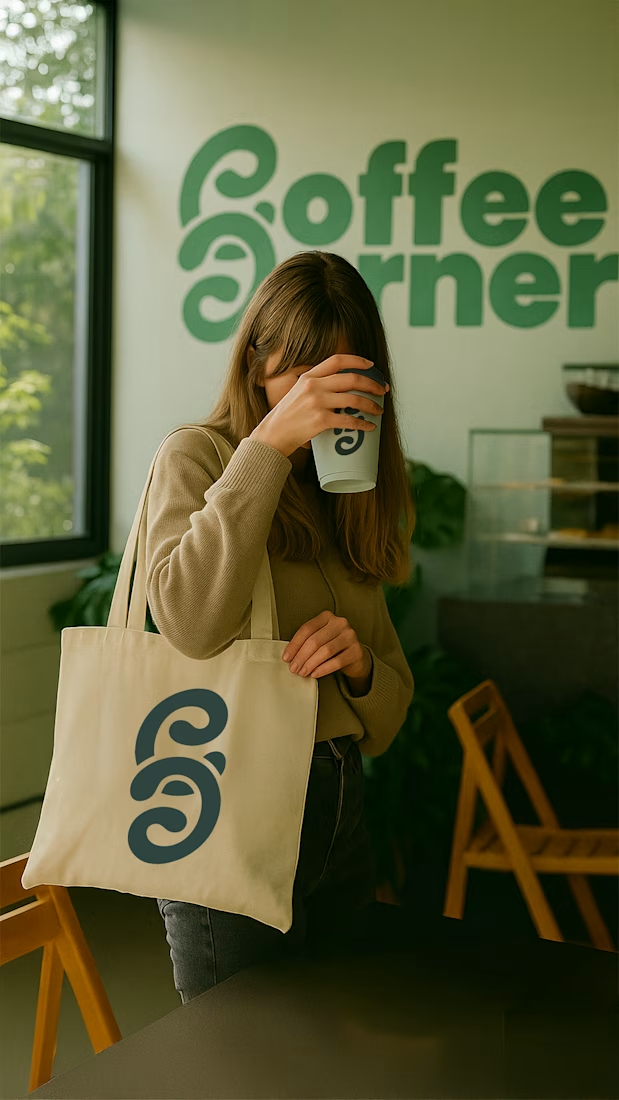
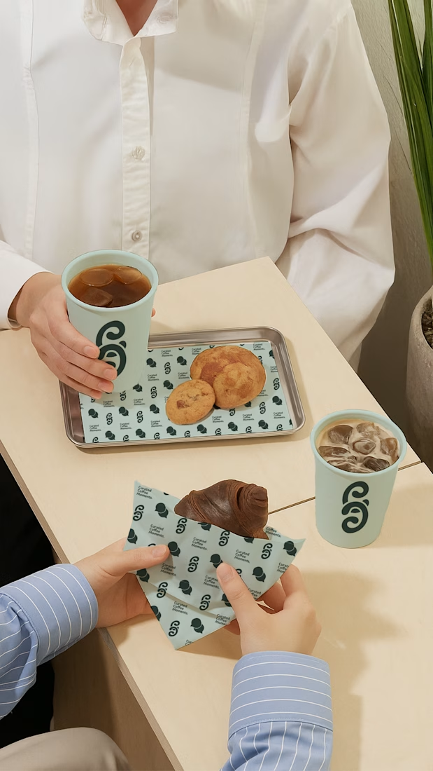
For this brand, the goal was simple: make a space that feels welcoming, and full of connection.
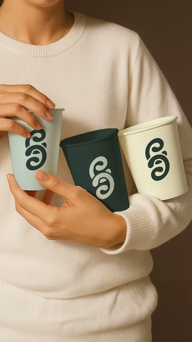
The two C’s in the logo? They’re inspired by swirling coffee, representing the conversations and connections that happen over a cup.
Every detail was designed to create comfort:
Friendly curves in the typography to make it approachable
A calming colour palette (not the usual browns) that stands out
A visual language that makes this café your go-to spot for community, creativity, and calm
Designing a brand like this is a reminder that branding is about feelings and presence, not just visuals.
What makes a café feel like your place? I’d love to hear your thoughts 👇
The network for creativity
Join 1.25M professional creatives like you
Connect with clients, get discovered, and run your business 100% commission-free
Creatives on Contra have earned over $150M and we are just getting started
Trending
Claude
Claude has entered the design space. How are you using Claude Design?
Contra University
Learn from expert creatives how to earn more using next-gen AI tools.
fifaworldcup2026
The World Cup is here and the whole world's watching. How are you designing for the world stage?
creativeaiflow
Creative AI workflows are evolving. What tools do you use, and what are their strengths and weaknesses?
freelancerlife
Freelancer life is wins, pivots, and everything in between. What’s yours right now?