
Sara Khan
Brand Designer for Founders | Packaging + Branding
Ready for work
Sara is ready for their next project!
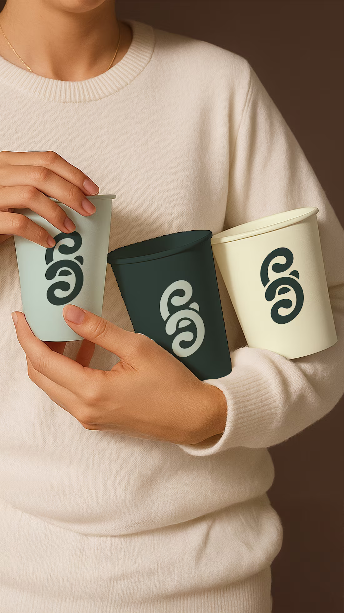
For this brand, the goal was simple: make a space that feels welcoming, and full of connection.
The two C’s in the logo? They’re inspired by swirling coffee, representing the conversations and connections that happen over a cup.
Every detail was designed to create comfort:
Friendly curves in the typography to make it approachable
A calming colour palette (not the usual browns) that stands out
A visual language that makes this café your go-to spot for community, creativity, and calm
Designing a brand like this is a reminder that branding is about feelings and presence, not just visuals.
What makes a café feel like your place? I’d love to hear your thoughts 👇
1
18
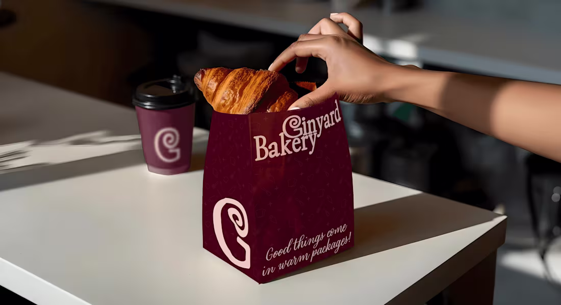
Ginyard Bakery – Branding
0
0
Clay Crest Studio: Pottery Branding
0
2
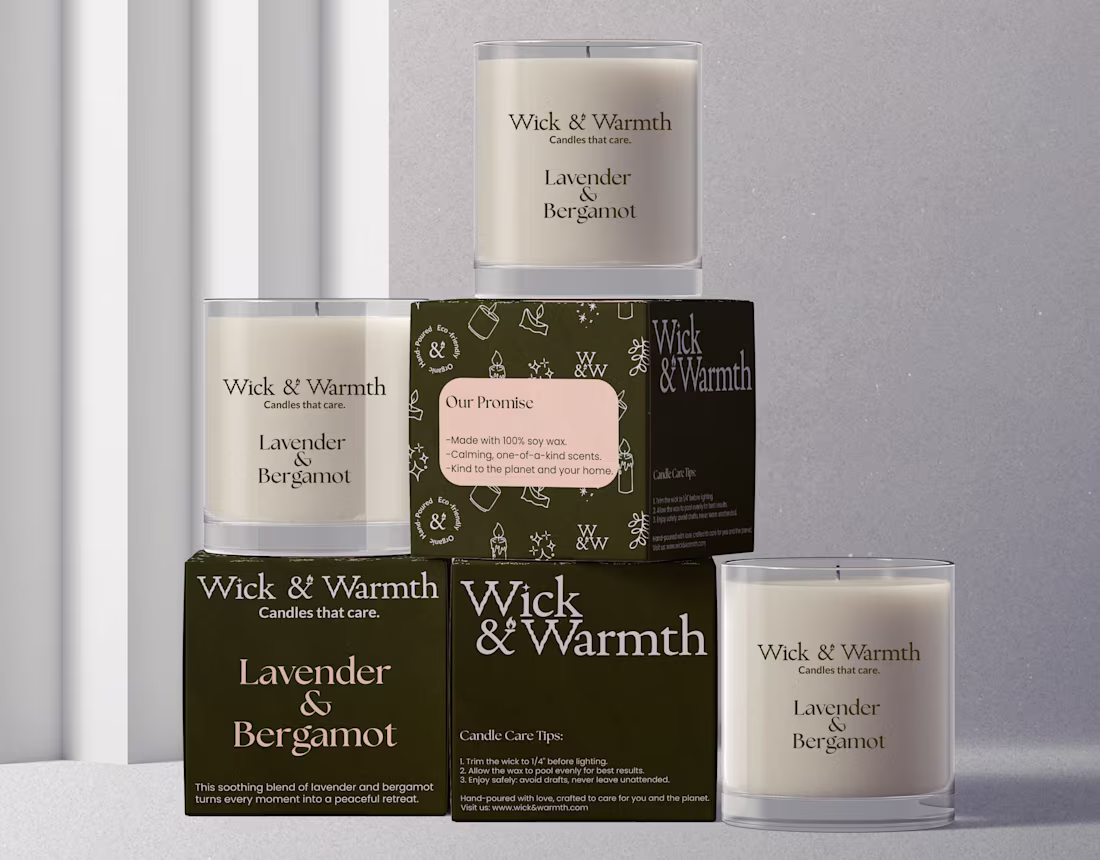
Wick & Warmth – Candle Branding & Packaging
0
2
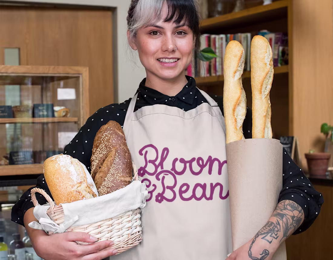
Bloom & Bean – Branding & Packaging
0
1
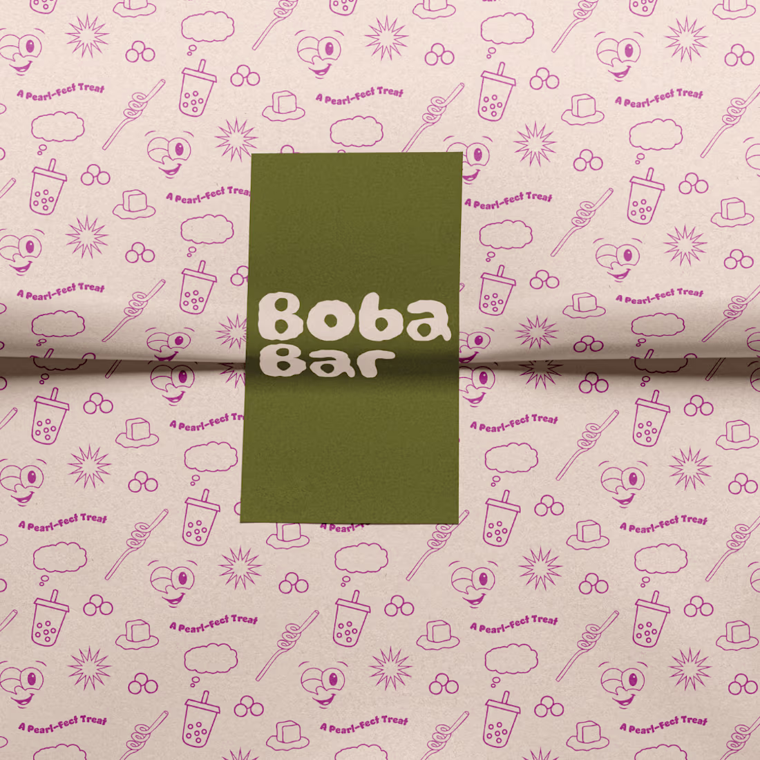
Boba Bar – Branding & Visual Identity
0
1
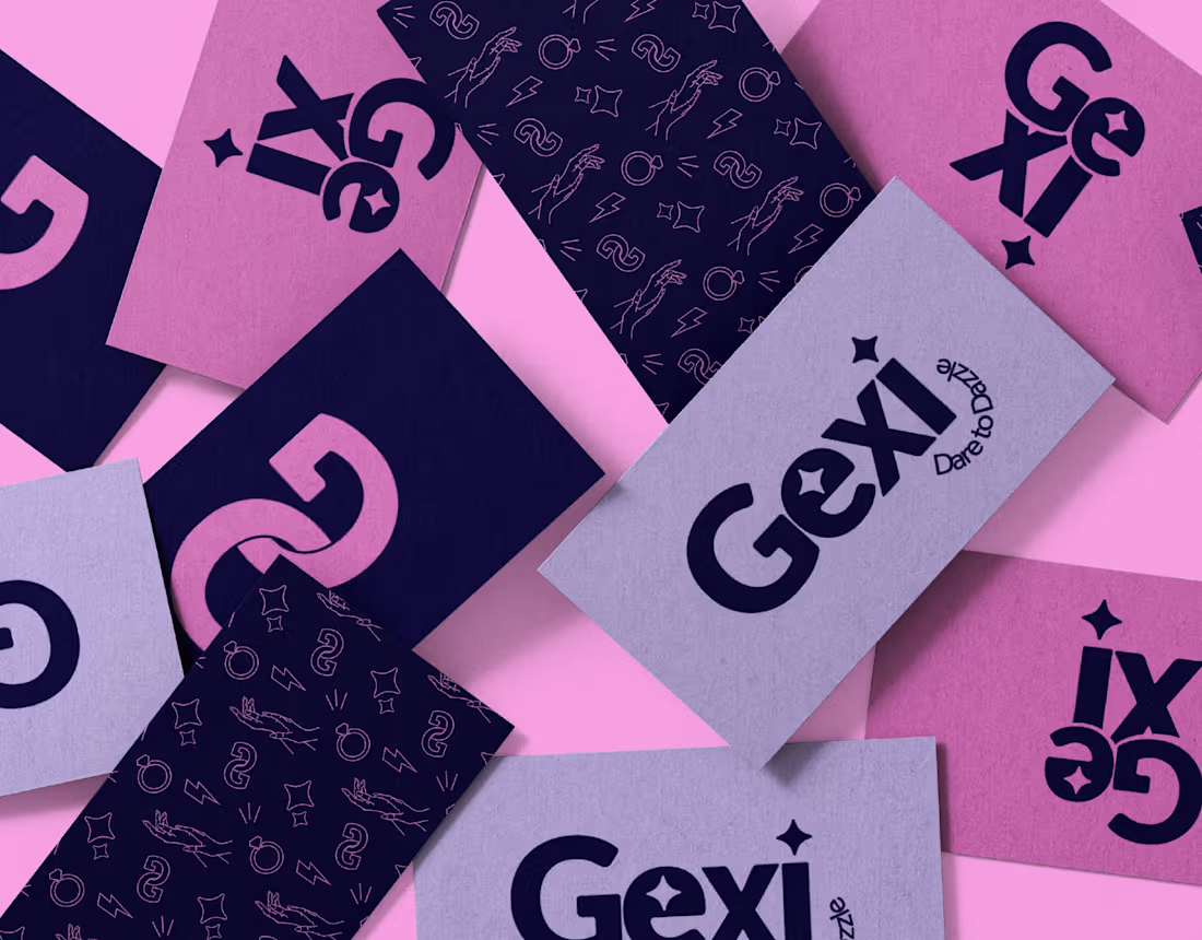
Gexi – Bold Jewellery Branding
0
1