The network for creativity
Join 1.25M professional creatives like you
Connect with clients, get discovered, and run your business 100% commission-free
Creatives on Contra have earned over $150M and we are just getting started
Back to feedPost


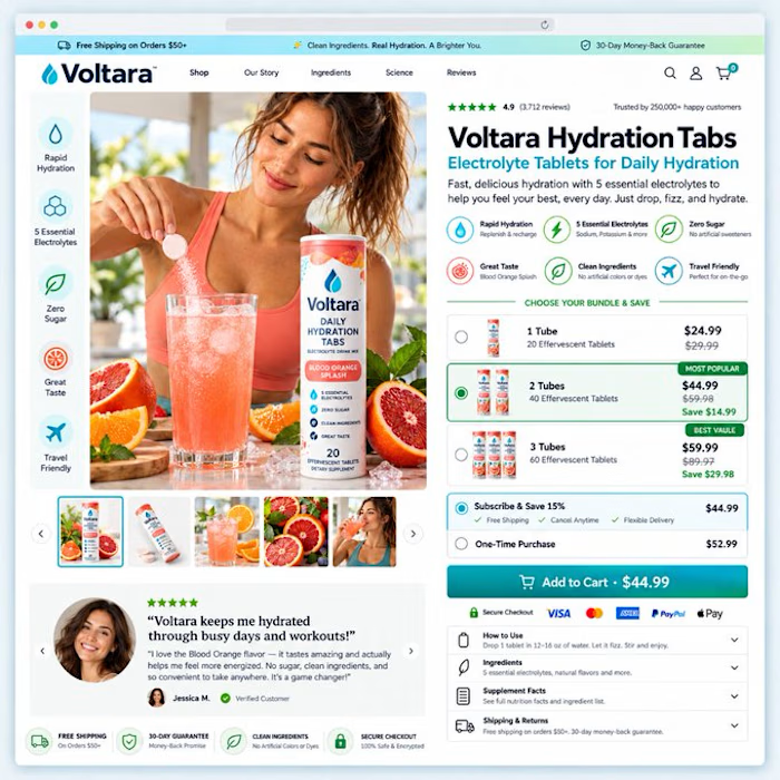

The bundle picker would stop me. Highlighting the 2 tubes option with the savings is clear.
The network for creativity
Join 1.25M professional creatives like you
Connect with clients, get discovered, and run your business 100% commission-free
Creatives on Contra have earned over $150M and we are just getting started





Related posts

🔥 From streetwear to a standout Shopify experience.
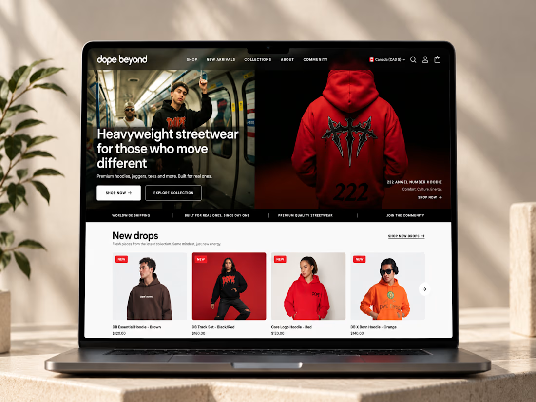
I recently worked on DOPE BEYOND, building a bold e-commerce store for a streetwear brand using Shopify and the Palo Alto theme.
From mega menu navigation to size charts and color swatches, every detail was designed to make shopping easier while keeping the brand’s identity strong.
What do you think matters most in a fashion e-commerce store: design, user experience, or functionality? 👇

Ye le Jani Solomon wali post ke liye copy-ready:
Fire work Solomon! 🔥 DOPE BEYOND looks like a perfect fit for a bold streetwear brand — love how you took Shopify + Palo Alto theme and pushed it beyond the template with mega menu, size charts and color swatches. Those small UX...


Okaaaayy, new profile picture and a new project! 🥳
This is one i'm really proud of and shows the development in our studio. Not just a brand or a website, but 120+ app screens + full IOS development for Mercury 🌍
I'm super proud of this project! Please check it out :)) 👇


Huge congrats Chris! 🎉 120+ screens + full IOS dev for Mercury is massive! Love the growth of your studio - from brand to full product. The editorial typography card looks premium. Big inspiration for us building in the app space! Checking it out now 👏


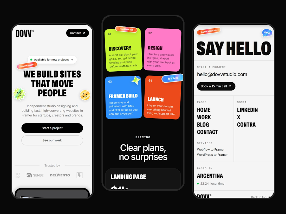
Clean mobile execution Dario! 📱 Love how bold DOVV's identity stays even on small screens. "WE BUILD SITES THAT MOVE PEOPLE" hits hard, and those sticky note cards in the middle for Discovery / Design / Framer Build / Launch are such a fun, scannable touch. That SAY HELLO page is super minimal and direct. Great Framer build!


