The network for creativity
Join 1.25M professional creatives like you
Connect with clients, get discovered, and run your business 100% commission-free
Creatives on Contra have earned over $150M and we are just getting started
Back to feedPost

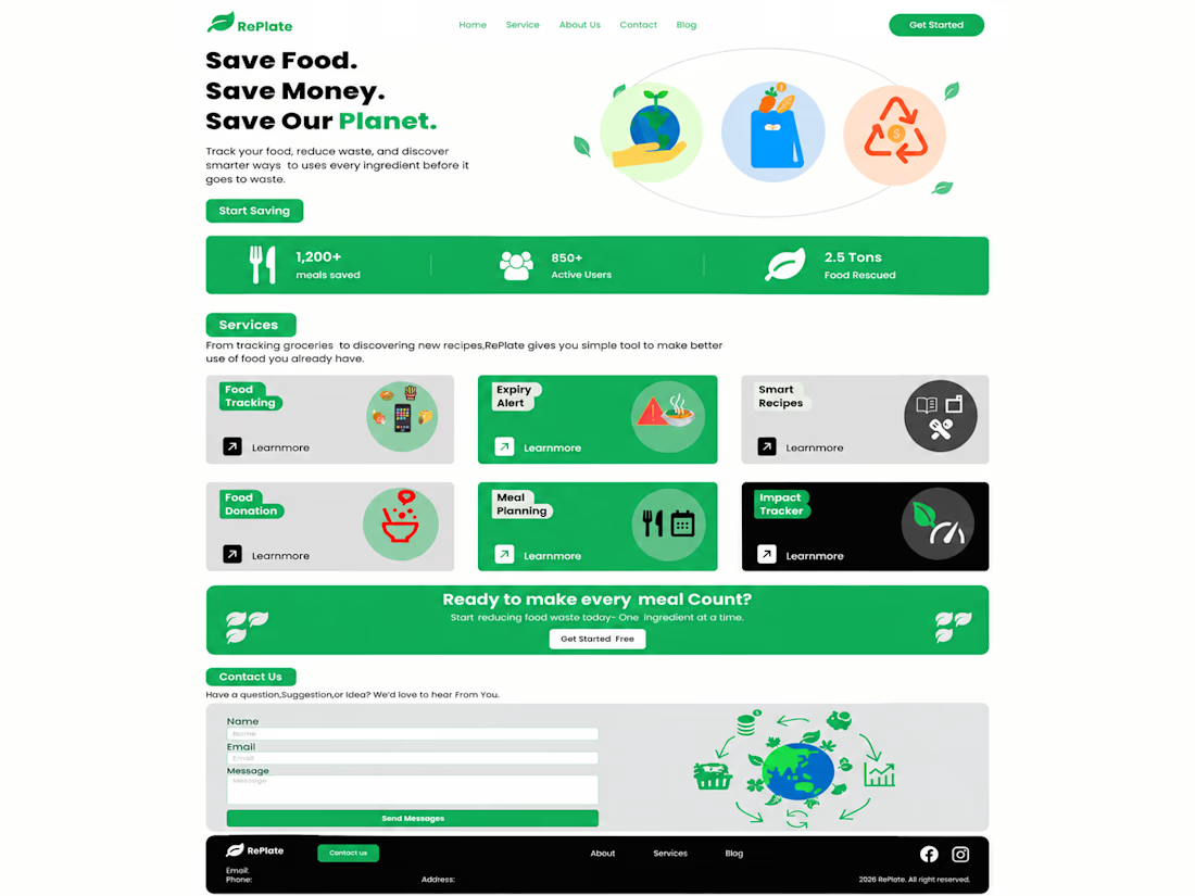
🌿 Introducing RePlate — Food Waste Reduction Website UI Design
I designed RePlate, a website concept focused on reducing food waste and promoting sustainable living.
The design features a clean layout, fresh green colors, and user-friendly sections to help people track food, manage expiry dates, discover recipes, and reduce waste.
✨ Designed with Figma
🎨 Focus: UI Design & Web Design
Always designing for a better experience and a greener future! 🌍
#UIDesign #WebDesign #Figma #UXDesign #Portfolio #SustainableDesign

The network for creativity
Join 1.25M professional creatives like you
Connect with clients, get discovered, and run your business 100% commission-free
Creatives on Contra have earned over $150M and we are just getting started











Related posts

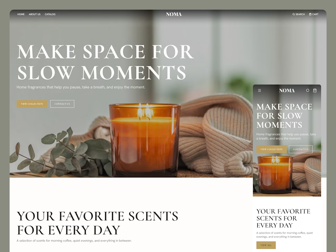
Built this in Framer as a concept project. Goal was to make it feel run by ex-journalists. Choices: editorial serif (Libre Baskerville), a dark photo with one color accent, and copy that positions against blast-style PR.
Where I’m unsure: text legibility over the photo and whether the two CTAs compete. What would you change?



That's great design it feels professional I like how the background mixed with interface ❤️❤️
Great job Cheree🎉🎉

✨ 2 spots open for new website projects!
Looking to launch a new website or give your existing one a fresh look? Let’s make it happen!
I help businesses and startups create modern, user-friendly websites that combine thoughtful UX with polished visuals.
Here’s what I offer:
🎨 UI/UX design in Figma - from wireframes to complete design systems and developer-ready specs.
💻 Framer websites - design, responsive development, animations, and launch.
🛍️ Shopify stores - modern e-commerce experiences tailored to your brand.
Whether you need a landing page, a multi-page website, or an online store, I’d love to help bring your vision to life.
🎁 Use code TKACH10 for 10% off your project.
Have a project in mind? Send me a message, let’s talk!
#WebDesign #Framer #Shopify #UIDesign


Looks great! 👌

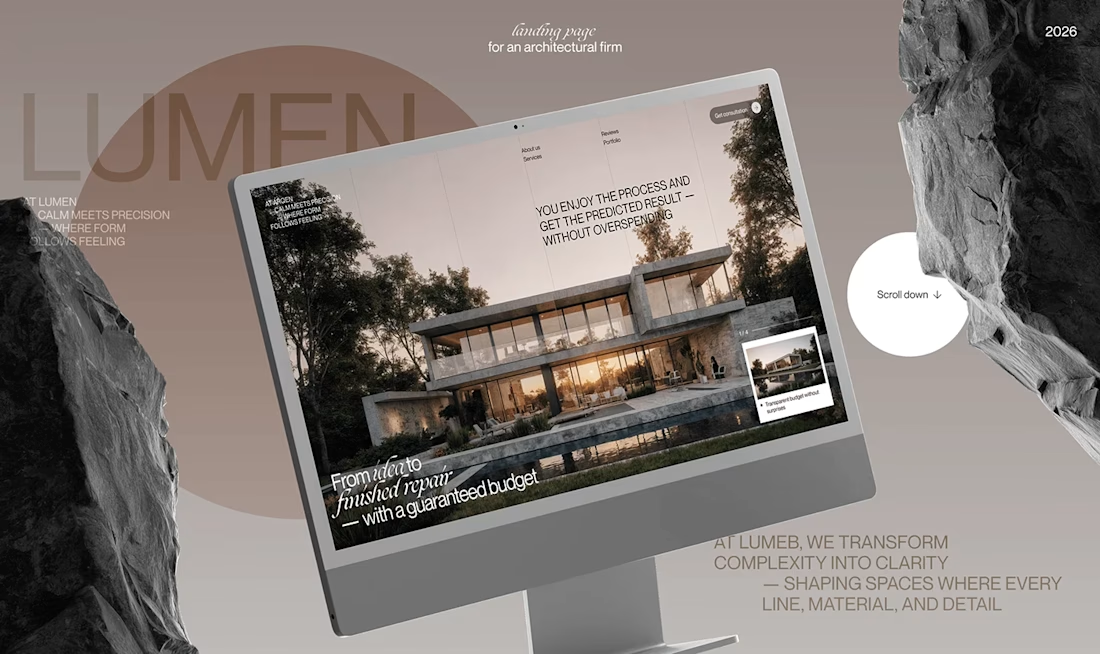
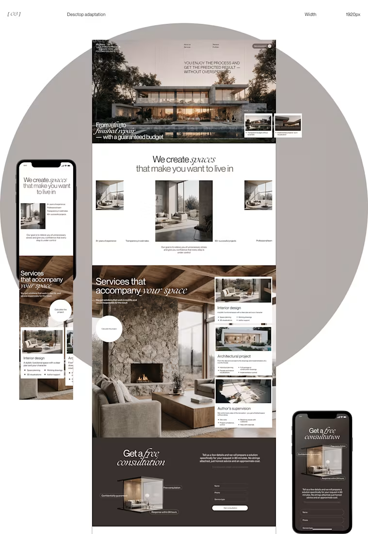
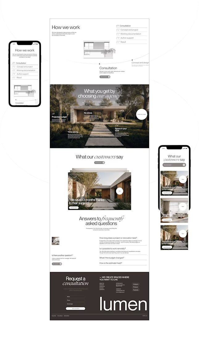
Lumen — UX/UI Design for a Premium Architecture Studio
Sometimes, the smallest details are what give a design its personality.
For Lumen, I found myself exploring how typography, architectural photography, colour, and layout could work together to tell a story before someone even starts reading.
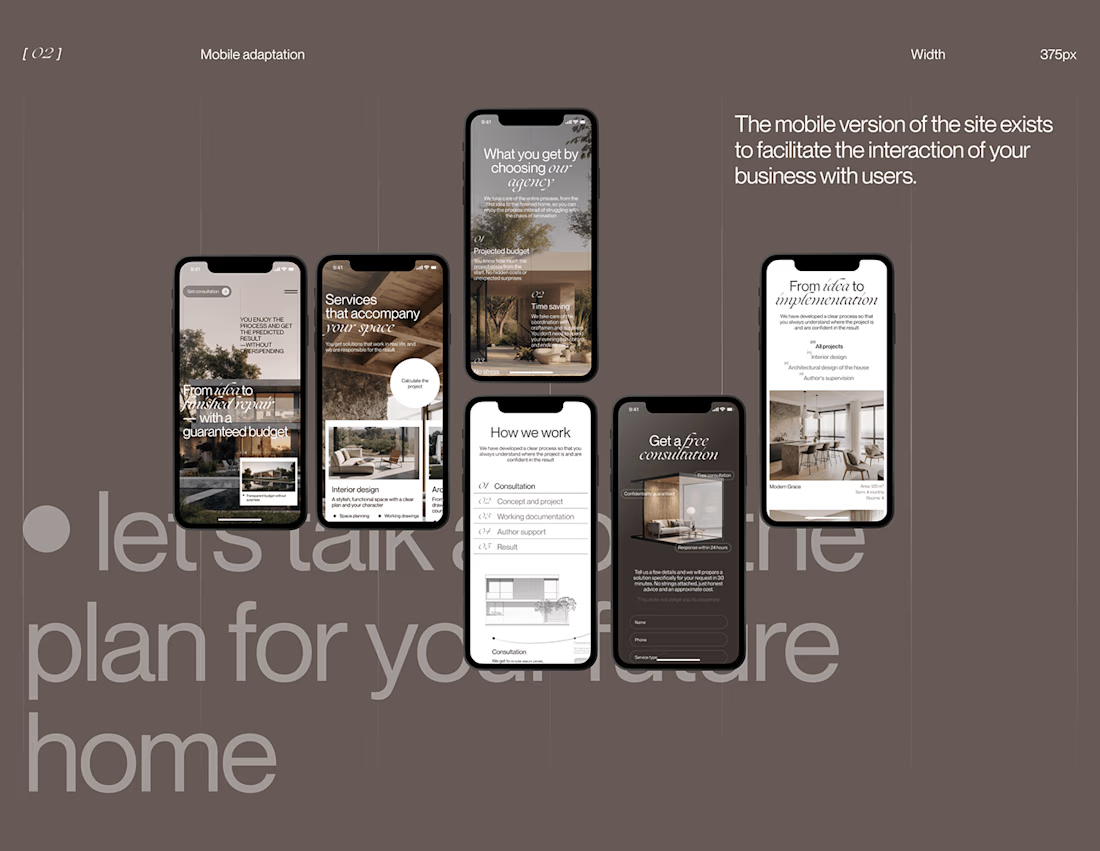
I played with oversized text, warm brown tones, editorial layouts, and a mobile experience that carries the same visual character as the desktop design.
I especially enjoyed putting the mobile screens together. Seeing the different sections come to life on a smaller screen made the whole concept feel more complete.
It's always interesting to see how different creative decisions can change the way people experience a brand.
What's one design detail that can make you appreciate a website even before you've explored everything?
#WebDesign #CreativeDesign #UIUXDesign #Architecture


i love this soooo wellllll, i just said welll with 4 l's thats how good this is