The network for creativity
Join 1.25M professional creatives like you
Connect with clients, get discovered, and run your business 100% commission-free
Creatives on Contra have earned over $150M and we are just getting started
Back to feedPost

🚀🐸 FROX Child Laboratory – Brand Identity Showcase
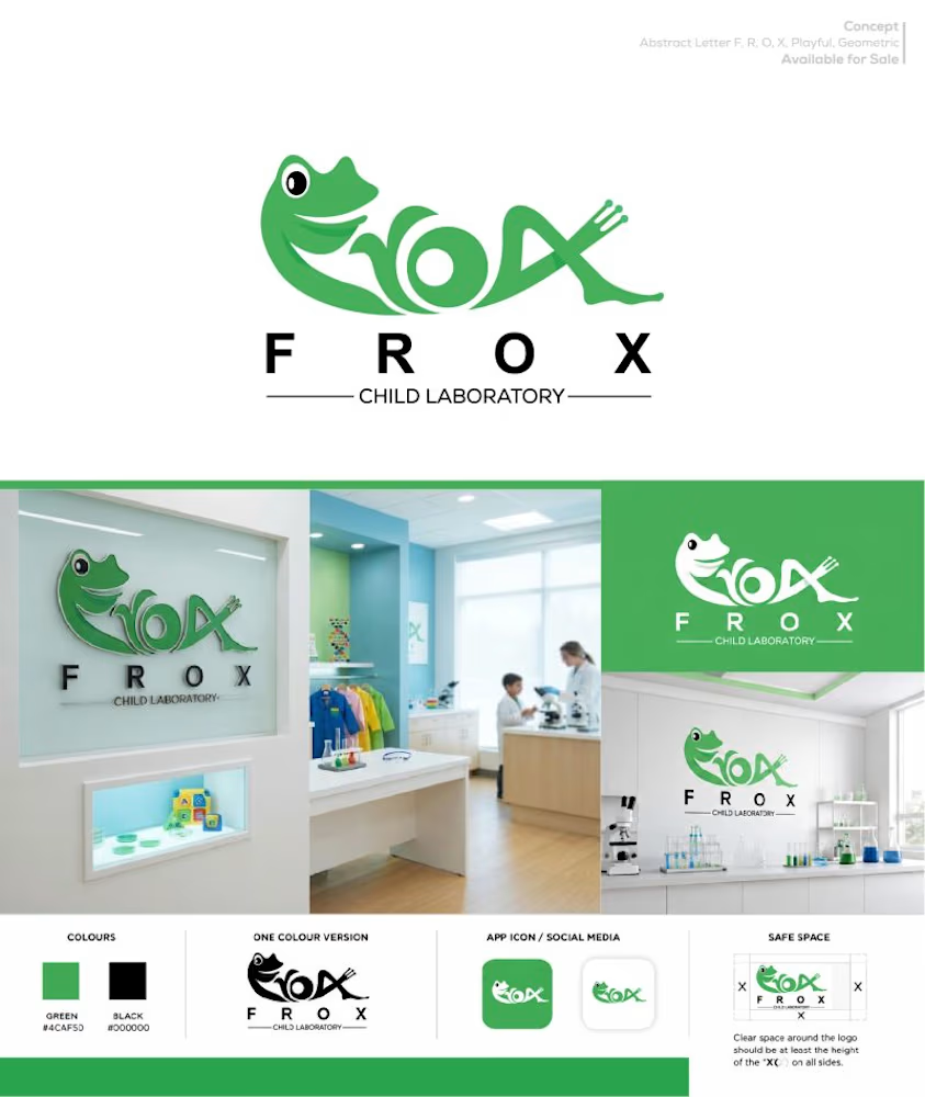
Excited to share this playful and modern logo concept created for FROX Child Laboratory, a child-focused laboratory brand designed to make healthcare and diagnostic services feel more welcoming, friendly, and approachable for children and their families.
The goal was to create a distinctive identity that communicates care, trust, science, and child-friendly energy while avoiding the typical clinical and overly serious laboratory aesthetics.
Design Concept:
The logo combines a friendly frog character with the FROX wordmark, creating a memorable visual connection with children while maintaining a professional foundation.The frog represents friendliness, curiosity, growth, and approachability, while the subtle laboratory-inspired details integrated into the lettering help connect the identity to science and diagnostics.
The custom FROX lettering gives the mark a unique personality and makes the logo instantly recognizable. The clean structure and simplified shapes also help ensure the identity remains clear across different applications and sizes.
Typography:
A clean, modern sans-serif approach was used for the supporting typography to maintain clarity, professionalism, and readability.
The spaced-out F R O X wordmark creates a balanced visual hierarchy and gives the identity a contemporary healthcare feels while allowing the illustrated logo mark to remain the main focal point.
Color Palette:
🟢 Green (#4CAF50) – Represents health, growth, freshness, nature, trust, and a positive child-friendly environment.
⚫ Black (#000000) – Provides strong contrast, professionalism, clarity, and visual stability.
⚪ White (#FFFFFF) – Keeps the identity clean, fresh, bright, and suitable for a modern laboratory environment.
The identity is designed to work effectively in both full-color and single-color applications, making it versatile for signage, stationery, uniforms, packaging, digital platforms, laboratory materials, and promotional assets.
Brand Applications:
The presentation showcases how the identity can adapt across:
🔬 Child laboratory environment
📱 App icon & social media profile
⚫ One-color logo version
🎨 Brand color palette
📐 Safe-space guidelines
📄 Marketing & laboratory materials
🧪 Child-friendly laboratory communication
The result is a friendly, memorable, and scalable visual identity that balances the credibility of a laboratory with the warmth and personality needed for a child-focused healthcare brand. A brand identity designed to make science feel a little more friendly, approachable and welcoming.
The network for creativity
Join 1.25M professional creatives like you
Connect with clients, get discovered, and run your business 100% commission-free
Creatives on Contra have earned over $150M and we are just getting started





Related posts

Wellness brand exploration
- Logo and identity exploration done in Figma
- Mockups done with @Kittl
- Brand video - Claude Opus 5.5

Love this!

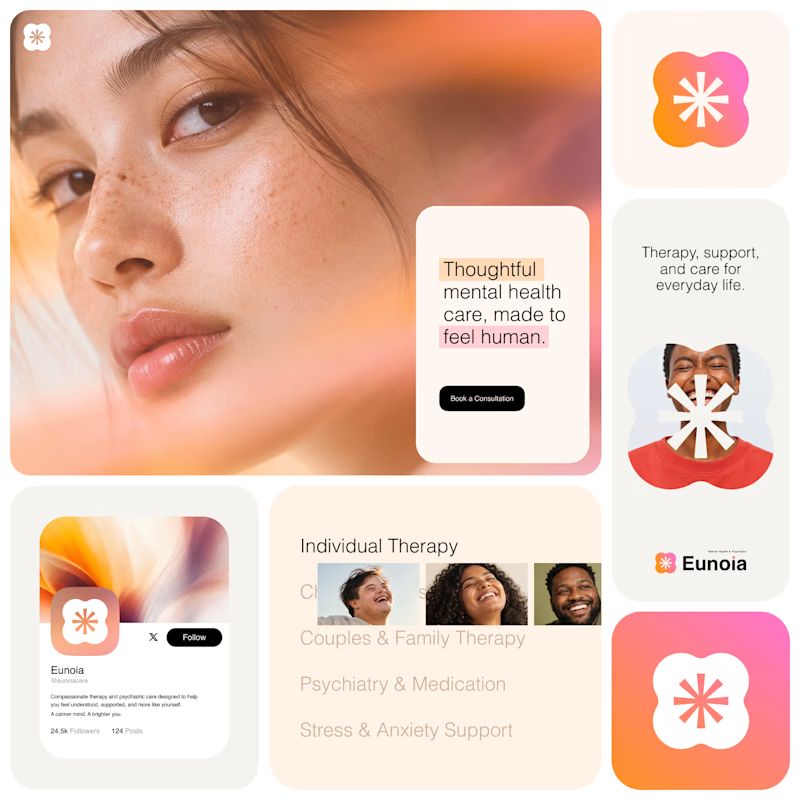
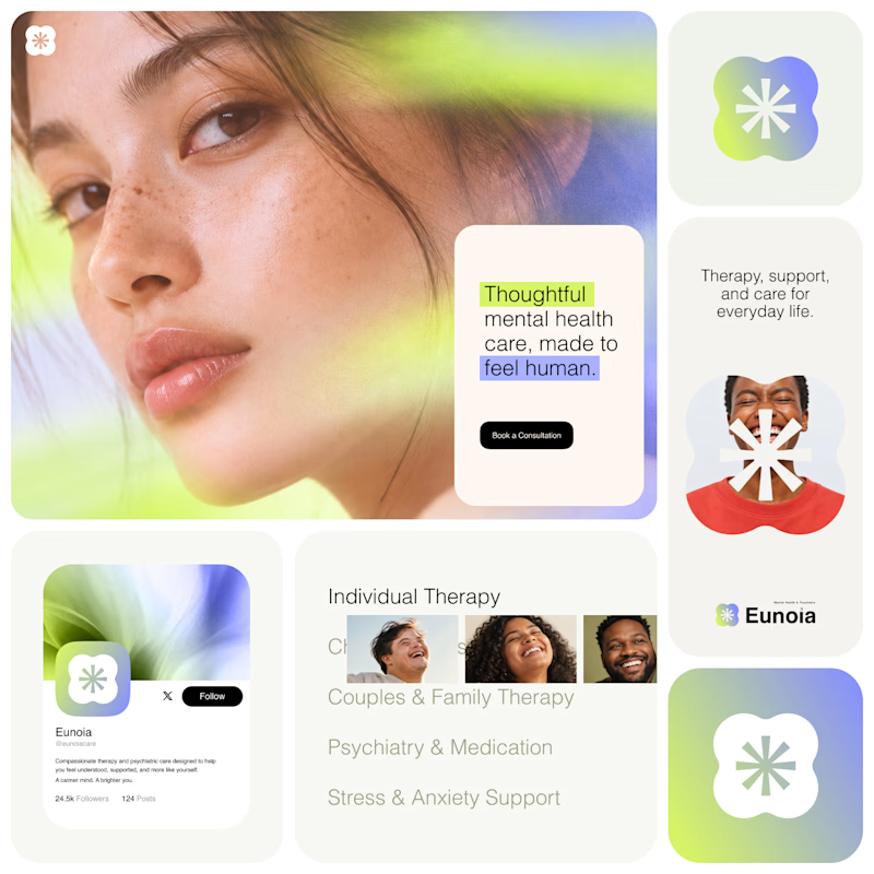
Exploring two visual directions for Eunoia, a mental health & psychiatry brand.
Direction 01 - Warm peach, orange and soft pink tones for a calm, human and comforting feel.
Direction 02 - Lime and periwinkle tones for a fresher, more optimistic and contemporary expression.
Same brand system. Different emotional energy.
32 voted
52%
29 voted
48%
61 votes
Closed

That's impactful, love to see fresh styles




🔥 🔥