The network for creativity
Join 1.25M professional creatives like you
Connect with clients, get discovered, and run your business 100% commission-free
Creatives on Contra have earned over $150M and we are just getting started
Back to feedPost

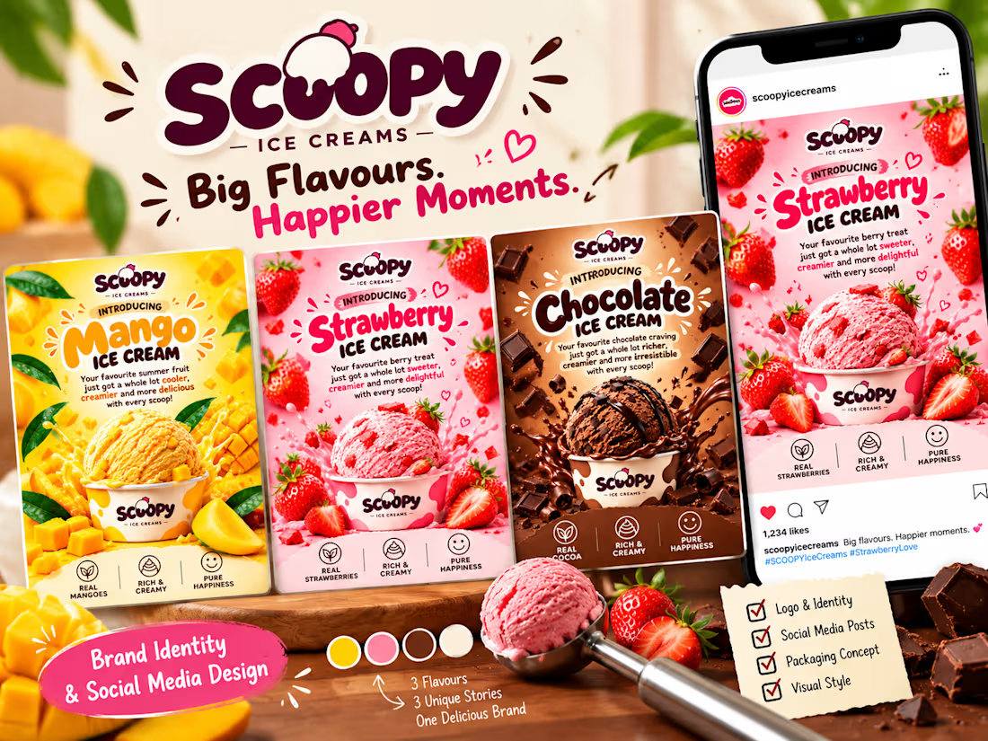
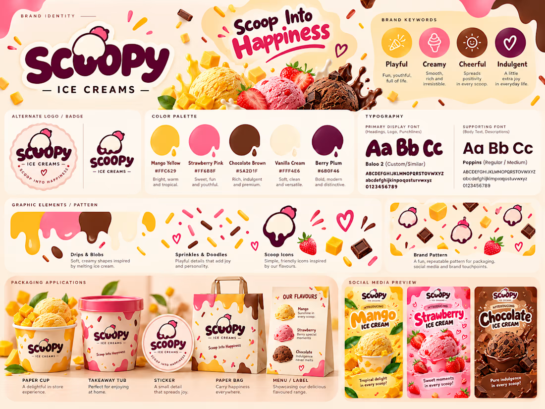
🍦 SCOOPY Ice Creams | Brand Identity & Social Media Design
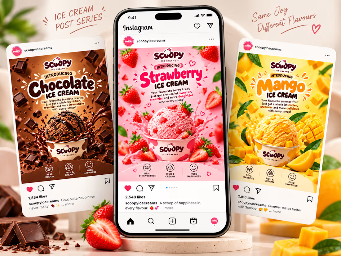
3 flavours. 3 personalities. 1 playful brand. 🎨
SCOOPY is a self-initiated branding concept I created for a fictional ice cream outlet.
The idea was simple: make every flavour stand out while keeping the entire collection visually connected.
🥭 Mango — Bright, tropical and refreshing
🍓 Strawberry — Sweet, cheerful and playful
🍫 Chocolate — Rich, indulgent and irresistible
My creative approach:
I focused on building a consistent visual identity through:
Playful, rounded typography
Flavour-inspired colour palettes
Consistent layouts and visual hierarchy
Eye-catching product compositions
Packaging concepts and Instagram-ready creatives
The process? AI + creative direction.
I used ChatGPT to help generate and refine the visuals, while I directed the concept, typography, colours, compositions and overall brand personality.
Because good design isn't just about making something look attractive. It's about creating visuals that communicate, connect and feel like they belong to the same brand.
The result: A fun, cohesive brand identity designed to make every scoop memorable.
*Tools: ChatGPT | AI-assisted Design | Creative
The network for creativity
Join 1.25M professional creatives like you
Connect with clients, get discovered, and run your business 100% commission-free
Creatives on Contra have earned over $150M and we are just getting started



Related posts

What makes a candy brand recognizable across every pack?
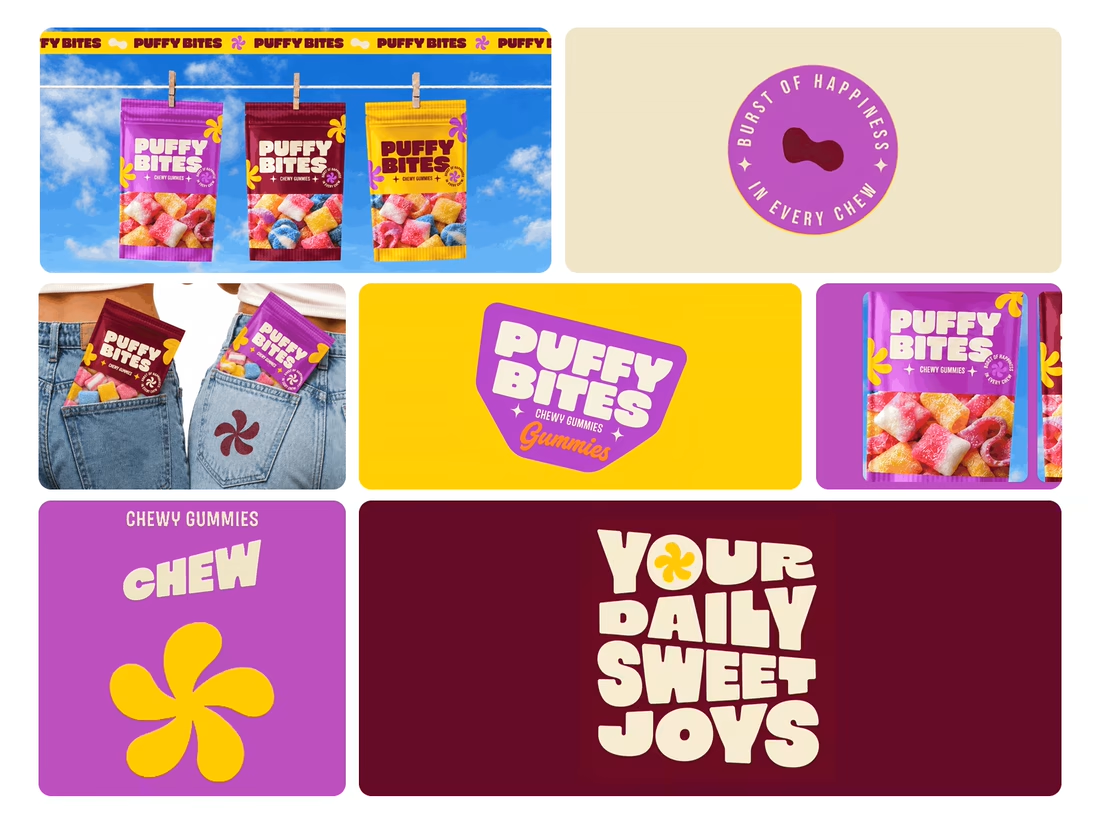
For Puffy Bites, I built the identity around rounded lettering, expressive symbols, and a palette of burgundy, purple, yellow, and cream.
The same visual language carries through pouch packaging, smaller wrappers, campaign imagery, and an animated brand showcase.
One design decision that ties it together: the packaging color changes, while the logo placement, product descriptor, and supporting graphics maintain a consistent structure.
I handled the full client project, from logo and visual identity to packaging and campaign applications.
Which colorway would catch your eye first—purple, burgundy, or yellow?
Explore the full Puffy Bites case study. If you’re developing a candy or snack brand, I’m available for branding and packaging projects.

Love it,
Great work

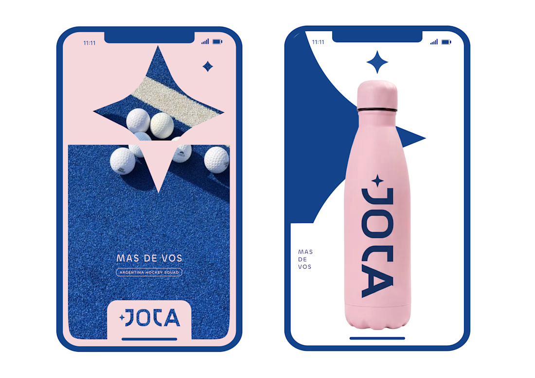
JOTA is an Argentine field hockey brand built for players who play with personality. The founder reached out to rethink how the brand shows up beyond the stick itself.


Wow project

If a logo had to tell what a brand does, Apple would be a fruit stand.
New on our blog: why comparing "logo + guidelines" with a branding process is comparing two different products, how to tell whether you need a new logo or a new brand, and why sometimes the professional move is to turn the work down.
A logo is the signature. The story is everything else. Read it here: https://ander.agency/blog-posts/branding-is-not-a-logo