The network for creativity
Join 1.25M professional creatives like you
Connect with clients, get discovered, and run your business 100% commission-free
Creatives on Contra have earned over $150M and we are just getting started
Back to feedPost
A hotel site should feel like walking into the lobby. The old website for 'The Address' didn't. So, I called the venue and talked about the difference a website makeover would make, next step? I served it in Base44 — chasing warmth in the type, calm in the color, until the page finally felt like somewhere you'd want to check in.
The old website wasn't all that- what needed to be added was only THE ENTIRE PERSONALITY responsible for speaking to the the business's audience.
Old website:
Partially frozen
Minimum visual appeal
Basic and cluttered UI
Photos that don't do the venue justice
Outdated information scattered across different vendors and websites
The glow that I gave to it?
Lead generation,
Private Tour Request Form (takes resistance off the client's mind when they don't have to commit too soon),
Refined booking automation,
WhatsApp flow,
Social media integration,
Map integration,
Warm and welcoming visuals and a proper colour story per section,
Neat and attractive UI,
High quality photographs to best reflect the true beauty of the venue,
And easy to update all-in-one website.
You can really see the idea and identity come to life from the scrawled blueprint to the polished and ready to deliver website.
Media- Before & After Makeover, Blueprint, Wireframes

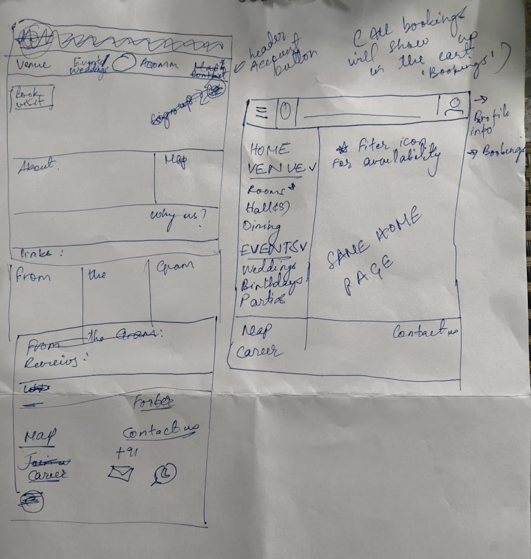
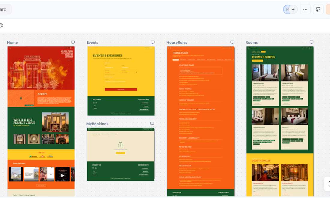

Mobile responsiveness- CHECK! ✓
The network for creativity
Join 1.25M professional creatives like you
Connect with clients, get discovered, and run your business 100% commission-free
Creatives on Contra have earned over $150M and we are just getting started






Related posts

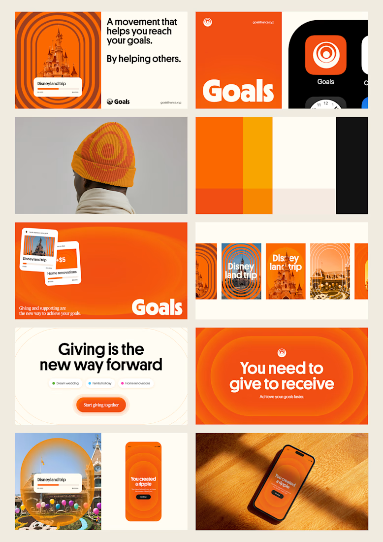
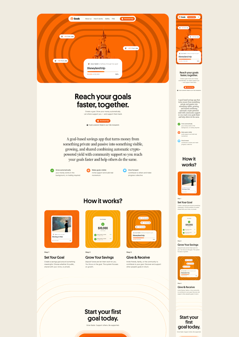
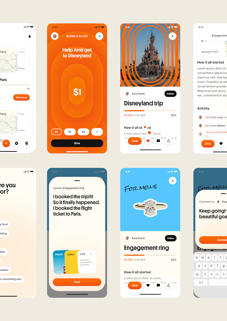
one of my favourite things about running a one-person studio is that nothing gets lost in translation.
the idea behind the brand is the same idea that shapes the website and the product.
no handovers, no starting from scratch, no trying to explain the vision to someone new.
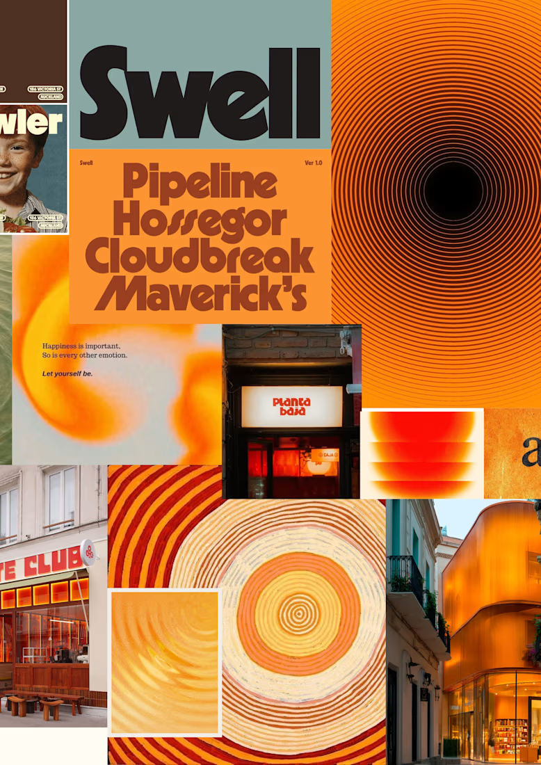
a little look at how that came together for goals, from the first moodboard to the app ↓

Love it!

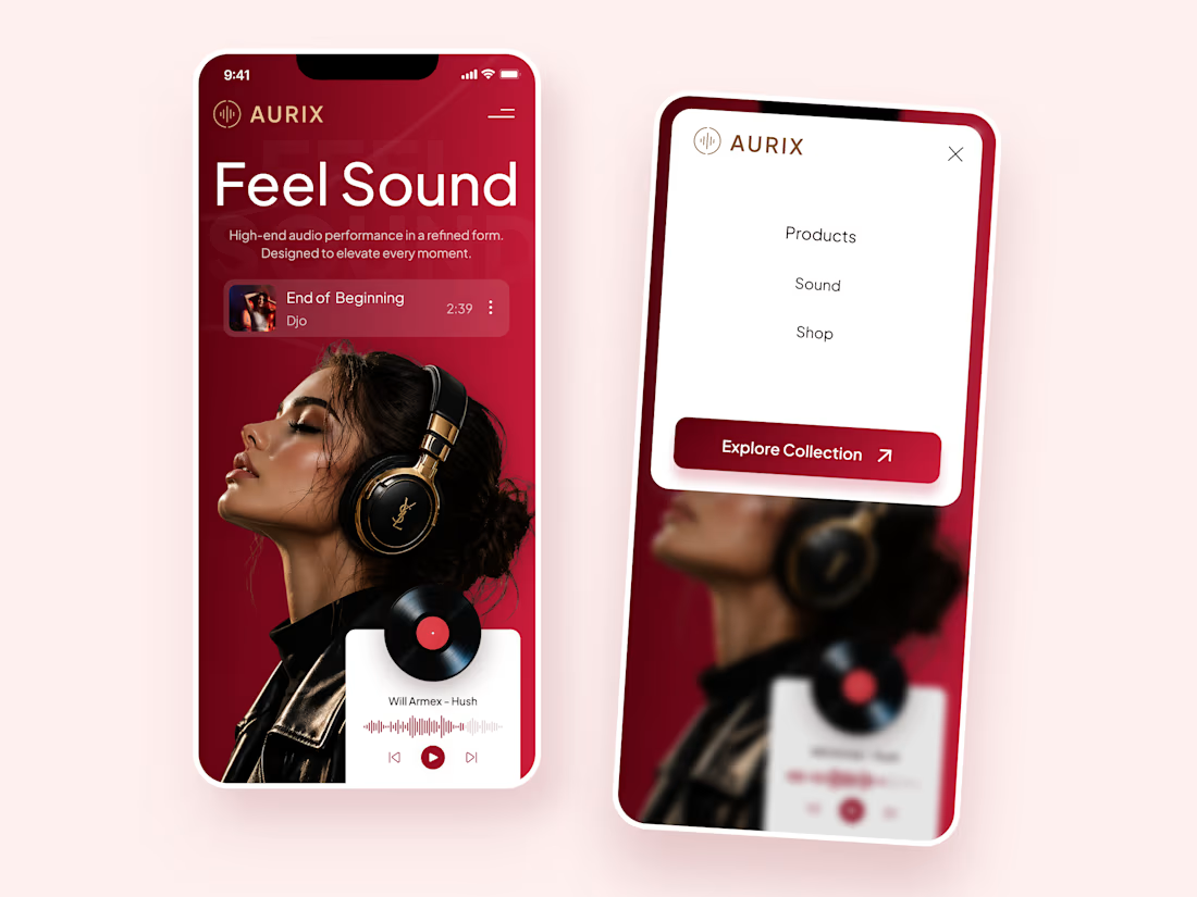
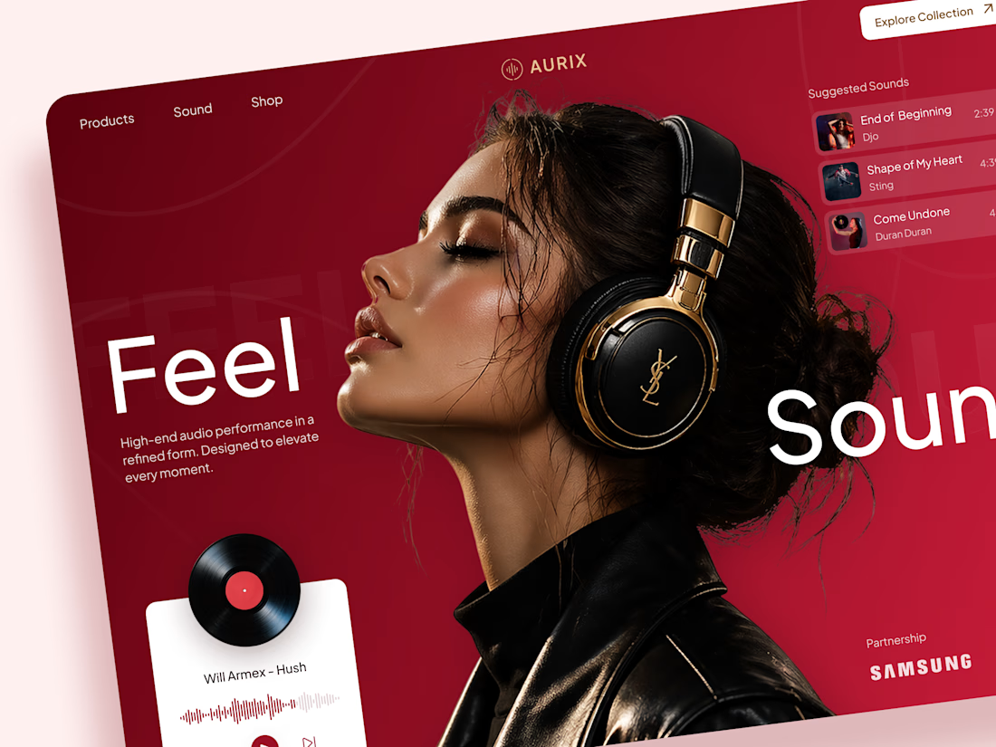
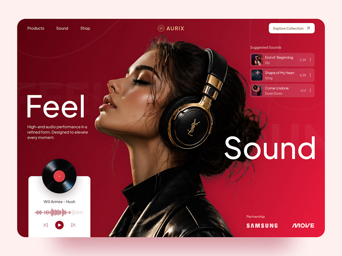
AURIX — Premium Headphones Landing Page 🎧❤️
A bold landing page concept for a premium audio brand, combining luxury headphones, music, and a strong lifestyle aesthetic
The design brings together deep red tones, elegant black and gold details, oversized typography, and immersive lifestyle imagery to create a modern, fashion-inspired experience
Special attention was given to:
• Bold lifestyle-focused hero composition
• Rich red and gold color palette
• Clean, oversized typography
• Music player and suggested tracks
• Premium product presentation
• Responsive mobile experience
• Minimal navigation and clear CTA
The result is a stylish, immersive landing page that connects premium audio with fashion, music, and everyday lifestyle ✨



Love the style!

NEOL. Making of the Hero
NEOL develops CuGlide™, a copper-based lubricant technology that reduces wear between metal parts.
I recently designed their website. The hero was the hardest part: two gears in contact, with a thin copper film where they meet. That's why I built it in 3D instead of generating it: AI video can't give that level of control and precision.
From the first draft to the live site.


Sleek work!