The network for creativity
Join 1.25M professional creatives like you
Connect with clients, get discovered, and run your business 100% commission-free
Creatives on Contra have earned over $150M and we are just getting started
Back to feedPost

Social media post showcasing website design for art company (website design also by me)


The network for creativity
Join 1.25M professional creatives like you
Connect with clients, get discovered, and run your business 100% commission-free
Creatives on Contra have earned over $150M and we are just getting started










Related posts

This is wild to me!
I have worked so hard to build this profile and it just goes to show that you really do get out what you put in. Work has really picked up since I worked on my discovery score and the right clients seem to be finding their way to me. Couldn't be happier.

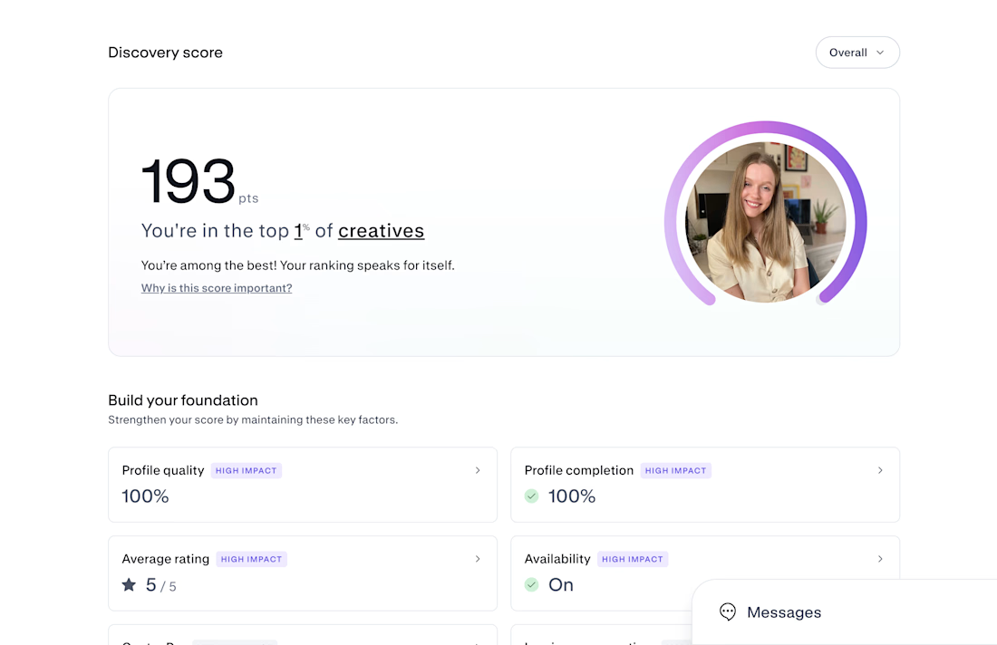

Congrats on Top 1% — that's huge! 193 is wild. If you don't mind sharing, what moved the needle most for your discovery score? Was it profile completion, case studies, or just consistent posting? Trying to build mine from scratch right now.


This UI was really great nice job Piotr🔥🔥🔥

A logo is not a brand identity.
It’s the signature at the bottom of the letter.
Most founders start by asking for a logo.
What they need is a system that still looks like them on day 100.
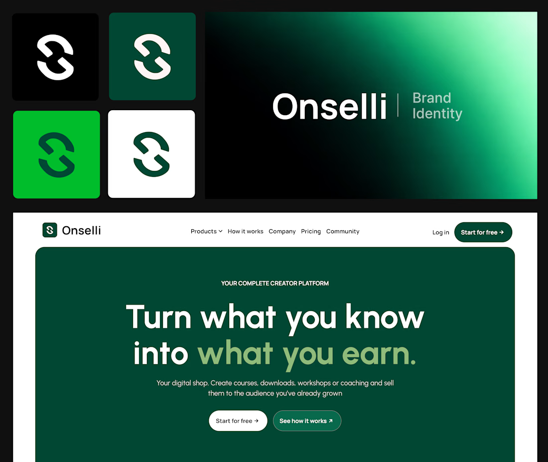
Here’s what sits behind the Onselli mark 👇
- A mark that holds on any background
- A style guide, with a color system where every color has a job and type with a point of view
- The brand principles, with the logo use cases on socials, mockups, or any surfaces.
- Components that match: buttons, cards, hero, forms, etc...
- Social creatives and copy that sells the product: “Turn what you know into what you earn.”
- A live website that carries all of it
Skip one and the whole thing starts to look like a template.
A logo gets you noticed.
A system gets you trusted.
Which of the 6 is your brand missing?
Drop the number below, and I’ll tell you how I’d fix it.
Know a founder who thinks branding is a logo?
Repost ♻️ and save them an expensive redo.
I’m Daniel, a Design Engineer. I craft premium web, motion, product design, and brand identities for startups.
Follow for more breakdowns like this, or DM me “identity” if you’re building something.
Great job Daniel 🎉🎉