The network for creativity
Join 1.25M professional creatives like you
Connect with clients, get discovered, and run your business 100% commission-free
Creatives on Contra have earned over $150M and we are just getting started
Back to feedPost

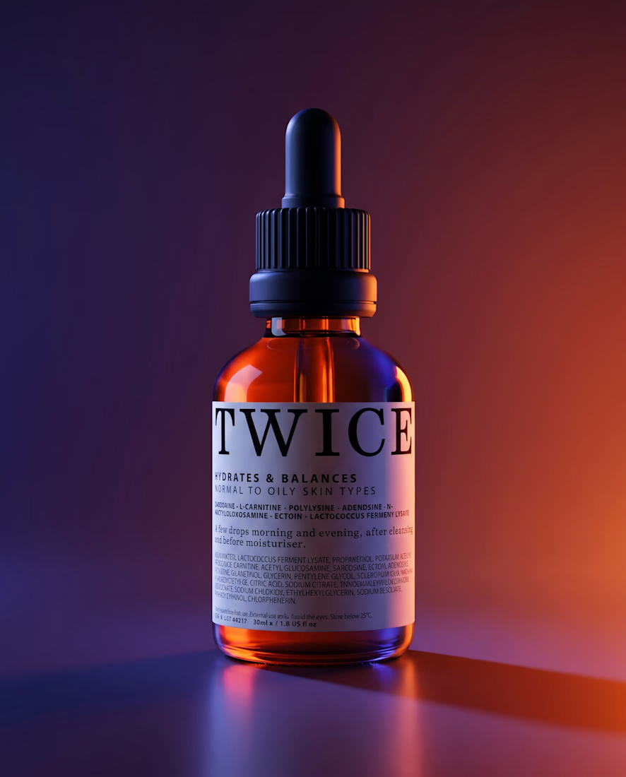
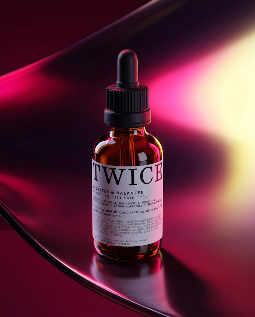
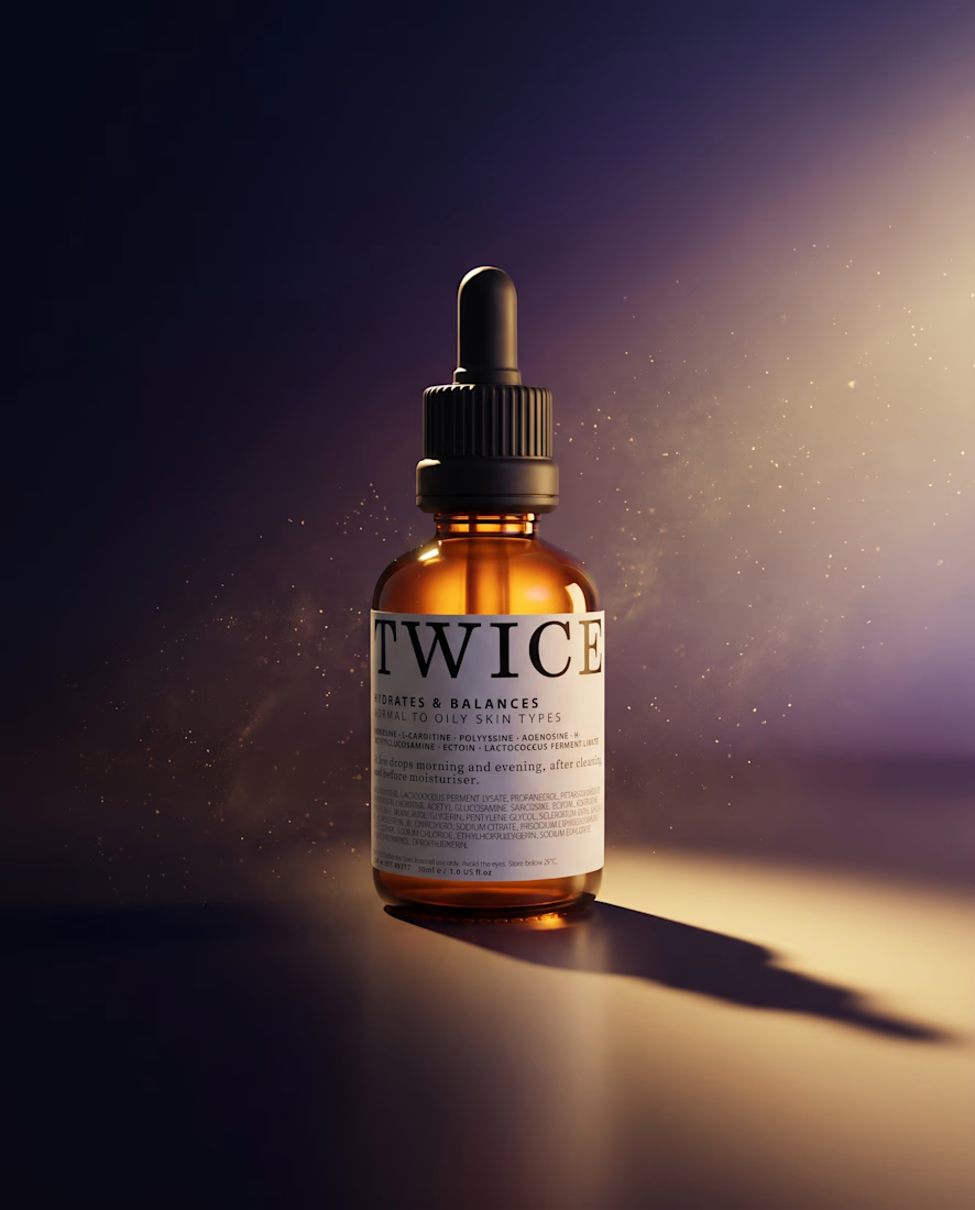
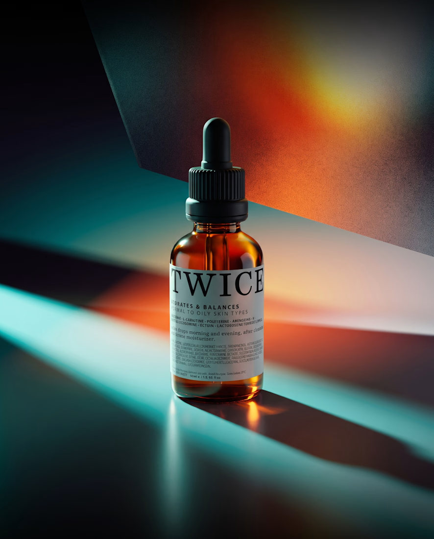
TWICE — serum, 30ml. A nocturne for a product used at both ends of the day. Built to survive a 3-inch screen.
Unstocked №1 · invented brand, real direction.
The network for creativity
Join 1.25M professional creatives like you
Connect with clients, get discovered, and run your business 100% commission-free
Creatives on Contra have earned over $150M and we are just getting started



Related posts

A modern brand identity concept designed for the architecture, interior design, and construction industry.
The visual identity is built around a distinctive geometric symbol, combining four interconnected forms to create an abstract interpretation of the letter “N.”
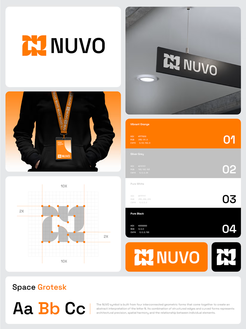

The construction grid with those 2X margins makes the N read as a system, not a one-off mark. Did you test the four-form symbol at favicon or lanyard-badge size, where the gaps between the forms start to close up?

Same product, same button, two ways to say "added to cart". Which one makes you buy?
Burst: springy, the bottle flies into the cart. Calm: a quick spinner, then a tick.
Vote, and tell me what you'd change. Both built from scratch in code.
3 votes
Ends in 1d

15 seconds inside the redesign I built for a natural cosmetics brand. Immersive hero, product-first layout, a clear path to buy. Live demo https://falak-refonte.netlify.app Want this for your brand? DM me, I reply within 24h.