The network for creativity
Join 1.25M professional creatives like you
Connect with clients, get discovered, and run your business 100% commission-free
Creatives on Contra have earned over $150M and we are just getting started
Back to feedPost

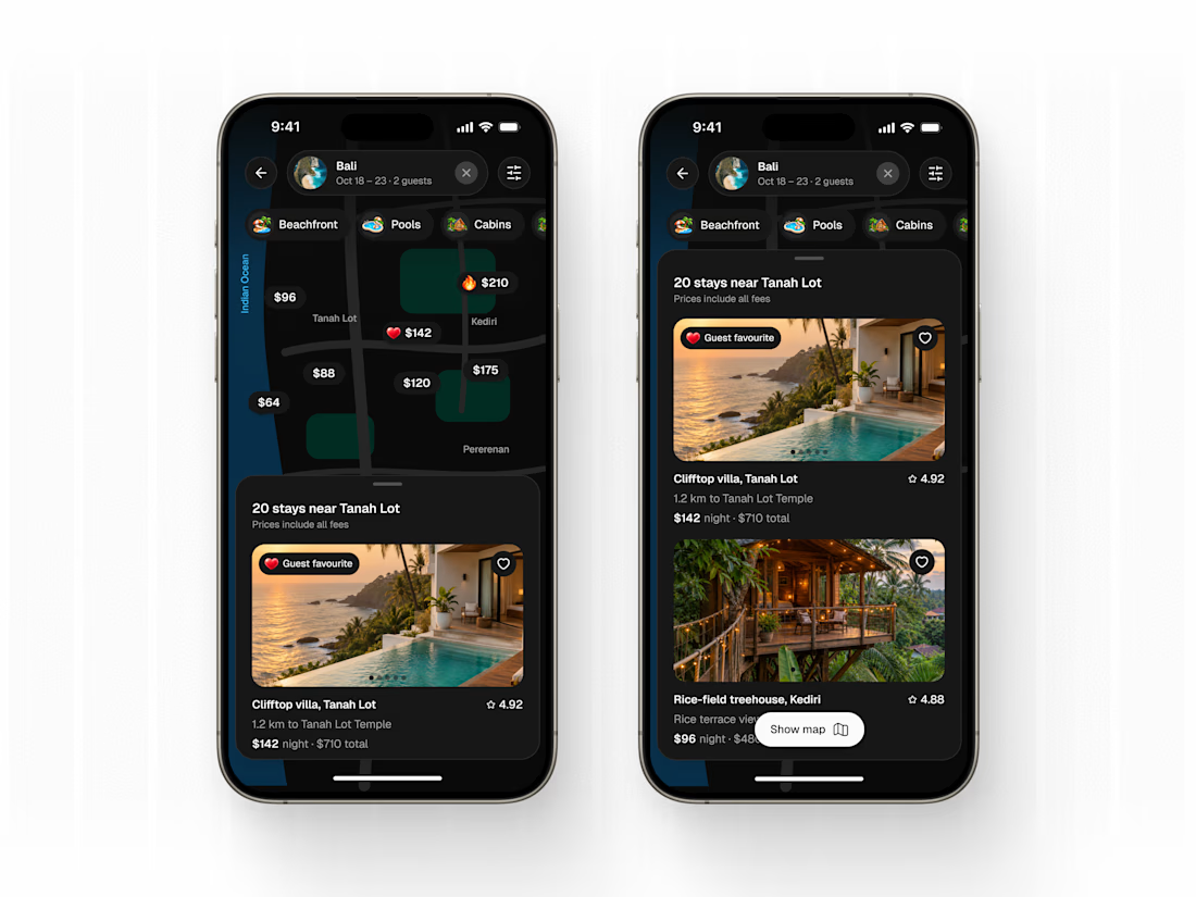
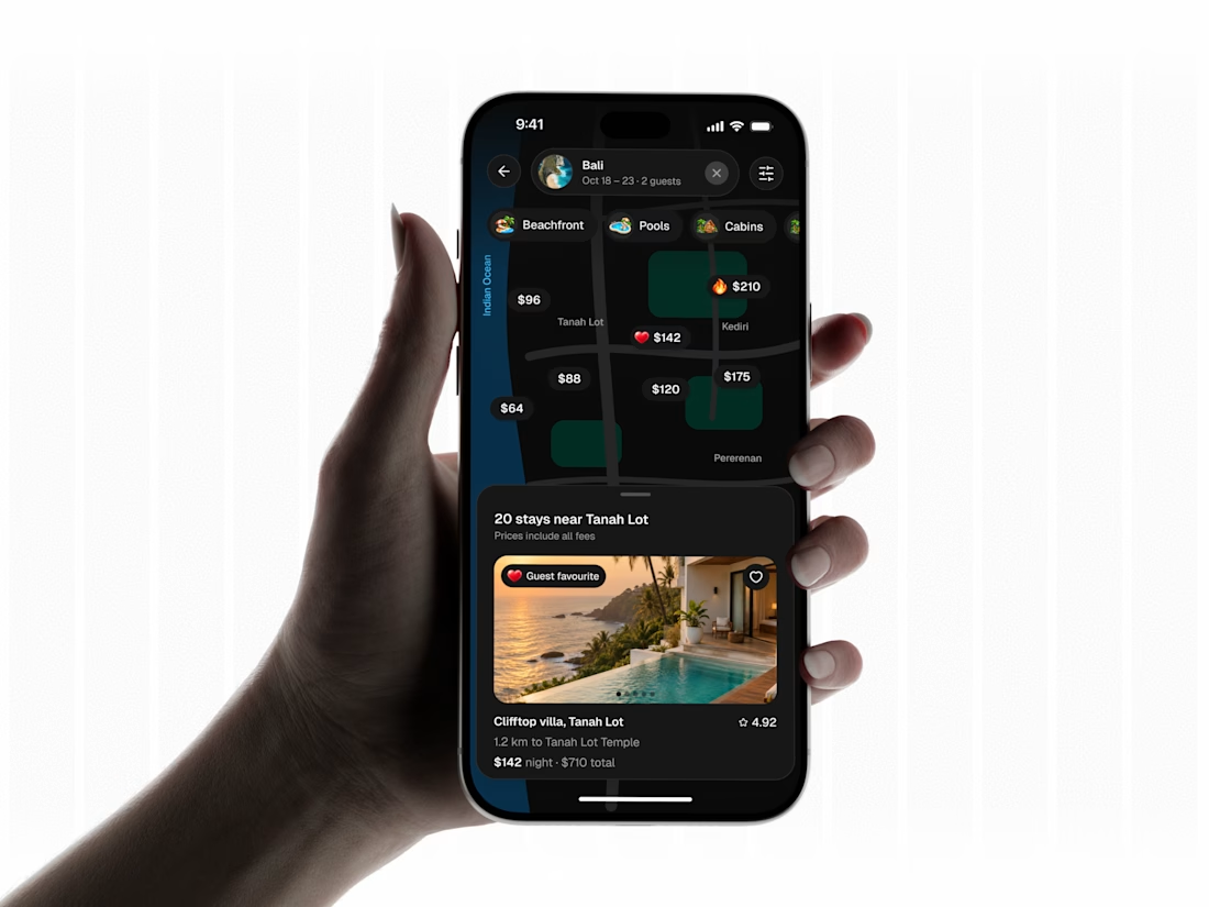
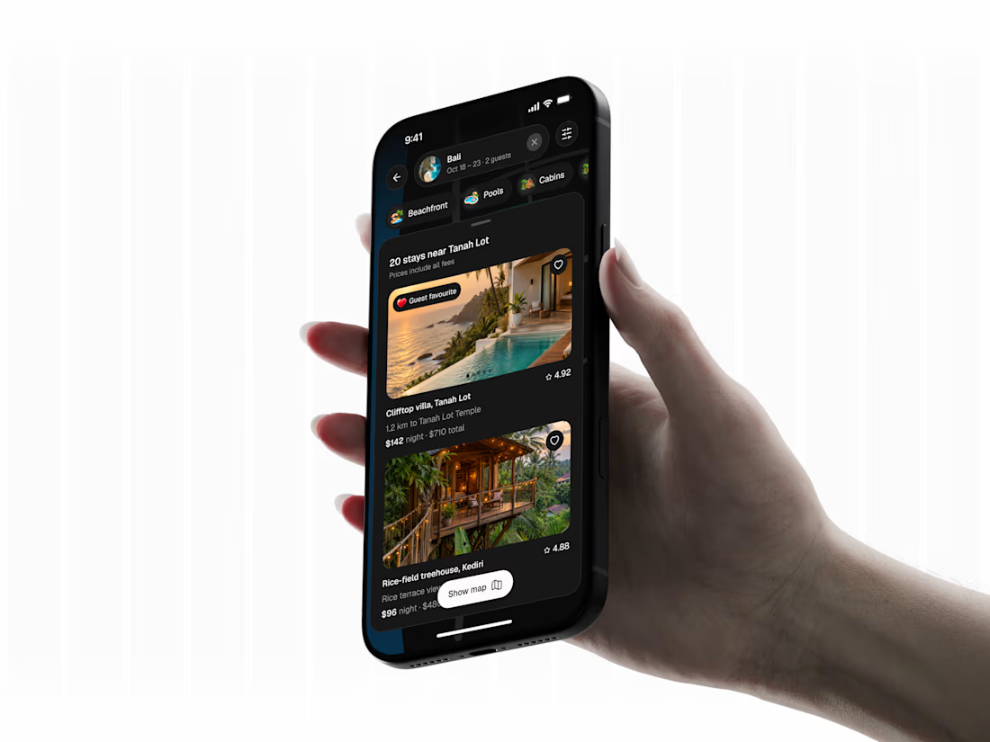
Finding your stay should feel like part of the trip. 🌴
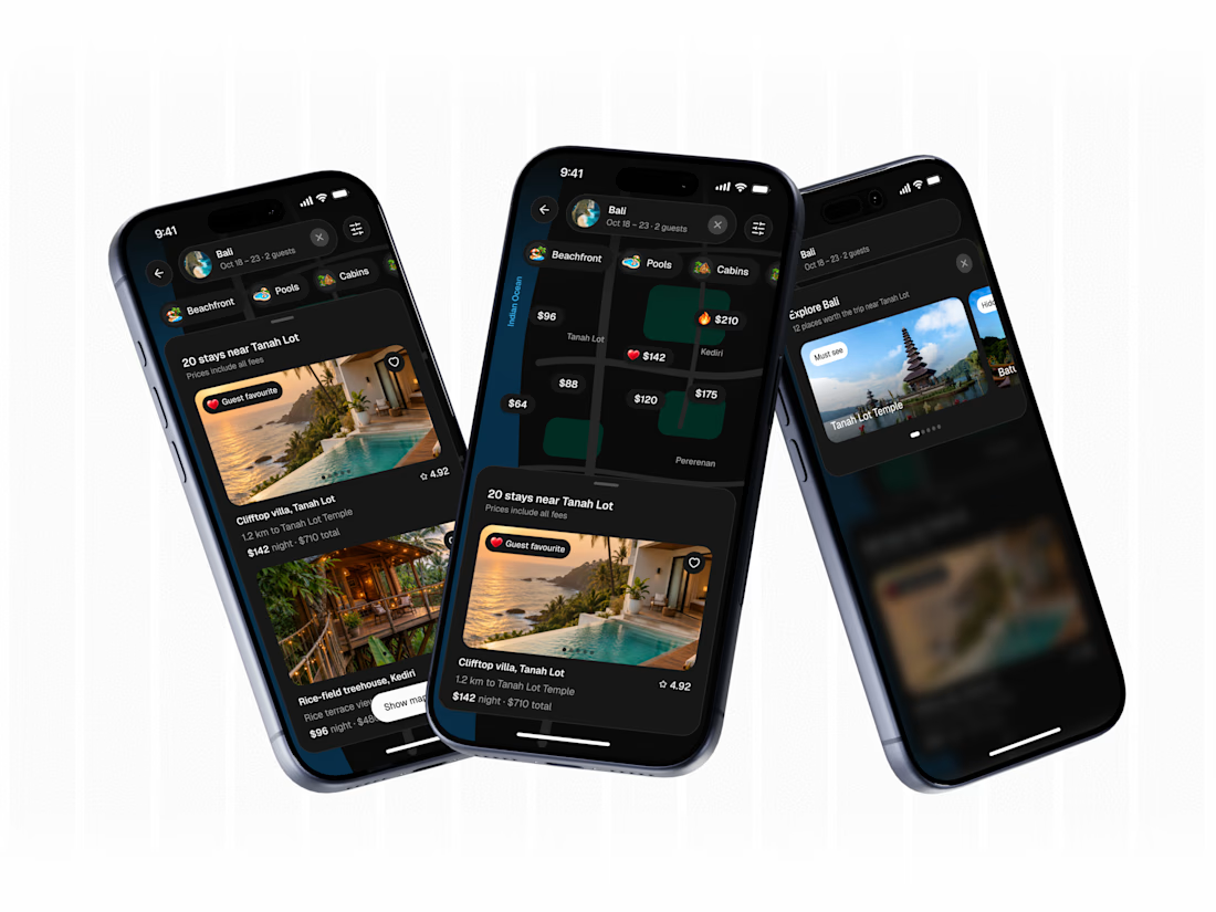
A travel experience designed to make exploring stays around Bali feel effortless. From browsing locations on a map to discovering stays through a clean listing view, the interface keeps the experience simple while giving users the freedom to explore.
Highlights
• Map-based stay discovery
• Seamless transition between map and listings
• Clear pricing and stay details
• Light & dark mode experience
• Clean, intuitive mobile interface
Designed to make exploring feel as easy as choosing where to go.
💬 Have a travel product in mind? Let's make it a great experience.
📩 Email: connect@extrive.design
The network for creativity
Join 1.25M professional creatives like you
Connect with clients, get discovered, and run your business 100% commission-free
Creatives on Contra have earned over $150M and we are just getting started





Related posts


Hover Effects: Decoration or Function?
The same online course card can respond to hover in very different ways.
Version A - Visual Hover
The image slightly zooms in, the card lifts, and the CTA arrow moves to the right. It signals that the card is interactive and makes the interface feel more dynamic, but it doesn’t provide any new information.
Version B - Functional Hover
The unedited portrait smoothly transitions into the final retouched version. Users can immediately see the potential outcome of the course before opening its page.
Both options add motion, but they serve different purposes: one attracts attention, while the other supports decision-making.
Which hover would you choose for an online course library?
9 voted
28%
23 voted
72%
32 votes
Closed

Definitely Version B. For visual skills like Photoshop retouching, seeing the actual outcome on hover answers the learner's biggest question immediately.

One family, different needs
Brand identity for Opy, connecting stays and arrivals through a warm visual system.
The design challenge was to carry the same personality across two different contexts. Homes needed to communicate comfort and hospitality. Parking needed to communicate access, direction and reassurance.


Nice!


We’ve been exploring how interactive motion can make app experiences more engaging.
In this prototype, icons react to gravity, clicks, and phone movement, then smoothly find their place in the interface.
Built with @Rive, combining animation, physics, and interaction.
Just experimenting with making everyday apps a little more fun to play with.
Try it here: nibi-kollektiv.com/organizer/
📱 On mobile, remember to tap “Enable Shake” and allow motion access to try the shake interaction!
#Rive #InteractiveDesign #UXDesign #AppDesign