The network for creativity
Join 1.25M professional creatives like you
Connect with clients, get discovered, and run your business 100% commission-free
Creatives on Contra have earned over $150M and we are just getting started
Back to feedPost


The network for creativity
Join 1.25M professional creatives like you
Connect with clients, get discovered, and run your business 100% commission-free
Creatives on Contra have earned over $150M and we are just getting started

Challenges
View all


Related posts

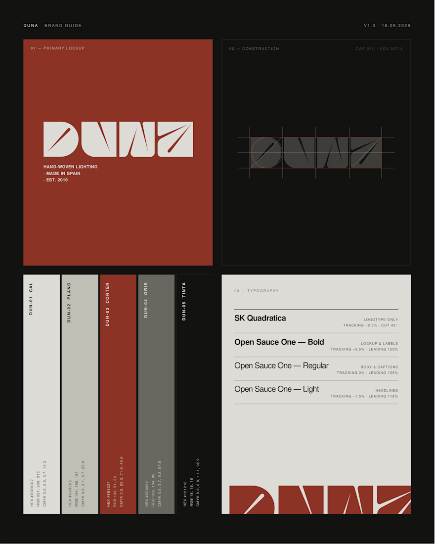
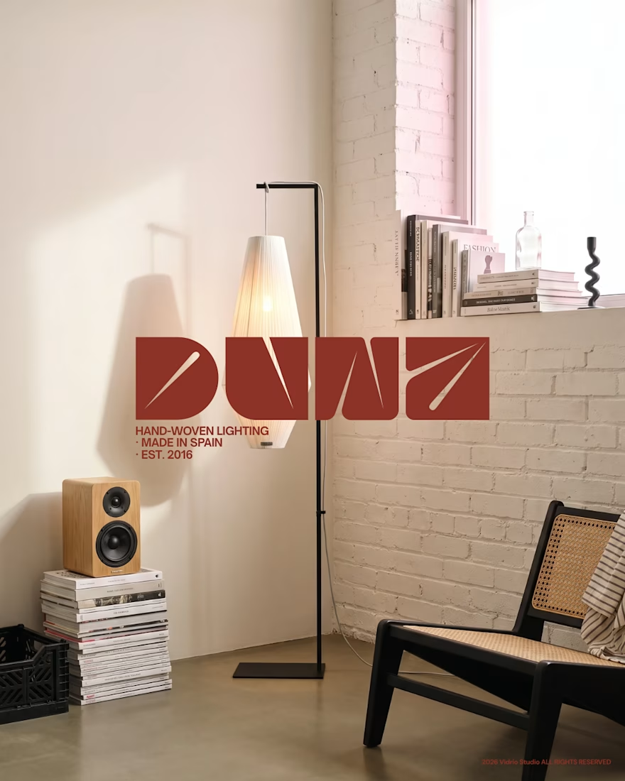
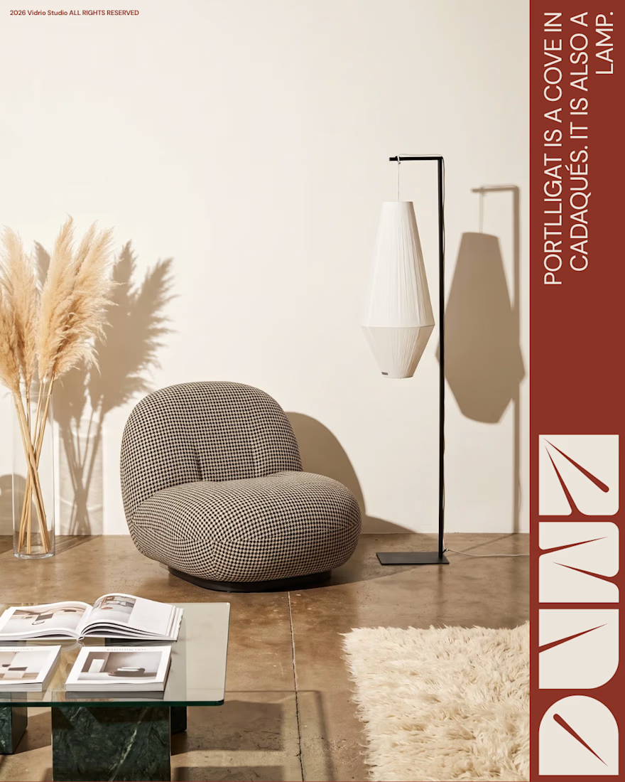
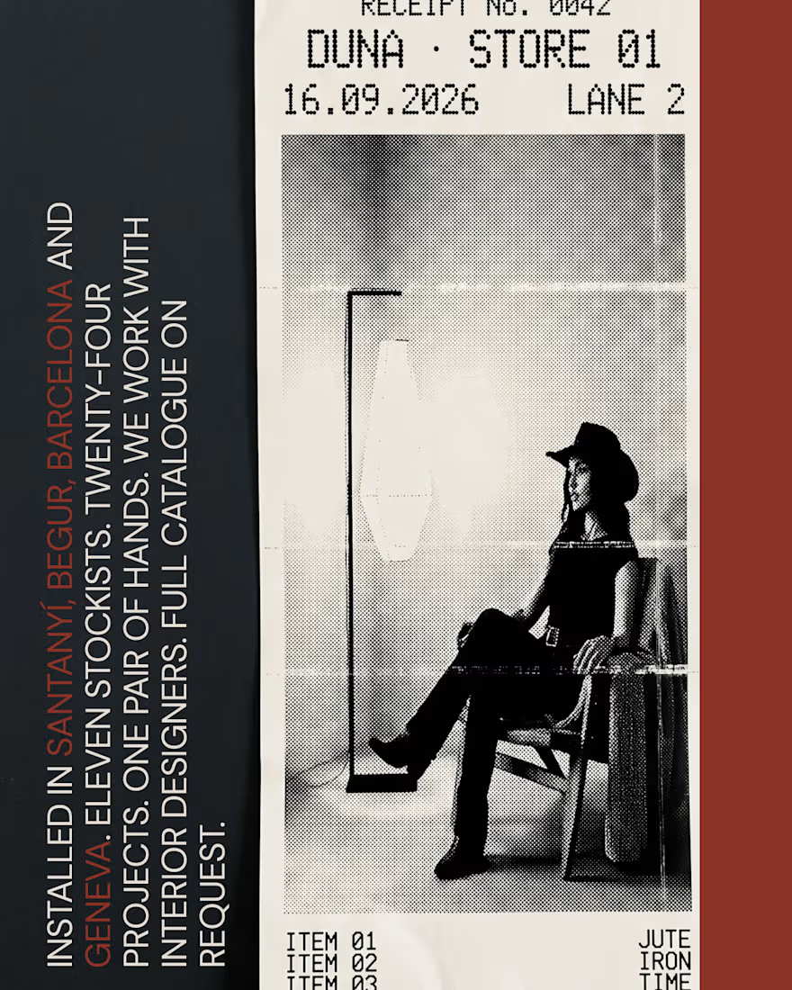
DUNA — Lighting brand identity (self-initiated)
A full rebrand of Lab des Sens Atelier, a Spanish workshop that hand-weaves lighting in natural fibre.
Every piece in their catalogue is named after a Spanish beach — Portlligat, Riazor, Zarautz. The brand itself was named in French. That gap was the whole project: new name, logotype, colour and type system, two collections, bilingual copy and a full set of campaign imagery, all built on one territory — the light of the Spanish coast.
Every image was art-directed before it was made, then generated and finished by hand.
Claude · Higgsfield · Photoshop · art direction throughout.
Unsolicited concept, not affiliated with the brand.
Does the direction land for you? Curious to hear what you'd have pushed further.




En noviembre voy a hacer un evento virtual, introductorio a la plataforma de Contra explicando como se usa y como podemos sacarle provecho
acu.sh
Freelancing en Contra
Introducción a la plataforma de Contra, cómo ser freelancer, mostrar nuestro trabajo y cobrar proyectos internacionales en USD sin comisión.

Creative Direction for Innerceuticals


The pivot from the real product bottle into that geometric particle animation is a smooth way to move from proof to brand world. Was Innerceuticals specifically asking for that split, ground it in the actual product first then get conceptual after, or did that pairing come together in the edit?