The network for creativity
Join 1.25M professional creatives like you
Connect with clients, get discovered, and run your business 100% commission-free
Creatives on Contra have earned over $150M and we are just getting started
Back to feedPost

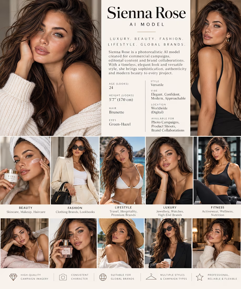
Meet Sienna Rose ✨ Our fictional AI luxury fashion and beauty model, available for bespoke digital photoshoots, skincare advertising, fashion lookbooks, jewellery campaigns and brand collaborations.
Created by Virtual Muse Studio, Sienna showcases the possibilities of photorealistic AI commercial imagery.
Concept portfolio | Available for paid brand bookings.


The network for creativity
Join 1.25M professional creatives like you
Connect with clients, get discovered, and run your business 100% commission-free
Creatives on Contra have earned over $150M and we are just getting started



Related posts

Website & Branding for Blockchain Payments Consortium (Mysten Labs)


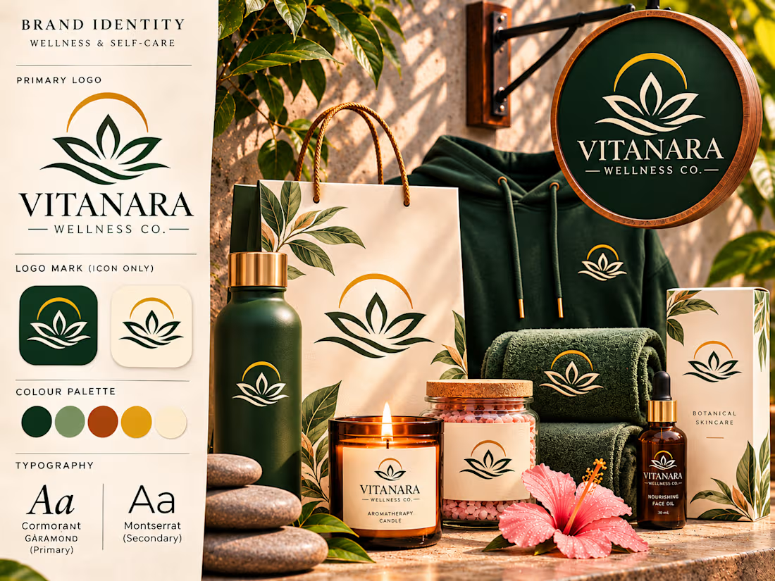
Vitanara Wellness Co. — Luxury Logo & Brand Identity Design
An elegant wellness identity built around a distinctive standalone emblem, refined typography, and a cohesive visual language inspired by balance, renewal, and natural well-being.
Vitanara Wellness Co. is a self-initiated brand identity concept developed to explore how a meaningful symbol can establish brand recognition independently of a company name.
The project brings together symbolic logo design, premium packaging, sophisticated typography, and realistic brand applications to create a cohesive visual experience for a contemporary wellness and self-care brand.
The Creative Vision
The concept began with a simple question: How can a wellness brand communicate its personality through a symbol alone?
Rather than building the identity around a letterform or monogram, the creative direction focuses on developing a recognizable emblem that represents the values associated with wellness.
The result is a visual identity centered on balance, natural beauty, tranquility, and personal renewal.
The brand name Vitanara complements this direction with an elegant, contemporary personality, while the emblem serves as the primary visual signature.
Logo Design & Symbolism
The central logo combines three meaningful visual elements.
The Lotus-Inspired Form
A symmetrical botanical form establishes the identity's most recognizable feature.
Its open petals communicate growth, renewal, and the idea of personal transformation.
The Flowing Lines
Curved lines beneath the lotus introduce a sense of movement and balance.
They reference the calming qualities of water and reinforce the brand's association with relaxation and restoration.
The Golden Arc
A refined arc above the botanical form introduces a sense of completeness and harmony.
Its circular character creates a balanced visual relationship with the petals and flowing lines.
Together, these elements establish an emblem that can function as a standalone brand signature without relying on initials or lettering.
A Symbol-First Identity System
One of the defining features of this project is the intentional distinction between the full brand signature and the standalone emblem.
The complete Vitanara Wellness Co. logo is reserved for applications where brand identification is important, including primary signage, selected packaging, and product labels.
The standalone symbol is used on applications where a more understated presentation feels appropriate.
These include apparel, reusable bottles, towels, shopping bags, and selected product packaging.
This approach creates a flexible identity system in which the emblem remains recognizable without requiring the brand name on every surface.
Typography & Color Direction
The typography combines classical elegance with contemporary simplicity.
Cormorant Garamond introduces a refined editorial personality through its expressive serif letterforms.
Montserrat provides a clean, modern supporting typeface for product information, packaging details, and practical brand communication.
The color palette draws inspiration from natural materials and restorative environments.
Deep forest green establishes a sophisticated foundation, while muted sage introduces softness and balance.
Terracotta brings warmth, golden ochre creates a premium accent, and warm cream provides a calming neutral backdrop.
Together, these colors establish a recognizable visual identity that feels both luxurious and approachable.
Brand Applications & Product Presentation
The identity was explored across a coordinated collection of wellness products and lifestyle applications.
Retail Signage
A circular storefront sign presents the complete brand signature, combining the standalone emblem with the Vitanara wordmark.
Shopping Bags
A premium cream shopping bag features the botanical symbol without the full brand name, creating an understated retail presentation.
Apparel
A forest-green hoodie displays a small standalone emblem on the chest, demonstrating how the identity can translate into lifestyle merchandise.
Reusable Bottles
A matte green bottle showcases the emblem independently, reinforcing the symbol-first design approach.
Wellness Towels
Embroidered-style logo applications demonstrate how the emblem works on textured fabric and hospitality accessories.
Self-Care Products
Coordinated candles, bath salts, skincare packaging, and facial oils demonstrate the identity's versatility across a premium wellness collection.
Selected products use the complete brand signature, while others rely on the standalone emblem.
Art Direction & Visual Experience
The final brand presentation combines realistic product mockups with a structured visual identity showcase.
Warm natural lighting, botanical details, textured stone surfaces, and carefully arranged products create a cohesive atmosphere.
The composition balances the formal elements of brand identity design with the emotional appeal of a luxury wellness experience.
The logo remains central throughout the presentation, while the surrounding applications demonstrate how the identity functions across different materials, formats, and environments.
Project Outcome
Vitanara Wellness Co. demonstrates how a distinctive symbol can become the foundation of an entire visual identity.
The project showcases an approach to branding that emphasizes meaningful symbolism, adaptable logo systems, cohesive packaging, and sophisticated art direction.
Its strongest feature is the relationship between the full brand signature and the standalone emblem.
By allowing the symbol to represent the brand independently, the identity establishes a flexible visual language that can extend across products, packaging, merchandise, and physical environments.
The result is a refined wellness brand concept built around one recognizable visual signature — designed to communicate balance, renewal, and understated luxury.
Self-initiated portfolio concept created to demonstrate symbolic logo design, brand identity development, and premium product presentation.



So pretty
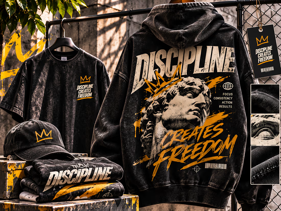
Discipline Creates Freedom — Streetwear Apparel Mockup Design
An expressive streetwear apparel concept combining oversized typography, classical sculpture imagery, distressed graphics, and cinematic product presentation.
Discipline Creates Freedom is a self-initiated fashion design and product mockup concept exploring how a powerful statement can be transformed into a distinctive visual identity across contemporary streetwear apparel.
The project brings together statement-driven graphic design, garment presentation, coordinated merchandise, and industrial-inspired art direction to create a visually compelling streetwear collection.
The Creative Concept
The central idea explores the relationship between discipline and personal freedom.
The phrase DISCIPLINE CREATES FREEDOM serves as both the collection's message and its defining graphic element.
Rather than presenting the statement as simple printed text, the design transforms it into an expressive visual composition through oversized lettering, classical sculpture imagery, energetic brushwork, and carefully layered details.
The concept is intended to appeal to audiences drawn to contemporary streetwear, personal ambition, and statement-driven fashion.
Typography & Graphic Expression
Typography is the dominant creative element of the apparel design.
The word DISCIPLINE appears in oversized, distressed, condensed lettering across the upper back of the hoodie, establishing an immediate focal point.
The phrase CREATES FREEDOM introduces movement through expressive, hand-painted lettering.
The contrast between structured block typography and energetic brush-style text reinforces the relationship between discipline and freedom.
Additional microtypography, including FOCUS, CONSISTENCY, ACTION, and RESULTS, contributes to the collection's visual storytelling.
These details create a layered graphic composition while supporting the central message.
Classical Imagery Meets Contemporary Streetwear
A grayscale classical sculpture portrait anchors the main hoodie graphic.
The sculpture introduces a sense of permanence, strength, and artistic heritage, contrasting with the raw energy of contemporary streetwear design.
A hand-drawn golden crown adds personality and creates a striking visual interruption across the portrait.
Distressed textures, paint splashes, barcode-inspired details, and small graphic symbols contribute to the rebellious, urban character of the collection.
The result combines classical visual references with modern graphic experimentation.
Apparel Mockup Development
The collection was presented across several coordinated apparel applications.
Oversized Hoodie
The primary product features a washed-black oversized hoodie with a large back graphic.
The composition combines expressive typography, classical imagery, and layered graphic elements to create a statement piece.
Graphic T-Shirt
A matching dark T-shirt introduces a more restrained application of the collection's identity.
The chest graphic uses the crown symbol and stacked statement typography, creating a complementary design that works independently of the hoodie.
Branded Cap
A washed-black cap features the hand-drawn crown emblem, demonstrating how a simple graphic detail can become a recognizable merchandise element.
Folded Apparel
Additional folded garments reinforce the collection's visual consistency and demonstrate how the typography translates across multiple pieces.
Product Hangtag
A coordinated black hangtag combines the crown emblem, collection statement, and barcode-inspired detailing to complete the retail presentation.
Materiality & Product Realism
An important part of the mockup was communicating the physical character of the garments.
The hoodie features a heavyweight, washed-black appearance, with visible fabric texture, seams, folds, and natural draping.
Distressed print effects reinforce the intended vintage-inspired streetwear aesthetic.
Supporting detail views highlight fabric texture, print character, and garment construction.
These elements help the artwork communicate not only the graphic design but also the imagined physical qualities of the collection.
Art Direction & Visual Presentation
The final presentation was developed around a gritty industrial atmosphere.
Concrete textures, chain-link fencing, metal fixtures, and weathered surfaces create a setting that complements the collection's rebellious visual language.
The palette remains intentionally restrained, combining washed charcoal, distressed cream, and vivid golden-yellow accents.
Warm directional lighting introduces contrast and depth, allowing the apparel to remain the central focus.
The composition brings together hanging garments, folded merchandise, accessories, and close-up material details in a cohesive product-focused scene.
Project Outcome
The completed concept demonstrates how expressive graphic design can be translated into a coordinated streetwear collection.
It showcases an approach to product mockups that combines strong typography, recognizable visual motifs, realistic garment presentation, and compelling art direction.
Rather than displaying a single isolated garment, the project presents a complete visual world around the collection.
The result is a statement-driven streetwear concept designed to communicate confidence, individuality, and the visual impact of expressive apparel graphics.
Self-initiated portfolio concept created to demonstrate streetwear apparel design, product mockup presentation, and editorial art direction.
Very nice