The network for creativity
Join 1.25M professional creatives like you
Connect with clients, get discovered, and run your business 100% commission-free
Creatives on Contra have earned over $150M and we are just getting started
Back to feedPost


The network for creativity
Join 1.25M professional creatives like you
Connect with clients, get discovered, and run your business 100% commission-free
Creatives on Contra have earned over $150M and we are just getting started




Related posts

Two directions. One product. Which one would you choose? 👀
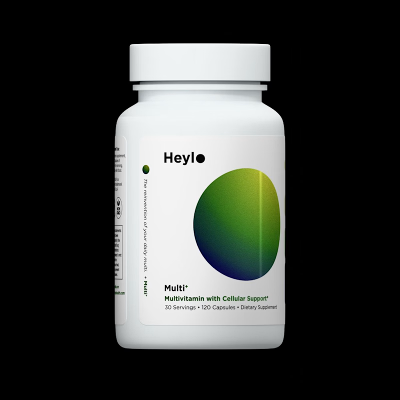
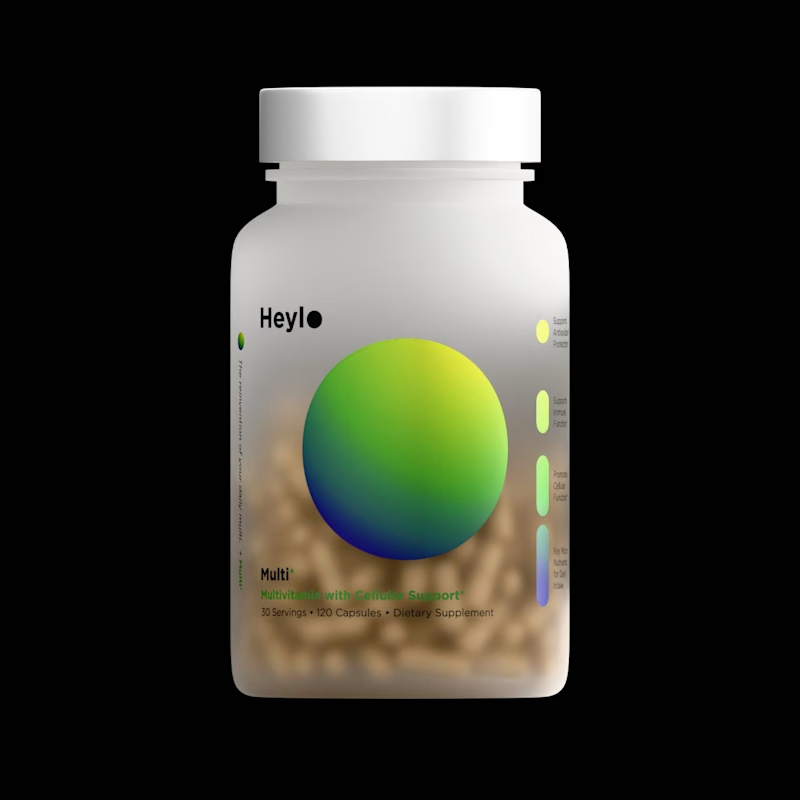
I created these 3D model for a Heylo supplement product, while exploring two different ways to present the same product.
For Image A,
Minimal background, controlled lighting, strong focus on the packaging.
For Image B, I
Added depth, atmosphere and visual context to make the product feel more like a campaign shot.
The buyer ended up going with A.
But I'm curious...
Which direction would you choose for a supplement brand?
A or B? 👇
7 voted
64%
4 voted
36%
11 votes
Closed


A circle disrupted. Surface becomes fabric, tension becomes motion. In the end, form remembers itself.
Created in 3dsMax, Vray render.


looks magical!

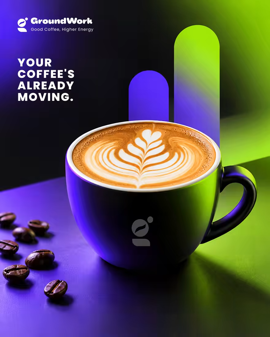
☕ GroundWork — Good Coffee, Higher Energy.
🎨 Brand Identity · 📱 UI/UX · 📦 Packaging
A modern coffee brand built around energy, creativity, and momentum. ⚡
💡 The Idea
I wanted to create a coffee brand that feels as energetic as the first cup of the day.
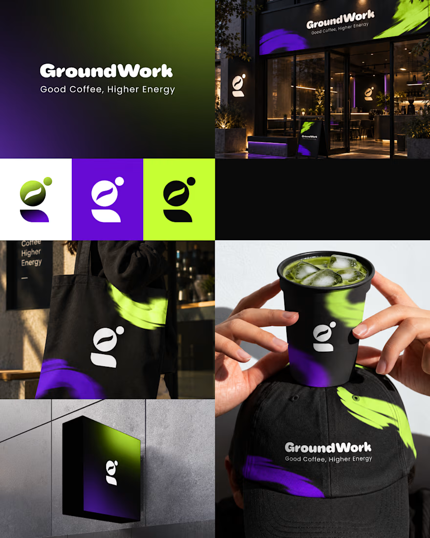
🎨 Visual Direction
🖤 Charcoal — premium foundation
💜 Electric Violet — creativity
💚 Neon Lime — energy & freshness
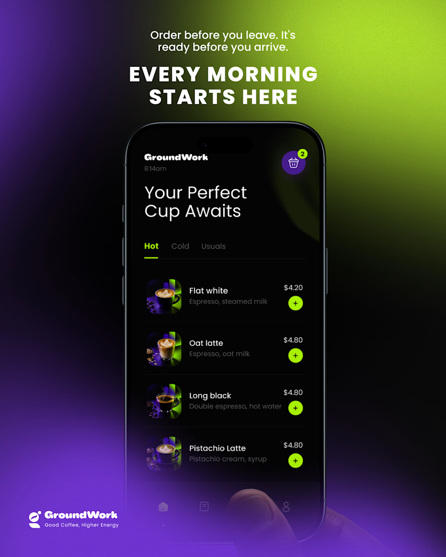
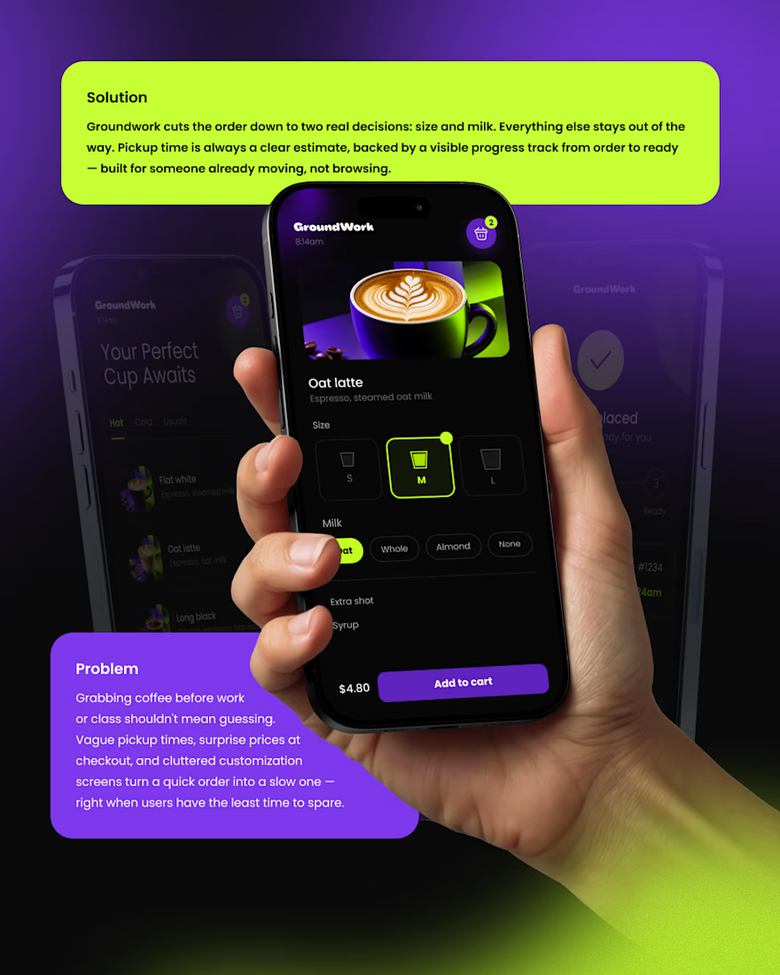
📱 Digital Experience
A clean mobile ordering experience designed to make getting coffee simple, fast, and engaging.
☕ Brand Experience
I extended the identity across cups, caps, totes, packaging, and storefronts — creating one consistent visual system.
✨ The Result
A bold coffee identity that connects digital + physical experiences under one idea:
Good Coffee, Higher Energy. ⚡
What’s your first impression of GroundWork? 👀☕



I personally don't like the colors intensity or shade