The network for creativity
Join 1.25M professional creatives like you
Connect with clients, get discovered, and run your business 100% commission-free
Creatives on Contra have earned over $150M and we are just getting started
Back to feedPost

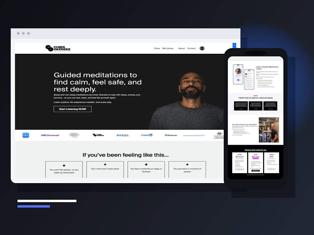
A polished Kajabi membership is not just a landing page.
For Chibs Okereke's meditation library, I designed one connected journey across five moments:
Reflect the visitor's sleep or stress problem
Introduce the meditation library
Compare monthly, annual, and lifetime offers
Move cleanly through checkout and access
Make repeat listening easy on desktop and mobile
The key UX decision was keeping the front end calm while making the purchase mechanics unmistakable. The most expensive membership leaks often happen after the sales page—between offer selection, payment, login, and first use.
If you run a coaching, course, or membership business in Kajabi, audit those handoffs before redesigning another section.

The network for creativity
Join 1.25M professional creatives like you
Connect with clients, get discovered, and run your business 100% commission-free
Creatives on Contra have earned over $150M and we are just getting started

Related posts


Just in time for Halloween! 🎃🔮 Excited to share this mystical tarot reading app concept, inspired by a little spooky season magic. Would love to hear your thoughts! ✨


Excellent work!


Really nice one, Max!


What happens when one website has to talk to two different people?
A client of ours teaches two audiences at once: expecting mothers who want a calm pregnancy, and women who want to become doulas. One brand, one site, two very different reasons to visit.
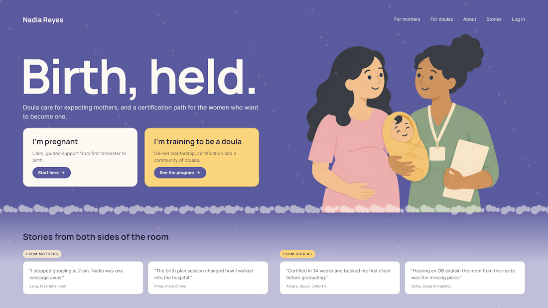
The usual fix is a hero that speaks to "everyone" and lands with no one. We designed it as a fork in the road instead:
1. Two doors in the hero. "I'm pregnant" and "I'm training to be a doula", side by side, equal weight. The visitor picks a path in one click, and the headline above them stays about the shared value.
2. One voice, two tones. The mothers' path is softer: fewer words, more room, gentle photos. The doula path is more structured: modules, certification, dates. Same fonts, same colors, different rhythm.
One proof section, split in two. Testimonials from mothers on the left, from doulas on the right. Each visitor sees people like them before the price.
Writing for everyone is writing for no one. Give each reader a door.
Have you ever designed a page for two audiences at once? How did you split it?

Love that purple hero with the two cards right up top.