The network for creativity
Join 1.25M professional creatives like you
Connect with clients, get discovered, and run your business 100% commission-free
Creatives on Contra have earned over $150M and we are just getting started
Back to feedPost

Vectora: a concept website for a creative agency
I designed and built Vectora as a concept site for a creative studio, to show the kind of bold, animation-heavy agency websites I can deliver for clients. The studio, brands and results on the site are fictional.
The goal was a site that grabs attention in the first few seconds and still feels fast and easy to use.
What I built:
A multi-page Next.js site with Home, Services, Portfolio, About, Blog and Contact pages
A big hero section with layered typography and scroll-triggered reveals
Lenis smooth scrolling and scroll-driven animations that guide the visitor down the page
An auto-scrolling showcase of portfolio projects (Lumea, Skyfold, Wayfarer, Northbridge and more), each linking to its own case study page
Service cards, a blog section and a clear “Book a Consultation” call to action
A fully responsive layout, deployed on Vercel
This project was a good chance to push motion design while keeping performance and readability in check. Animation should guide the visitor, not distract them.
Live: vectora-studio.vercel.app
Need a site like this for your agency or brand? Message me.


The network for creativity
Join 1.25M professional creatives like you
Connect with clients, get discovered, and run your business 100% commission-free
Creatives on Contra have earned over $150M and we are just getting started











Related posts

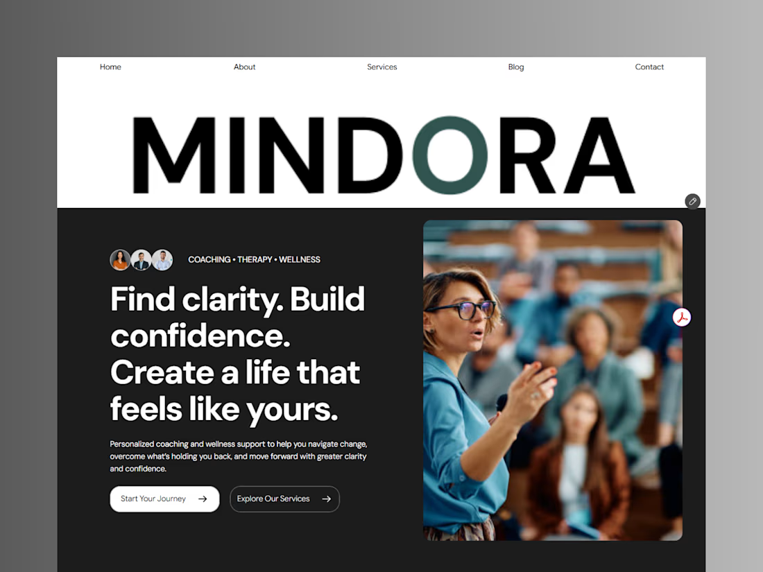
Introducing Mindora — a Life Coaching & Wellness Framer Template.
I designed Mindora for life coaches, wellness professionals, and personal growth brands looking for a calm, modern, and welcoming online presence.
Inspired by clarity, confidence, and meaningful growth, Mindora features a thoughtful layout, dedicated service sections, a blog for sharing valuable insights, and a clean visual style designed to help brands connect with their audience.
Built with Framer, it's a customizable starting point for creating a professional coaching or wellness website.
Explore Mindora and bring your next website idea to life.
Kindly check it out the template: https://www.framer.com/marketplace/templates/mindora-life-coach/



Great work

A flower that inflates arrives in the mail.
Next month, a phone made of shell.
STILL LIFE SERVICE. Case study dropping soon.
Which object earns your shelf? Reply below.
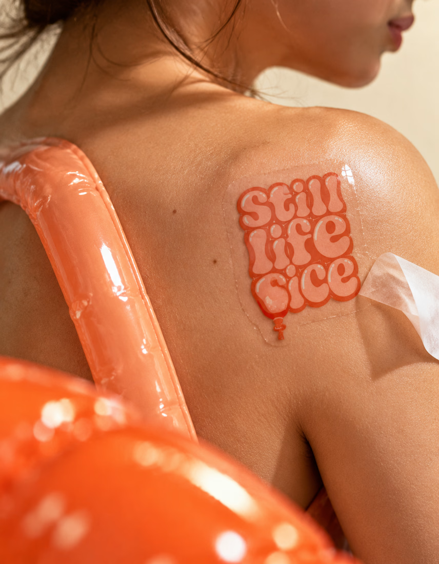

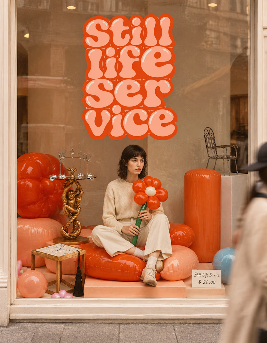

The inflatable flower. Only houseplant I'm guaranteed not to kill. Also, a new object every month is a sneaky good retention hook, people will stay subscribed just to see what's next.

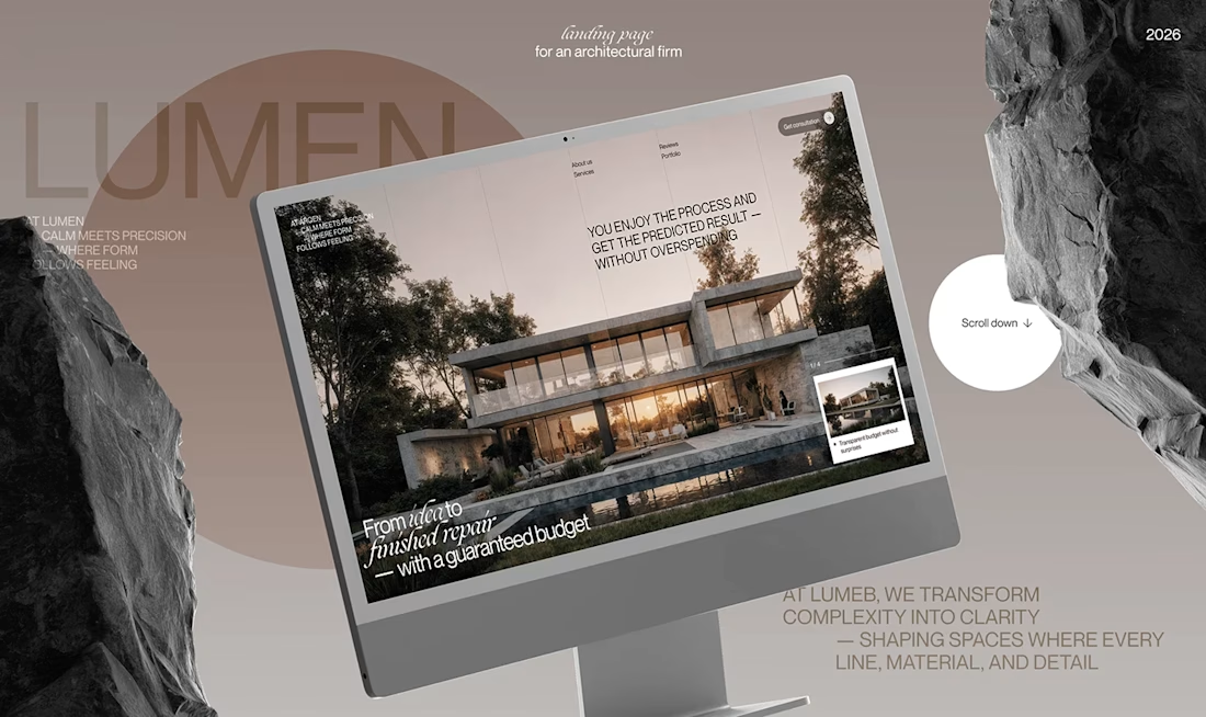
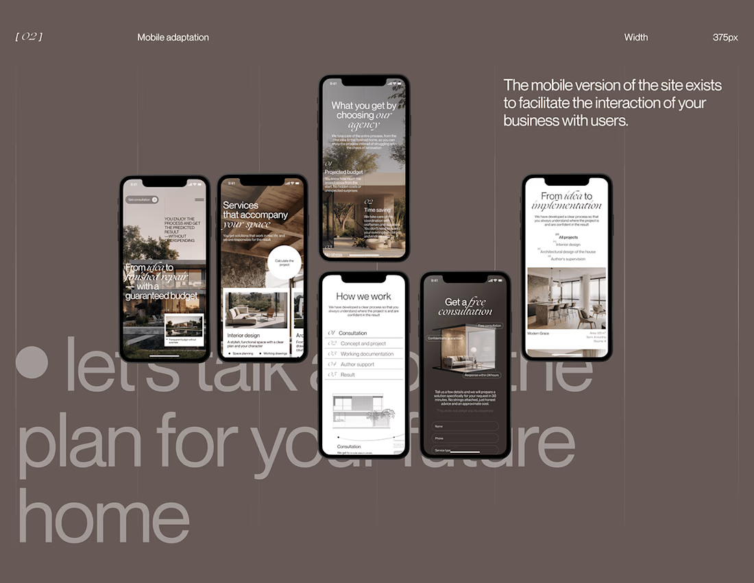
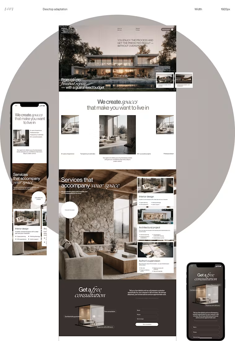
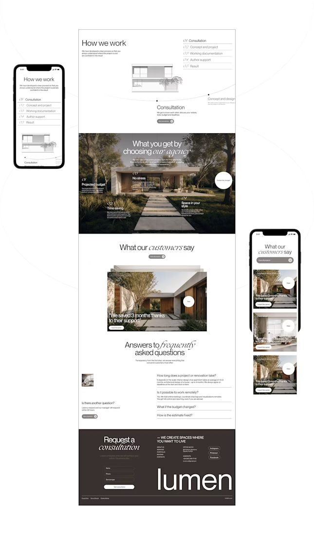
Lumen — UX/UI Design for a Premium Architecture Studio
Sometimes, the smallest details are what give a design its personality.
For Lumen, I found myself exploring how typography, architectural photography, colour, and layout could work together to tell a story before someone even starts reading.
I played with oversized text, warm brown tones, editorial layouts, and a mobile experience that carries the same visual character as the desktop design.
I especially enjoyed putting the mobile screens together. Seeing the different sections come to life on a smaller screen made the whole concept feel more complete.
It's always interesting to see how different creative decisions can change the way people experience a brand.
What's one design detail that can make you appreciate a website even before you've explored everything?
#WebDesign #CreativeDesign #UIUXDesign #Architecture


i love this soooo wellllll, i just said welll with 4 l's thats how good this is