The network for creativity
Join 1.25M professional creatives like you
Connect with clients, get discovered, and run your business 100% commission-free
Creatives on Contra have earned over $150M and we are just getting started
Back to feedPost
☀️ Good afternoon!
A question for anyone who runs a small business: what do customers ask you most often?
🕒 Opening hours?
💶 Prices?
📋 The menu?
📍 Where you are?
Whatever it is, that’s the first thing your website should answer, in the first few seconds on a phone. I’m curious what your answer is 👇

Great framing, Alexander. Most small business sites bury the one thing visitors actually want. Answering the most-asked question in the first few seconds is such a simple rule and most sites still miss it.

Thanks! For a cafe it's usually the menu and the opening hours, and for a repair shop it's "is my device ready yet?" Do you see the same pattern in your work?
The network for creativity
Join 1.25M professional creatives like you
Connect with clients, get discovered, and run your business 100% commission-free
Creatives on Contra have earned over $150M and we are just getting started








Related posts


this is clean. malo ai branding feels super minimal but pro. how was working with opus 5.5 for this?

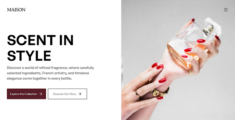
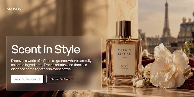
✨ Two Hero Concepts. One Luxury Fragrance Brand. Which one wins?
I explored two different hero section designs for Maison, a fictional luxury fragrance brand inspired by Parisian elegance, timeless scents, and premium visual storytelling. 🥂🌹
I’d love to hear what makes your choice stand out!


4 voted
50%
4 voted
50%
8 votes
Closed

Option A is unique I don't know why but it get my attention great job Orlerx🎉🎉❤️❤️


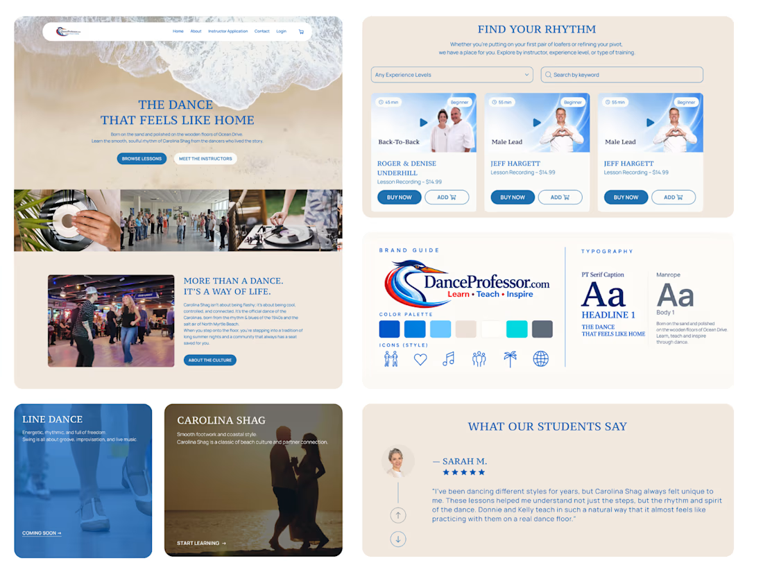
Another Kajabi project wrapped up! 🎉
We've noticed a common challenge across many of our recent projects: clients have a growing number of courses, but making them easy to browse isn't always straightforward.
Kajabi doesn't offer advanced course filtering out of the box, so for DanceProfessor, we built a custom solution.
It took quite a bit of time on both the design and development sides, but the result was worth it. The client is happy, and visitors can now easily find exactly what they're looking for.
Sometimes the most challenging features are the ones that make the experience feel the simplest.