The network for creativity
Join 1.25M professional creatives like you
Connect with clients, get discovered, and run your business 100% commission-free
Creatives on Contra have earned over $150M and we are just getting started
Back to feedPost

Nike | Kids Basketball Color Design Concept
A concept-driven kids basketball color study inspired by community courts.
PROJECT OVERVIEW
Developed a concept color design project for a kids basketball sneaker, using restored and artistically painted community basketball courts as the core source of inspiration. The project explored how color can tell a story, create emotional connection, and bring energy, playfulness, and personality to a product designed for young athletes.
THE CHALLENGE
Create a compelling color direction for a kids basketball shoe that felt fresh, spirited, and emotionally engaging.
The challenge was not just to make the shoe colorful, but to develop a concept with depth — something rooted in a clear point of view, supported by research, and translated into colorways that felt intentional, wearable, and distinctive.
MY APPROACH
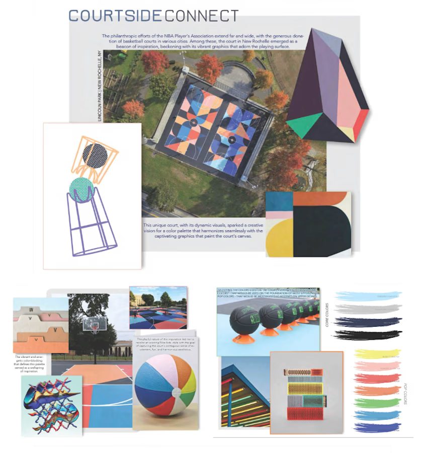
I started by researching renovated and donor-supported basketball courts across the U.S., especially courts that had been transformed through bold graphics, vibrant palettes, and strong community presence.
What stood out to me was the way these spaces represented more than sport. They reflected joy, access, creativity, neighborhood pride, and the power of design to energize everyday environments.
Using that as the foundation, I built a concept around playful, expressive color storytelling for kids. I pulled visual references that reinforced that feeling — spirited graphics, youthful energy, movement, and bold color interactions — and used those references to shape the overall mood and direction of the project.
THE EXECUTION
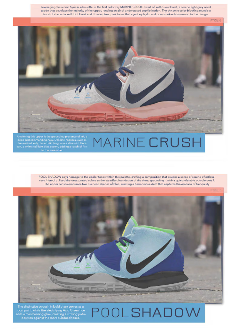
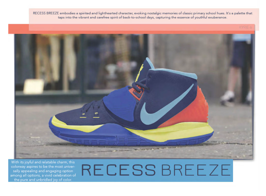
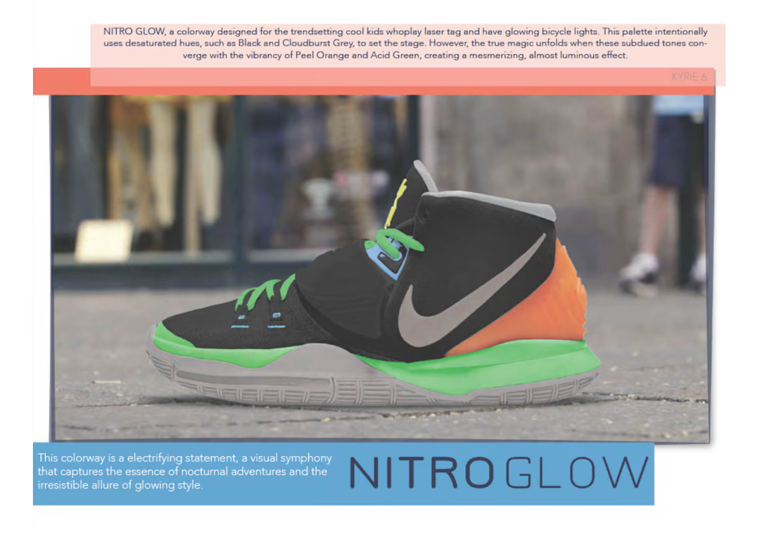
From that research, I developed multiple colorways for the sneaker, each with its own name, narrative, and emotional point of view.
I created moodboards, identified supporting inspiration imagery, selected and refined the palettes, named the individual colors, and applied the concepts across the shoe silhouette in a way that felt balanced and intentional.
Each option was designed to communicate a specific mood while still functioning as a cohesive product concept. I also wrote descriptive copy for each colorway to help articulate the story, energy, and personality behind the design.
This process required more than selecting appealing colors. It involved concept development, visual research, color sensitivity, storytelling, and the ability to translate inspiration into a product that feels both imaginative and commercially relevant.
THE OUTCOME
A concept-driven kids basketball color design project that combined cultural research, community-inspired storytelling, and visual product development.
This work reflects my ability to build a design concept from the ground up — from identifying a meaningful source of inspiration, to shaping the emotional direction, to executing colorways that feel thoughtful, expressive, and marketable.
It also demonstrates how I approach color design as more than decoration. For me, color is a tool for storytelling, connection, and creating products that resonate on both an emotional and visual level.
The network for creativity
Join 1.25M professional creatives like you
Connect with clients, get discovered, and run your business 100% commission-free
Creatives on Contra have earned over $150M and we are just getting started

Related posts

Photorealistic 4K Sneaker Loop - Built for E-commerce Conversion
Goal: Create ad-ready product video that shows material detail.
How I did it:
PBR materials + HDRI lighting in Blender
8s seamless loop, 4K render
Post in After Effects
Result: 95% material accuracy, client ready for ads. Open for freelance product videos - DM me!
#3DRender #ProductVisualization #AIvideo


wow ,

A collection of brand identity concepts exploring different visual directions across technology, wellness, healthcare, logistics, food and fashion. Each concept was developed around a distinct audience, tone and use case, with attention to logo versatility, typography, color systems and real-world brand applications.




Six sectors in one set is a good stress test for a logo system. Did you work from a shared construction logic across them, or let each concept find its own starting point?

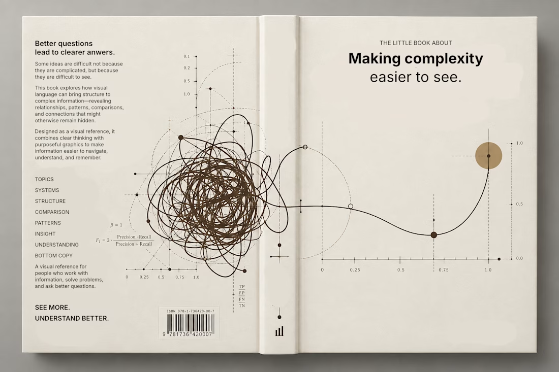
Currently exploring a book design focused on making complex information easier to understand through visual language. Playing with typography, data visualization, and graphic systems to give the subject a more editorial feel.

This is a trully elegant and impressive design concept.
I love it.





