The network for creativity
Join 1.25M professional creatives like you
Connect with clients, get discovered, and run your business 100% commission-free
Creatives on Contra have earned over $150M and we are just getting started
Back to feedPost

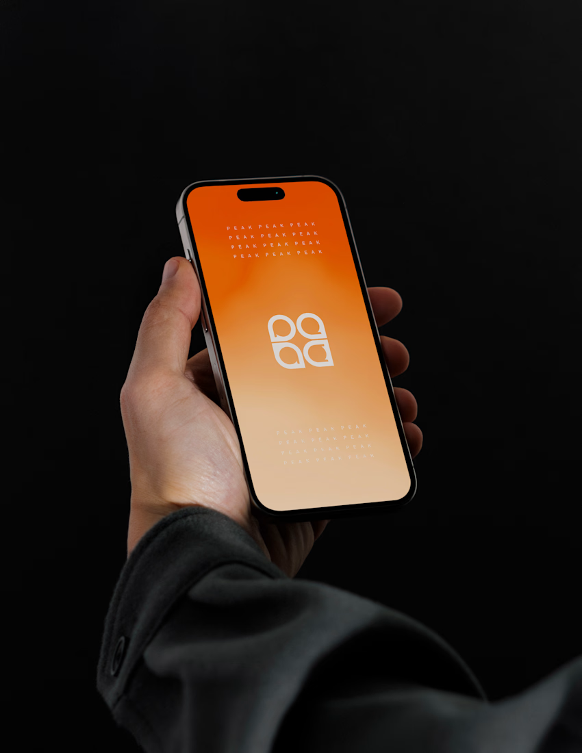
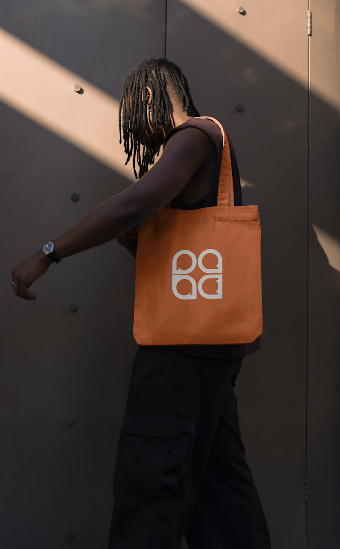
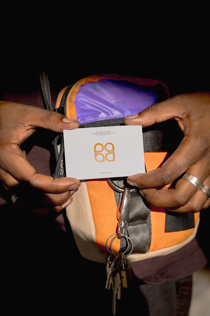
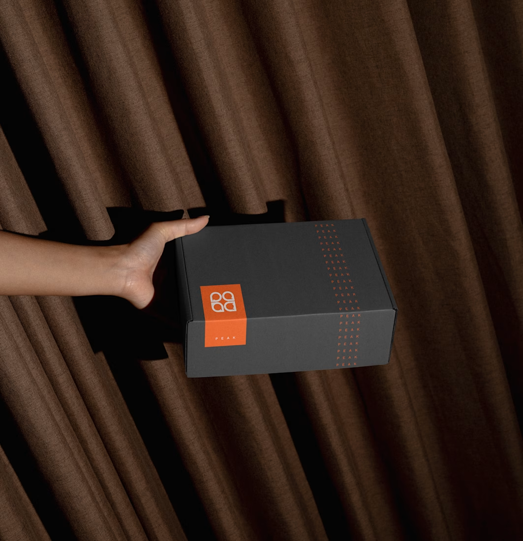
New branding completed — here's a teaser!

Already a 100/10 🔥, looks marvelous

Clean reveal 👌
Really like the visual direction.
The network for creativity
Join 1.25M professional creatives like you
Connect with clients, get discovered, and run your business 100% commission-free
Creatives on Contra have earned over $150M and we are just getting started








Related posts



Beautyy

Logos & Marks — Volume 12
A curated selection of recent logo and identity work.
This collection brings together commissioned projects, unused concepts, and exploratory directions across technology, AI, finance, sports, retail, and other industries.
The work explores geometric symbols, custom typography, monograms, and abstract forms, with a focus on clarity, distinction, and strong visual character.
Selected marks are available for acquisition.
For licensing, customization, or brand identity inquiries, feel free to get in touch.

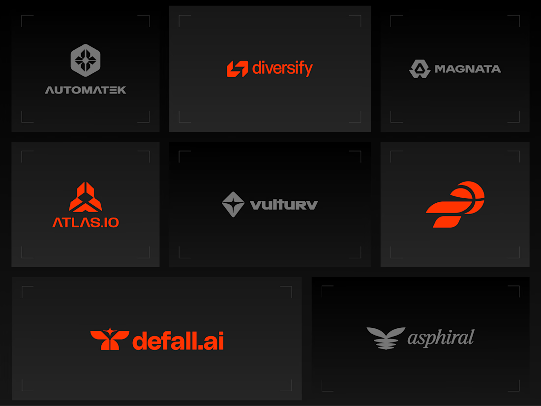
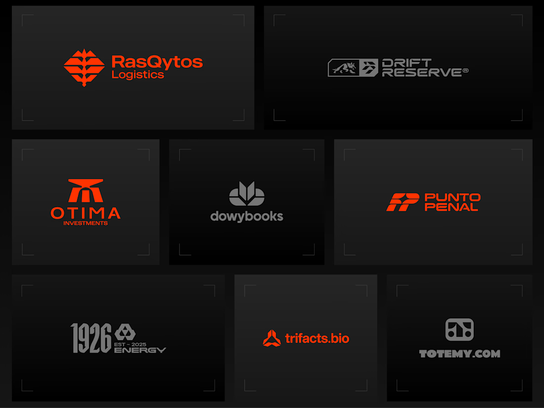
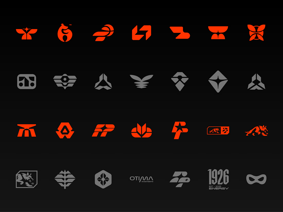
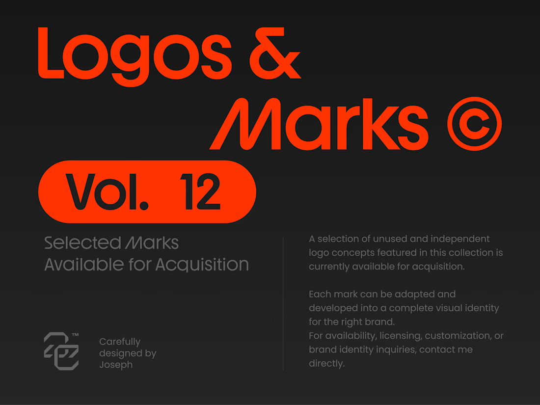


Holding the whole volume to one hot orange on charcoal makes the marks easy to compare, and the Otima symbol stacking a gate shape over the wordmark is my favorite of the set.
Fresh case study 🚀🚀🚀
Brand identity for Peak, an all-in-one website builder for WordPress that I design and build. A four-letter mark, a warm paper-and-ember palette and one system that runs from the favicon to the packaging.

A four-letter mark that has to hold from favicon to packaging is a tough constraint. Did you draw one letterform first and build the other three from it, or design them together as a set from the start?


