The network for creativity
Join 1.25M professional creatives like you
Connect with clients, get discovered, and run your business 100% commission-free
Creatives on Contra have earned over $150M and we are just getting started
Back to feedPost

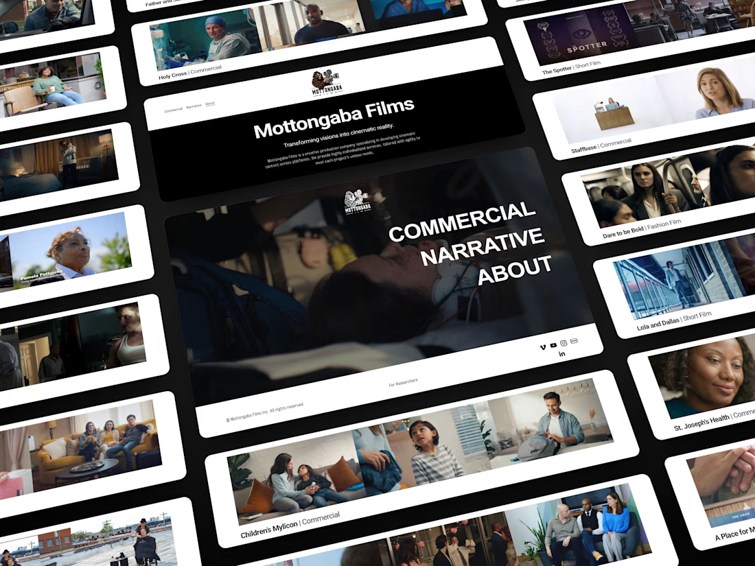
A film production company that pitches with its reel, not with words. Most production sites bury the work under a hero, a services grid, and an about block.


Pitches with its reel, not with words is exactly how a production company should talk about itself. Leading with the work instead of the usual hero plus services grid plus about block is so much more honest, the footage is the pitch. Was it a hard sell getting the client to...
The network for creativity
Join 1.25M professional creatives like you
Connect with clients, get discovered, and run your business 100% commission-free
Creatives on Contra have earned over $150M and we are just getting started


Related posts


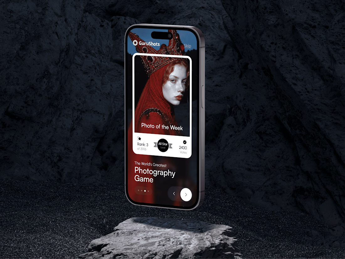
A new day, a new design to share! 📸
This time it is a photography challenge app that brings creativity and competition together through contests, voting, and gamification. What do you think of this one? ✨



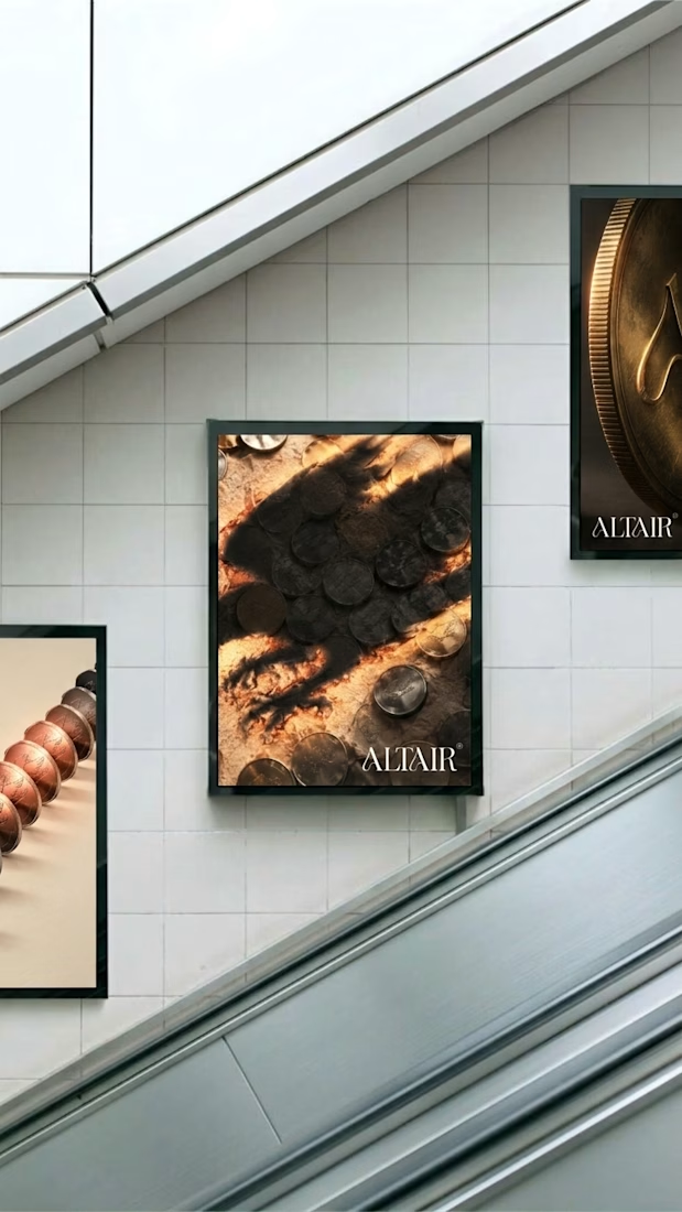
What does a fintech look like when it says no to neon, no to blue, and hands the whole brand to a hand-inked raptor?
Altair. Parchment, struck metal, one swash that repeats like security print.

A little more about the inspiration behind Tindara.
I wanted the identity to have a connection to Tindari, Sicily. The Madonna di Tindari statue was the starting point for the symbol, while Sicilian decorative patterns inspired the graphics around it.
For the colors, I chose mustard yellow, deep green, and burgundy, balanced with cream. I wanted to bring some of that warmth and richness into the packaging, while keeping the different elements comfortable together.
For me, these references are what give the project its character and sense of place.

