The network for creativity
Join 1.25M professional creatives like you
Connect with clients, get discovered, and run your business 100% commission-free
Creatives on Contra have earned over $150M and we are just getting started
Back to feedPost

In the healthcare space, clarity is everything. I designed the Providence Hospital logo to be highly legible and recognizable. The iconography symbolizes medical professionals reaching out to those in need, conveying a sense of security and trust. This imagery ensures patients feel they are in expert hands within a modern facility that keeps pace with a rapidly evolving industry.


The network for creativity
Join 1.25M professional creatives like you
Connect with clients, get discovered, and run your business 100% commission-free
Creatives on Contra have earned over $150M and we are just getting started
Related posts

A little behind-the-scenes look at a brand identity coming together.
I'm currently working on a new identity for a coworking space in Austin, TX, with a vintage-inspired direction, warm colors, and a logo that brings a bit of nostalgia into a modern setting.

Carrying the vintage idea onto the coasters and the dot pattern gives the identity somewhere to live besides the logo.

A little more about the inspiration behind Tindara.
I wanted the identity to have a connection to Tindari, Sicily. The Madonna di Tindari statue was the starting point for the symbol, while Sicilian decorative patterns inspired the graphics around it.
For the colors, I chose mustard yellow, deep green, and burgundy, balanced with cream. I wanted to bring some of that warmth and richness into the packaging, while keeping the different elements comfortable together.
For me, these references are what give the project its character and sense of place.



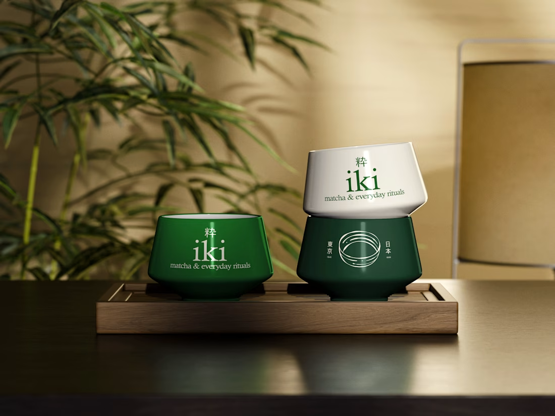
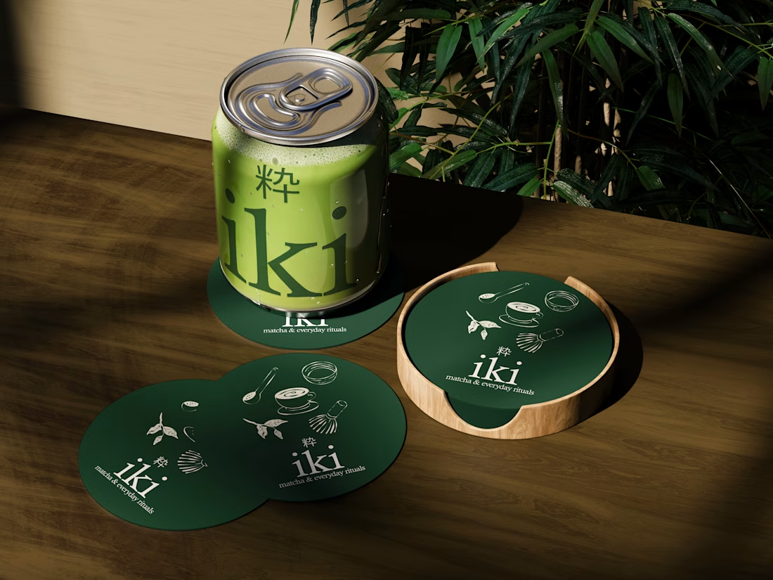
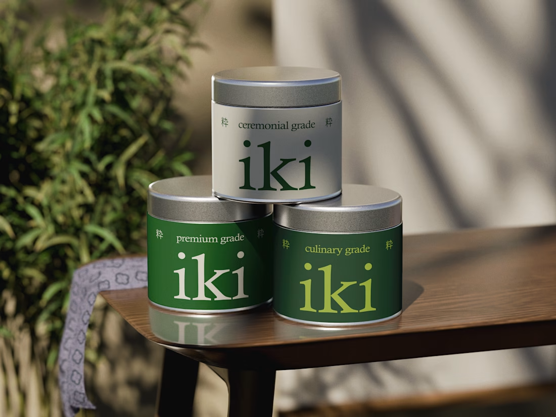
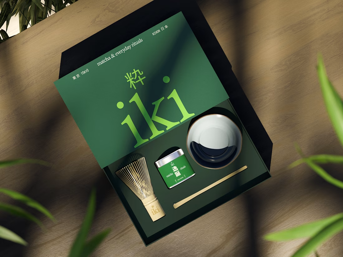
more glimpses of iki 🍵
the project is almost finished, and i should be wrapping everything up next week.
it’s been a fun one to work on, especially seeing how the initial concept has evolved into a complete visual identity.
excited to share the final result soon :)