The network for creativity
Join 1.25M professional creatives like you
Connect with clients, get discovered, and run your business 100% commission-free
Creatives on Contra have earned over $150M and we are just getting started
Back to feedPost
Taste Test

A classic designer vs. motion designer debate:
Which background makes the animation work better? 👀
We’re working on a client project and they specifically asked for the colours to feel bright and vibrant. Now we’re stuck between these two directions.
Help us settle it. Which one works better: A or B?

2 voted
100%

0 voted
0%

2 votes
Closed

Thank you for your input 🙌
The network for creativity
Join 1.25M professional creatives like you
Connect with clients, get discovered, and run your business 100% commission-free
Creatives on Contra have earned over $150M and we are just getting started





Related posts


Collage

Minimal vs Detailed - Which coin design feels more premium for a fintech brand?
9 voted
27%
24 voted
73%
33 votes
Closed

I like the premium gold version

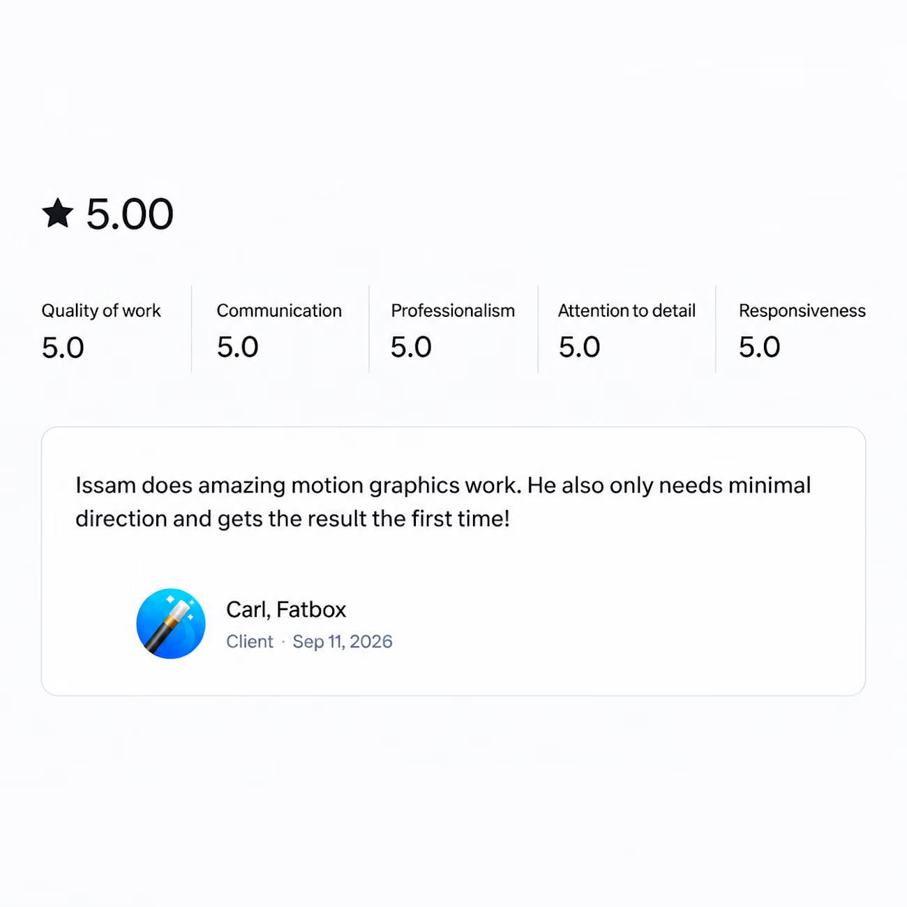
Got a review last week that made my day.
Wrapped a motion graphics project recently and the client said it only needed minimal direction and came out right the first time.
That's the part I'm grateful for. Not the compliment on the work itself, but the fact that the process actually worked the way it's supposed to. One clear brief, one round, done.
And that never happens because of me alone. It happens when the client writes a brief that makes sense, trusts you enough to let you run with it, and gives feedback that actually helps instead of feedback that just moves things around.
So thank you for that. Projects like this are the reason I still enjoy this work.

I am happy about you my brother keep it up!