The network for creativity
Join 1.25M professional creatives like you
Connect with clients, get discovered, and run your business 100% commission-free
Creatives on Contra have earned over $150M and we are just getting started
Back to feedPost
Taste Test

Building a screenshot editor web app
Thinking of naming it BetterWay. Which logo looks better? Or should I go with a more tool-related logo instead?
Would love your feedback!
#buildinpublic #branding #design #startup
1 voted
100%

0 voted
0%

1 vote
Closed
The network for creativity
Join 1.25M professional creatives like you
Connect with clients, get discovered, and run your business 100% commission-free
Creatives on Contra have earned over $150M and we are just getting started



Related posts


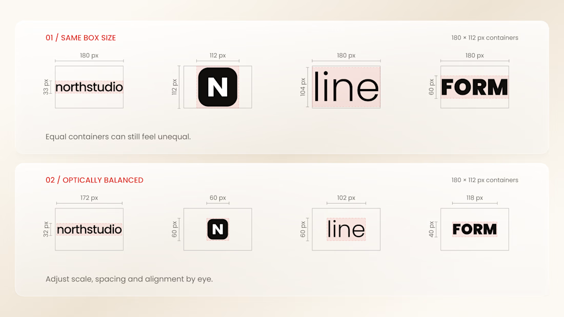
Why do logos look uneven even when they have the same size?
Every logo has a different shape, proportion, and visual weight. A wide wordmark can appear smaller than a compact symbol, while a bold logo may dominate a thinner one - even when their dimensions are technically identical.
That’s why logo sections shouldn’t be aligned by numbers alone.
Adjusting each logo optically, using a consistent visual area, balanced spacing, and a shared baseline helps every brand feel equally represented.
The goal isn’t to make every logo exactly the same size.
It’s to make them feel equally important.
Because visual consistency is based on perception, not just pixels.


Thanks for the information you shared



Great work 👏🏻

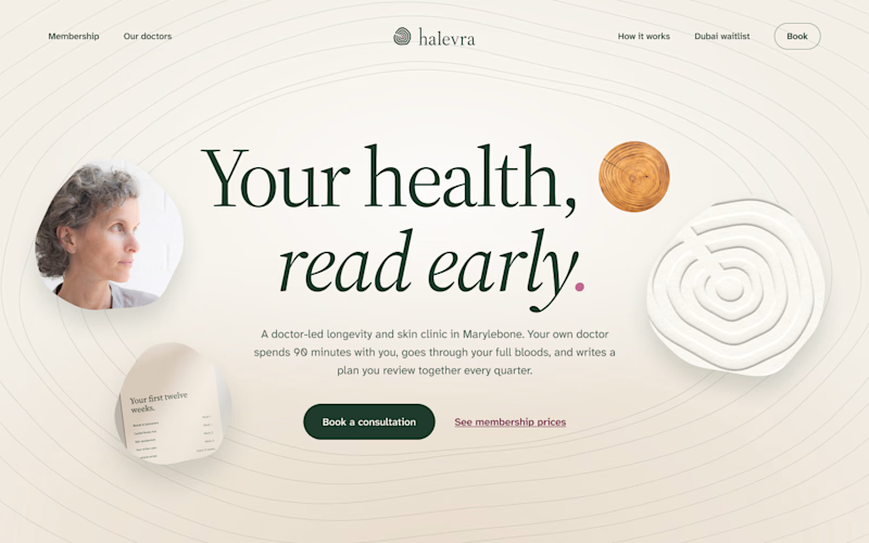
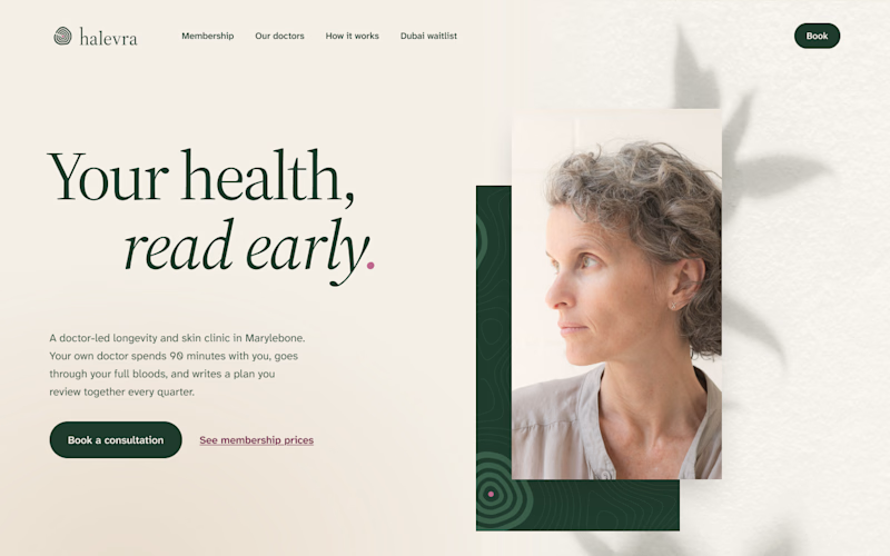
I’ve been building Halevra, a concept brand for a doctor-led longevity and skin clinic in Marylebone. This week was the homepage hero.
Same words, same brand kit, two different layouts.
A puts everything in the centre. The growth rings from the logo run across the whole page, with a few small pieces of the clinic around the headline.
B is quieter. The words sit on the left, one portrait on the right, and a leaf shadow on the wall behind her.
Which one would make you book the consultation?

3 voted
50%
3 voted
50%
6 votes
Closed

I would go with B, the editorial split. For a doctor-led clinic the portrait and the calm space around it do a lot of the trust work, and the headline reads clearly without competing with the rings. In A the rings are lovely but they pull the eye away from the message and the...