The network for creativity
Join 1.25M professional creatives like you
Connect with clients, get discovered, and run your business 100% commission-free
Creatives on Contra have earned over $150M and we are just getting started
Back to feedPost

I'm rebuilding my portfolio, and I want to share the process.
A few months ago I built my portfolio on React + Vite, served from S3 and CloudFront. I wanted to work with some AWS infrastructure, and I did. But a portfolio is not the place to show that.
So I decided to rebuild it with a focus on what actually matters here: better UI and real animations.
Part #1 is about the foundation
I started by gathering references: a few sites and visuals I liked, and some notes comparing them with my current portfolio to identify what I wanted to change. From there I moved into Figma and translated those ideas into an actual design for my new portfolio.
Once the design felt solid enough to build from, I initialized the project with Next.js.
In the video I'm sharing a Miro board with the references I collected, and the Figma designs I landed on.
This is part of a series documenting the full rebuild process, from research to deployment.
Part #2 is about turning that design into code


The network for creativity
Join 1.25M professional creatives like you
Connect with clients, get discovered, and run your business 100% commission-free
Creatives on Contra have earned over $150M and we are just getting started











Related posts

A modern SaaS website concept designed in Figma, featuring clean layouts, intuitive navigation, consistent visuals, and a user-friendly experience across different screen sizes.


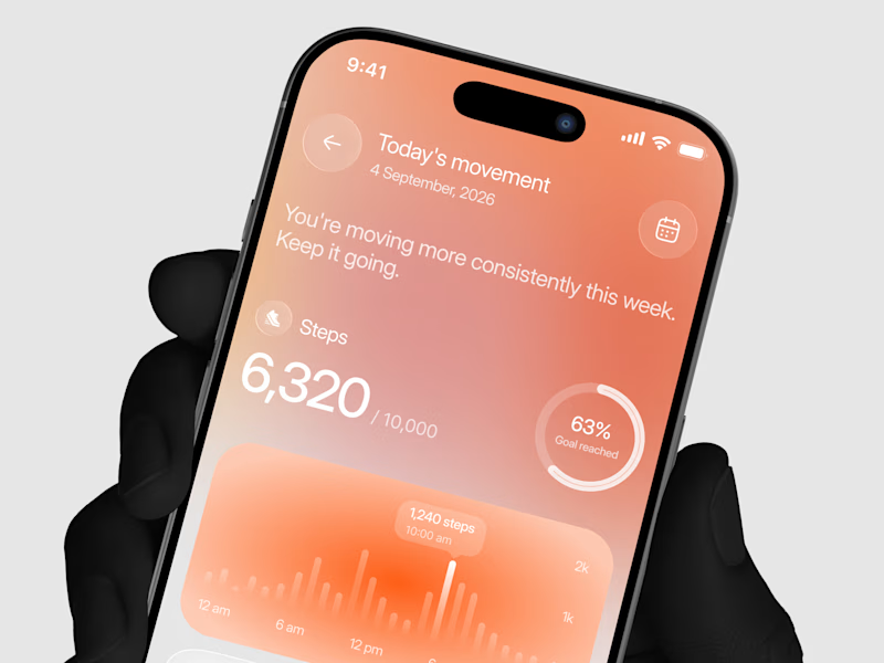
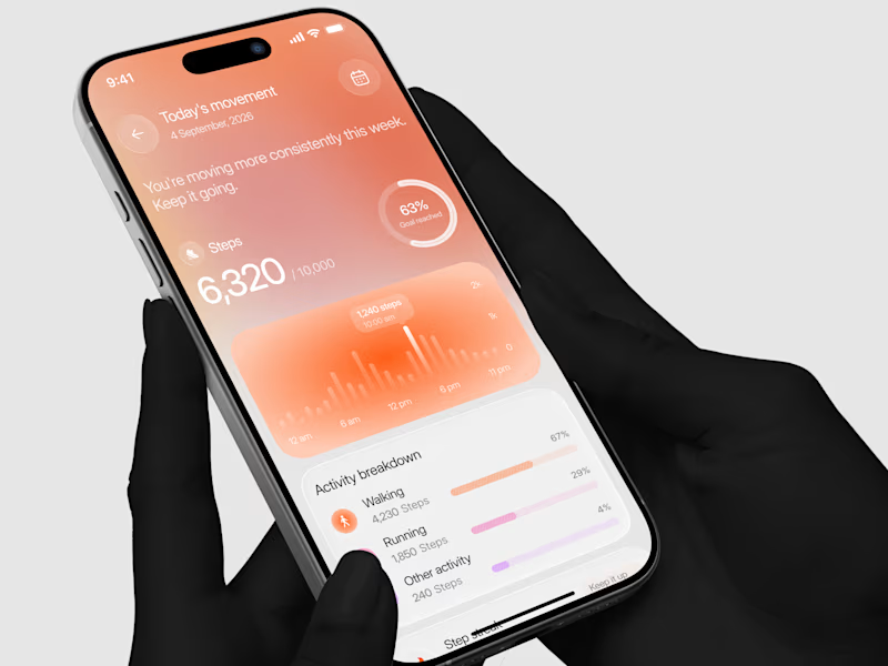
Designed a step tracking screen where you can see your daily progress and weekly trend in one glance.
Same screen, two shots. Which one would stop your scroll? 👀

11 voted
73%
4 voted
27%
15 votes
Closed




Clean and confident work! The green gradient with the mark feels very modern for fintech - trustworthy but not boring. The app screens look really polished. Curious how you landed on this mark, does it represent growth / movement?