The network for creativity
Join 1.25M professional creatives like you
Connect with clients, get discovered, and run your business 100% commission-free
Creatives on Contra have earned over $150M and we are just getting started
Back to feedPost

Three tattoo artists in Austin were running their whole business out of an Instagram inbox. Consults arrived as DMs at midnight, a third of bookings never showed up, and nobody ever paid a deposit — there was simply no way to take one.
InkBook gives Iron & Ink a real front door. Clients browse the artists and their actual work, pick the style they want, and book a real slot — with a $50 deposit that makes the appointment stick. If plans change, they reschedule or cancel themselves instead of ghosting. Reminders go out at confirmation, 48 hours before, and on the day.
The owner gets one screen: today's chairs, who might not show and why, and which deposits are in. No more evenings lost to DM triage.
Built end to end in Lovable: public site with flash gallery, pricing and reviews, full booking flow, client bookings, and the owner dashboard. Demo video below walks a complete booking in 30 seconds.

The network for creativity
Join 1.25M professional creatives like you
Connect with clients, get discovered, and run your business 100% commission-free
Creatives on Contra have earned over $150M and we are just getting started



Related posts

What if sending money felt a little more like giving a gift?
For Nova, I explored a banking app that brings payments, cards, and a bit of personality together. You can check your balance, browse recent transactions, send or request money, top up, and pay bills.
My favorite part is the digital postcard feature. Before sending a transfer, you can add a little illustrated card—a heart, a birthday greeting, or a playful character. A simple way to make birthday money or a thank-you feel more personal.
I carried that same 3D character into onboarding, pairing it with bold red gradients and large, clear payment details. There’s room for play, while the recipient and amount stay easy to check.
Would you add a postcard to a transfer? I’d love to know what occasion you’d use it for.






AI-Powered Physiotherapy Clinic Dashboard | Smart Appointment Scheduling
A modern AI-powered dashboard concept designed for physiotherapy clinics to simplify appointment scheduling, therapist management, and daily operations. The interface focuses on improving workflow efficiency with an intuitive calendar, smart booking experience, patient scheduling, and a clean visual system.
The design features an elegant and minimal UI, helping healthcare professionals manage appointments, therapists, and patient availability with ease. Every screen is crafted to deliver a fast, accessible, and user-friendly experience while maintaining a premium SaaS aesthetic.


so nice work

Exploring two different hero directions for a new project.
Same message, two completely different visual approaches.
Which one makes a stronger first impression?
A or B? Curious to hear your thoughts!

36 voted
90%
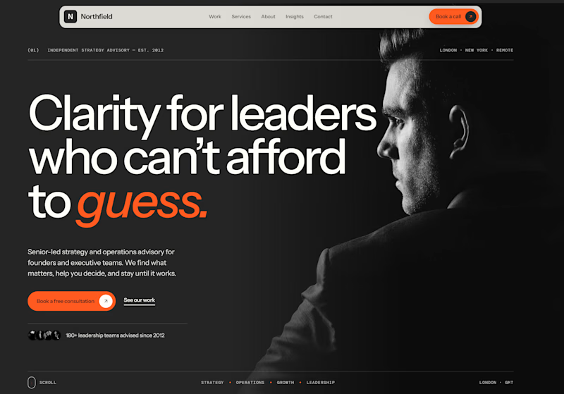
4 voted
10%
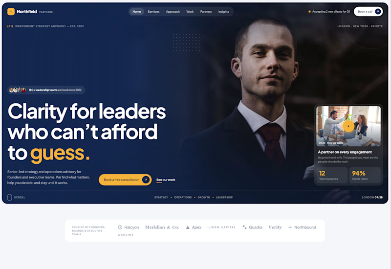
40 votes
Closed

Both are strong. I lean towards the dark version, because the orange accent on the italic "guess." pops and the profile portrait gives it a more editorial, confident feel. The navy one reads a bit more corporate, which could suit a more conservative audience. Nice exploration!