The network for creativity
Join 1.25M professional creatives like you
Connect with clients, get discovered, and run your business 100% commission-free
Creatives on Contra have earned over $150M and we are just getting started
Back to feedPost
Taste Test

Wordmark Logo Design for mattress brand with a bold typography, using my design on Adobe to compare chatgpt. Wich work feel more minimal

2 voted
67%
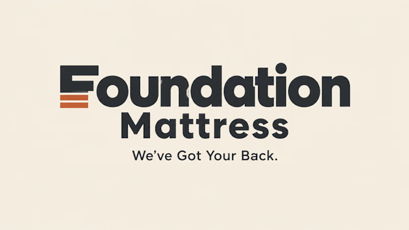
1 voted
33%
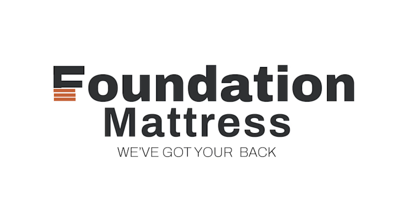
3 votes
Closed

Adobe work is more attractive to me ❤️

Comparing your manual design against AI output is a useful way to spot where the tech still struggles with specific brand personality. It helps you see exactly which elements need human refinement rather than relying entirely on generated drafts.
The network for creativity
Join 1.25M professional creatives like you
Connect with clients, get discovered, and run your business 100% commission-free
Creatives on Contra have earned over $150M and we are just getting started






Related posts

Most gyms follow a pretty similar approach to branding. I wanted to see what a strength club could look like if it drew more inspiration from a private-membership club vibe, since that's really trending right now.
Designed two directions for Arkos using the same mark. A is more refined and traditional, while B takes a bolder, more modern approach.
Which direction would you go with?
11 voted
50%
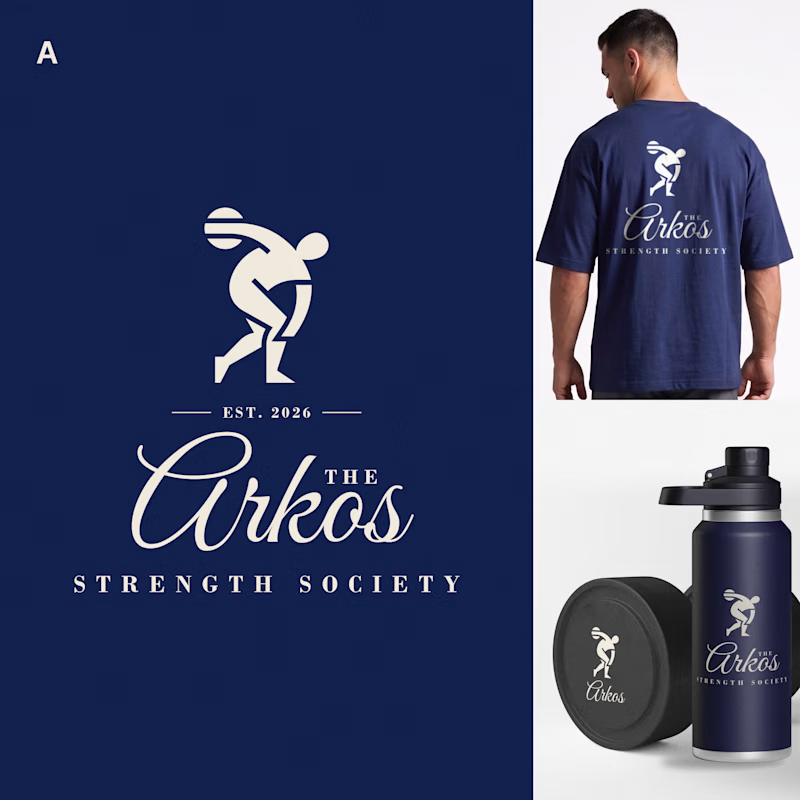
11 voted
50%
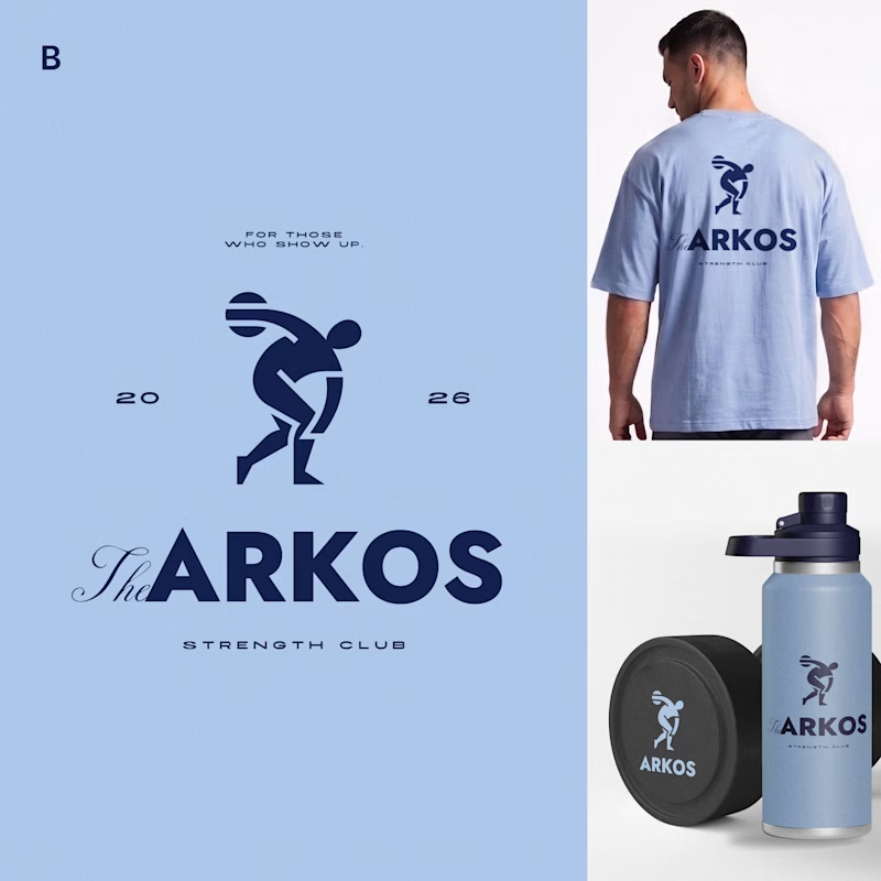
22 votes
Closed

The darker one is the best for me, but both are really good, man

Holographic is back, so I built the same concert ticket two ways in code. Which one would you keep after the show?
Foil: the rainbow shifts as it tilts. Silver: embossed type, one clean light sweep.
Vote, and tell me what you'd print on yours.
46 voted
82%
10 voted
18%
56 votes
Closed

Silver make it feel more real then Foil,,, good design in both

One of the hardest things in branding is knowing what not to change.
Nubank recently worked with Koto to evolve its visual identity as the company expands internationally.
They kept the recognizable logo but rebuilt the wider system around typography, colour, illustration, photography, and motion.
The interesting part for me is how much of this work happens inside the actual product.
Animations built in Rive, a more consistent interface language, and an identity that needs to work across different markets without losing its personality.
I think that's where branding is heading, especially for digital-first companies.
A good identity shouldn't just look great in a presentation. It needs to work just as well inside the product people use every day.

Top-notch branding/rebranding