The network for creativity
Join 1.25M professional creatives like you
Connect with clients, get discovered, and run your business 100% commission-free
Creatives on Contra have earned over $150M and we are just getting started
Back to feedPost

🚀 Something Exciting Is Coming Soon! 👀
What makes a product page stand out and turn visitors into customers? 🔥
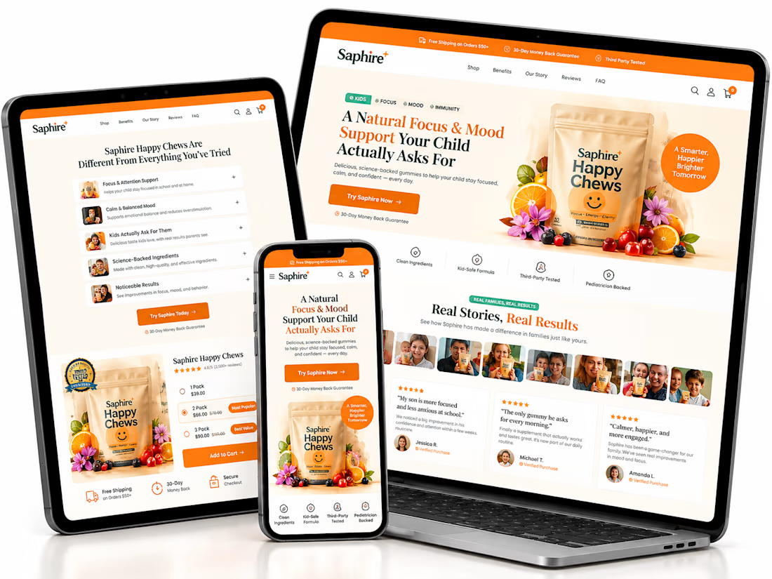
I’m currently working on a new Shopify Product Page Design focused on a clean layout, premium visuals, mobile responsiveness, and a better shopping experience.
✨ Modern UI/UX
🛍️ Professional Product Presentation
📱 Mobile-Friendly Design
🎯 Customer-Focused Layout
This is still in progress, and I can’t wait to share the final result with you!
Stay tuned — the best is yet to come! 🚀
💬 What feature do you think every high-converting product page should have?
#Shopify #ShopifyDesigner #ProductPageDesign #EcommerceDesign #ComingSoon
The network for creativity
Join 1.25M professional creatives like you
Connect with clients, get discovered, and run your business 100% commission-free
Creatives on Contra have earned over $150M and we are just getting started











Related posts

🔥 From streetwear to a standout Shopify experience.
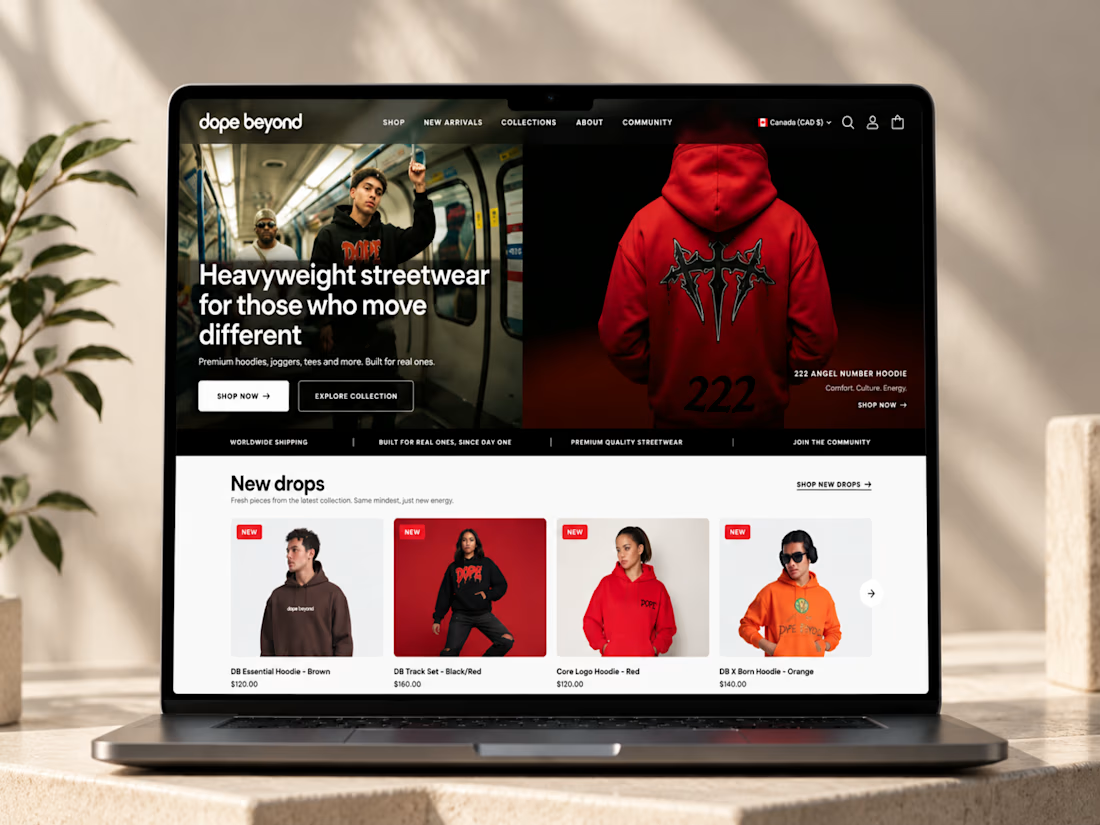
I recently worked on DOPE BEYOND, building a bold e-commerce store for a streetwear brand using Shopify and the Palo Alto theme.
From mega menu navigation to size charts and color swatches, every detail was designed to make shopping easier while keeping the brand’s identity strong.
What do you think matters most in a fashion e-commerce store: design, user experience, or functionality? 👇



Ye le Jani Solomon wali post ke liye copy-ready:
Fire work Solomon! 🔥 DOPE BEYOND looks like a perfect fit for a bold streetwear brand — love how you took Shopify + Palo Alto theme and pushed it beyond the template with mega menu, size charts and color swatches. Those small UX...


A conversion-focused Shopify product page featuring a clean, modern layout and an intuitive shopping experience.
The page brings together an engaging product gallery, bundle selection, clear Add to Cart actions, customer testimonials, product education, comparison tables, and FAQs.
The design emphasizes visual hierarchy, product discovery, purchase clarity, and trust-building elements to help shoppers make informed decisions.
Focus: Shopify UI/UX, product page design, and conversion rate optimization.


The comparison table is the part I'd check hardest on mobile. It often ends up as a horizontal scroll nobody touches, so I usually cut it to three rows with the one claim that really sets the product apart. How did you decide the order below the fold, testimonials before education or the other way around?
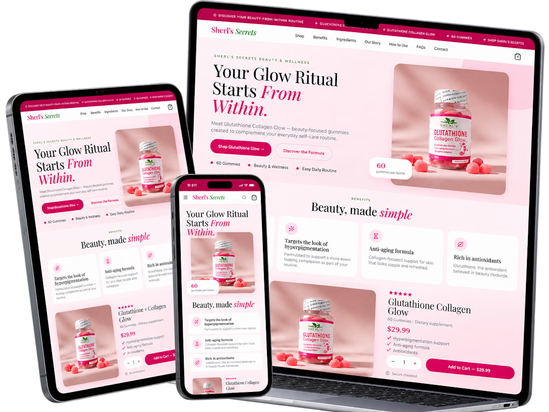
A conversion-focused Shopify product page for Saphire Happy Chews, designed around clearer product storytelling, customer trust, and a smoother shopping experience.
The page features an engaging hero, customer testimonials, expandable product information, bundle selection, prominent Add to Cart buttons, educational content, purchase reassurance, and FAQs.
The CRO approach emphasizes visual hierarchy, reduced decision friction, and improved product discovery to support stronger conversion potential.