
max
Ismel Figueroa
Expert on Audience Monetization for Top Creators and Brands.
- $100k+
- Earned
- 63x
- Hired
- 4.94
- Rating
- 1.8K
- Followers
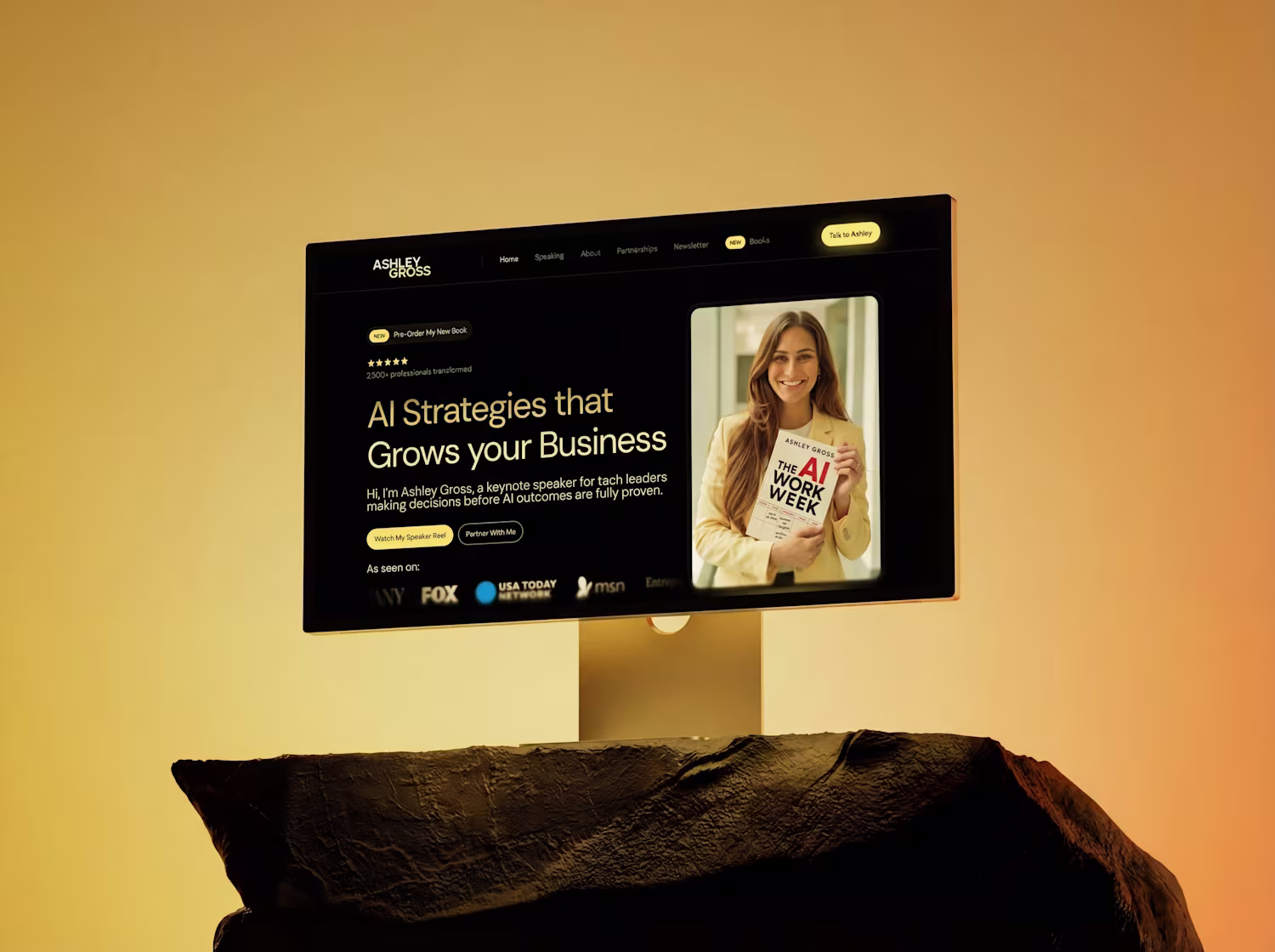
every time I see a website using the Anthropic serif font, it immediately gives me Claude-ish vibes, and honestly, a strong hint of lazy design taste.
give me a Claude-ish prototype and I'll add a premium salty taste to it.
thoughts?
8 voted
15%
44 voted
85%
52 votes
Closed
Nick (@nickbakeddesign) just shared with @Daniel G Bright and I how he uses AI to think like a dev, design better products, and close higher‑quality clients, while staying tiny on purpose.
New UnContrad episode is live now for...
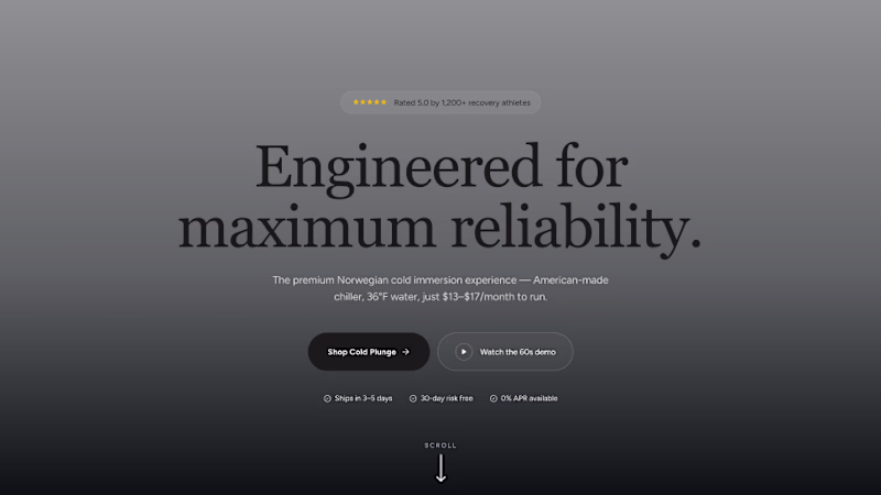
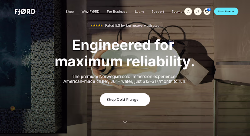
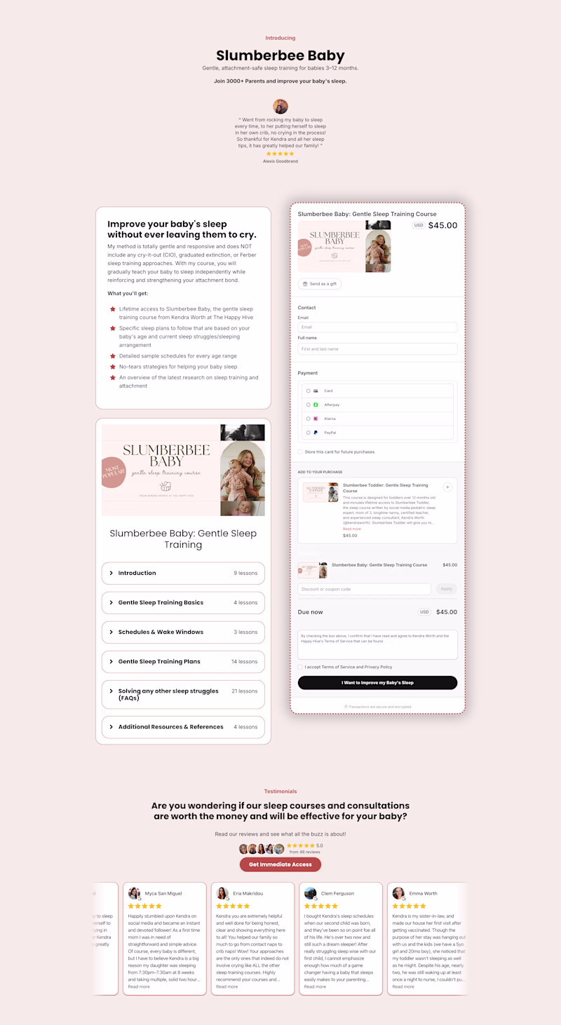
My client generated over $100K with their old checkout page and a $45 product 😳
This redesigned version doesn't just look better, it introduces:
- stronger value positioning
- strategic cross-sells
- added value
This alone creates opportunities to significantly increase average...
16 voted
44%
20 voted
56%
36 votes
Closed
would you approve v1 concept vs. old one? if so, why? 💜🩷
1 voted
2%
49 voted
98%
50 votes
Closed