The network for creativity
Join 1.25M professional creatives like you
Connect with clients, get discovered, and run your business 100% commission-free
Creatives on Contra have earned over $150M and we are just getting started
Back to feedPost

👋 Let me introduce myself!
I'm Veronica, a Brand Designer based in Italy.
A few facts about me:
✦ I've been designing for 8 years
✦ I specialize in branding, visual identity & packaging design
✦ My favorite part of the process is turning ideas into visual systems
✦ I'm currently building my freelance career and growing my portfolio
✦ I'm a huge music lover (especially K-pop 🎧)
✦ BTS and Stray Kids are always on my playlist
✦ A few months ago I started going to the gym... now I'm slowly becoming a gym rat 💪
✦ Adobe Illustrator is that girl and I refuse to elaborate
✦ Before design, I tried studying Computer Science and failed miserably 😭
✦ I will absolutely judge a product by its branding and packaging
Excited to connect with other creatives here on Contra! ✨
Tell me something random about you 👇


Hi Veronica, Welcome to Contra! 🙌
something random about me, I love my work 😊

I definitely judge businesses by their websites.

Welcome to Contra. The packaging detail is real, anyone who judges a product by its branding before anything else usually cares deeply about the full experience. That mindset comes through in the work.

Welcome 🤗
The network for creativity
Join 1.25M professional creatives like you
Connect with clients, get discovered, and run your business 100% commission-free
Creatives on Contra have earned over $150M and we are just getting started
Related posts

New on Contra, not new to design.
I draw logos by hand, then build everything around them: the brand, the website, the store. Lately I also make product films and ads with AI.
Recent work: an RY monogram and site for a Koreatown law firm, a winged W for a defense firm, and my family's golf eyewear brand, from the mascot to Shopify.
Starting a brand, or have one that doesn't feel like you yet? Show me what you're building.

The logo-led system reads tight because the wordmark sits clean in the negative space instead of fighting the emblem — when a brand has that kind of restraint, the Shopify store usually carries the same hierarchy into the product grid and checkout without inventing new rules....

A little reminder that freelancers are humans, too. ❤️
This freelancer is moving apartments next week, and not all stress comes from work.
After a year of amazing clients, projects, and even winning Contra hackathons that helped make this new chapter possible, it feels like a lot is changing at once. I'm scared, but happy.
And right after the move, I’m off to Europe to visit Christmas markets, something I’ve dreamed about for years. 🎄
So I probably won’t be as available as usual for a little while, and I’m learning to be okay with that.
Sometimes growth looks like new projects. Sometimes it looks like a new home, a long-awaited trip, and making room for life outside your laptop.
Here’s to new beginnings. ✨
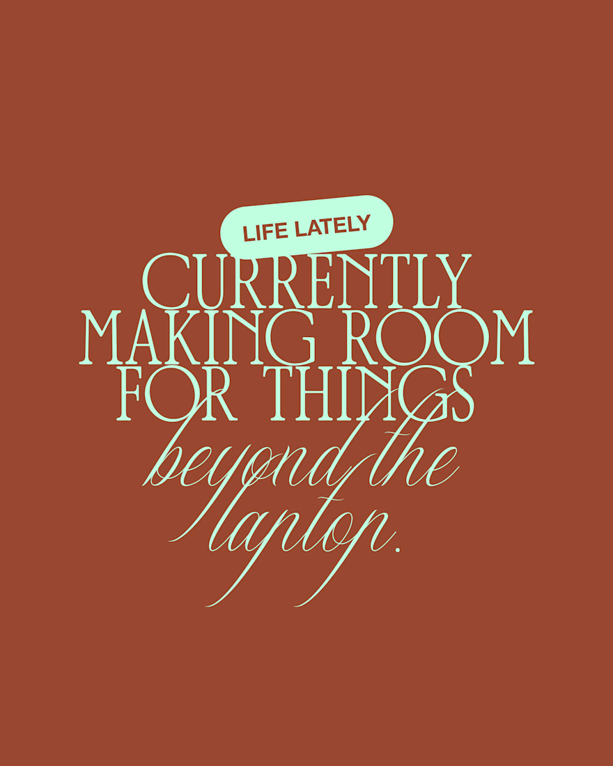

totally agree! I’m learning to adapt to the quieter periods between projects and enjoy the extra free time. Wish you a nice trip!
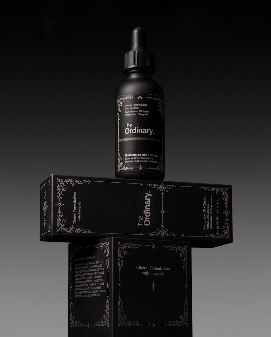
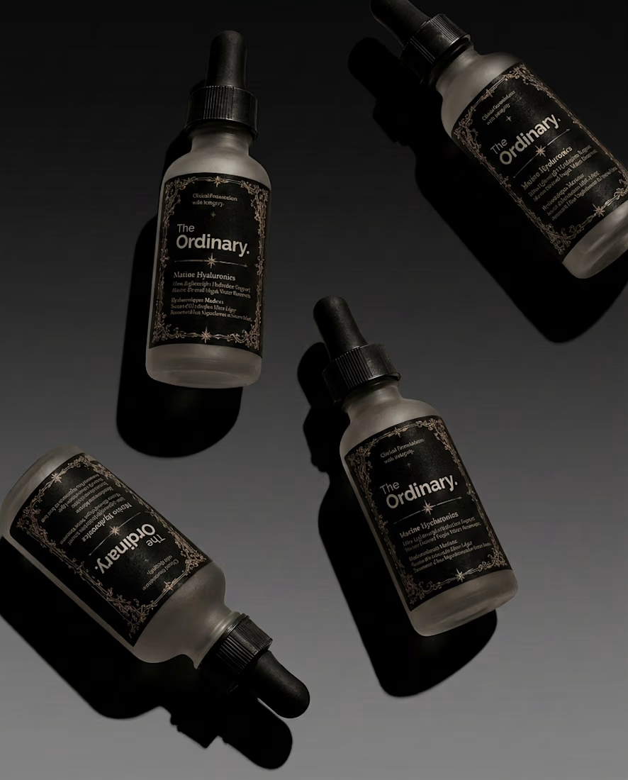
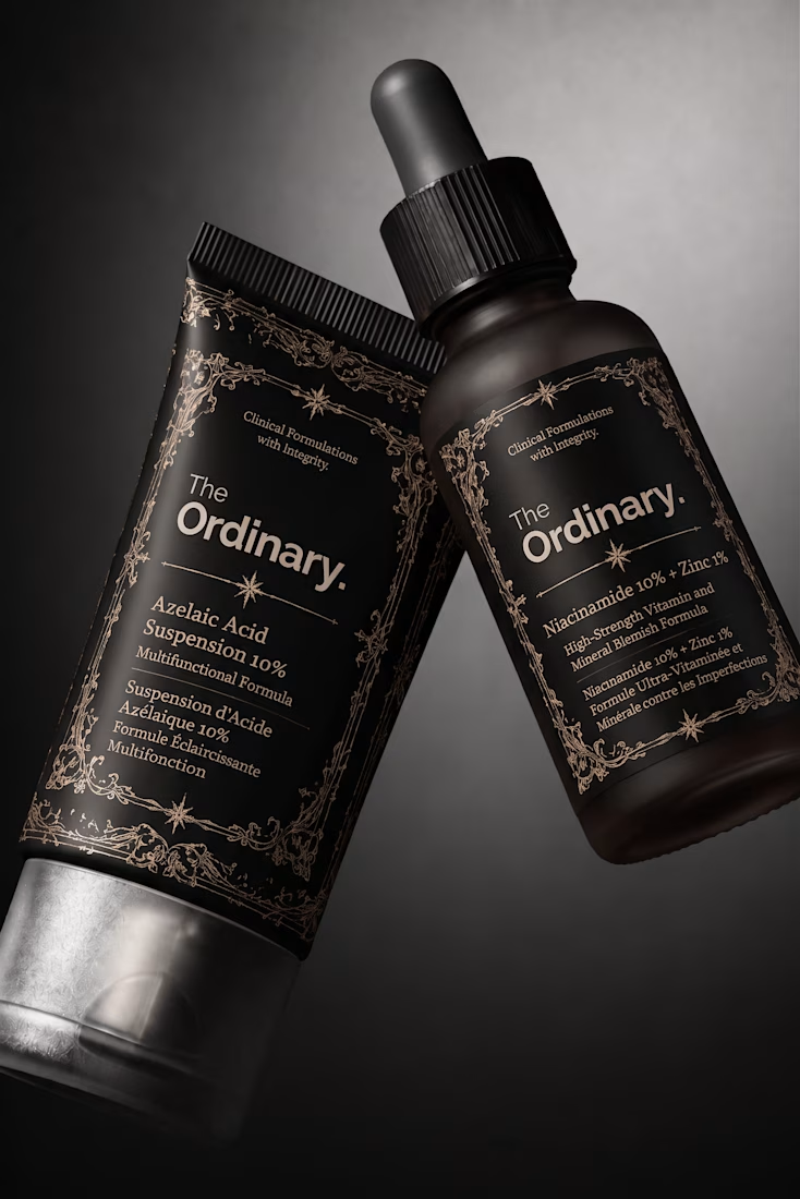
What if your favorite skincare brand got a Halloween makeover? 🕷️
For this little experiment, I’m giving The Ordinary a 𝔤𝔬𝔱𝔥 alter ego.
The challenge was keeping the things that make the brand instantly recognizable: its straightforward logo and typographic editorial layout, clinical packaging, and no-nonsense aesthetic.
Instead of turning it into a completely different brand, I wanted to push those same elements into darker territory with 𝔢𝔢𝔯𝔦𝔢 tones🕸️ , gothic details, and a more mysterious product presentation.
Even in costume, you should know exactly who you're looking at.
Which brand would you love to see get a Halloween makeover next? 👻

Keeping the logo untouched and only changing the mood works really well. Glossier next?