The network for creativity
Join 1.25M professional creatives like you
Connect with clients, get discovered, and run your business 100% commission-free
Creatives on Contra have earned over $150M and we are just getting started
Back to feedPost

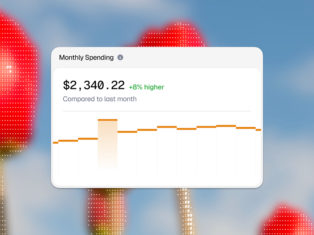
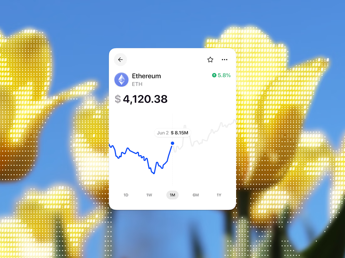
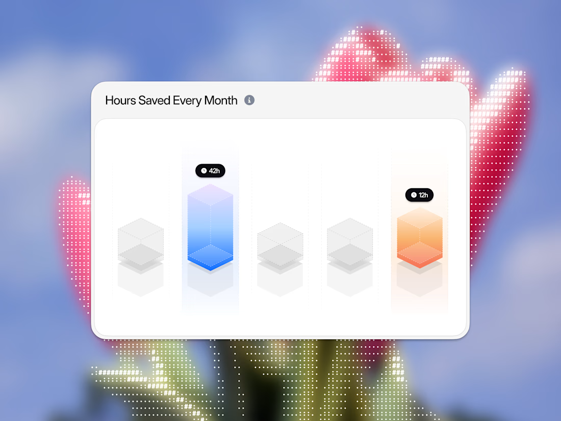
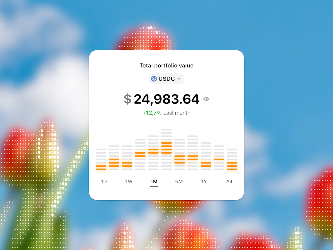
Great dashboard design isn't just about showing numbers—it's about making complex metrics effortlessly scannable!
Here is a quick micro-component showcase featuring 4 distinct UI blocks from 4 different product case studies. From clean personal spending trackers showing monthly peaks to stacked USDC portfolio equalizers, live blue Ethereum price curves, and glowing 3D isometric productivity columns, each element was engineered to reduce data anxiety and boost visual trust.
Slide through all 4 attached images right now to review the detailed UI blocks up close, and let me know how the visual balance lands with you! 🚀📊👇

The network for creativity
Join 1.25M professional creatives like you
Connect with clients, get discovered, and run your business 100% commission-free
Creatives on Contra have earned over $150M and we are just getting started





Trending

Claude
Claude has entered the design space. How are you using it?

Contra University
Learn from expert creatives how to earn more using next-gen AI tools.
Brand Design
The best brand designers are on Contra. Scroll to see what's trending in brand design. What are you building?
creativeaiflow
Creative AI workflows are evolving. What tools do you use, and what are their strengths and weaknesses?
freelancerlife
Freelancer life is wins, pivots, and everything in between. What’s yours right now?
Related posts

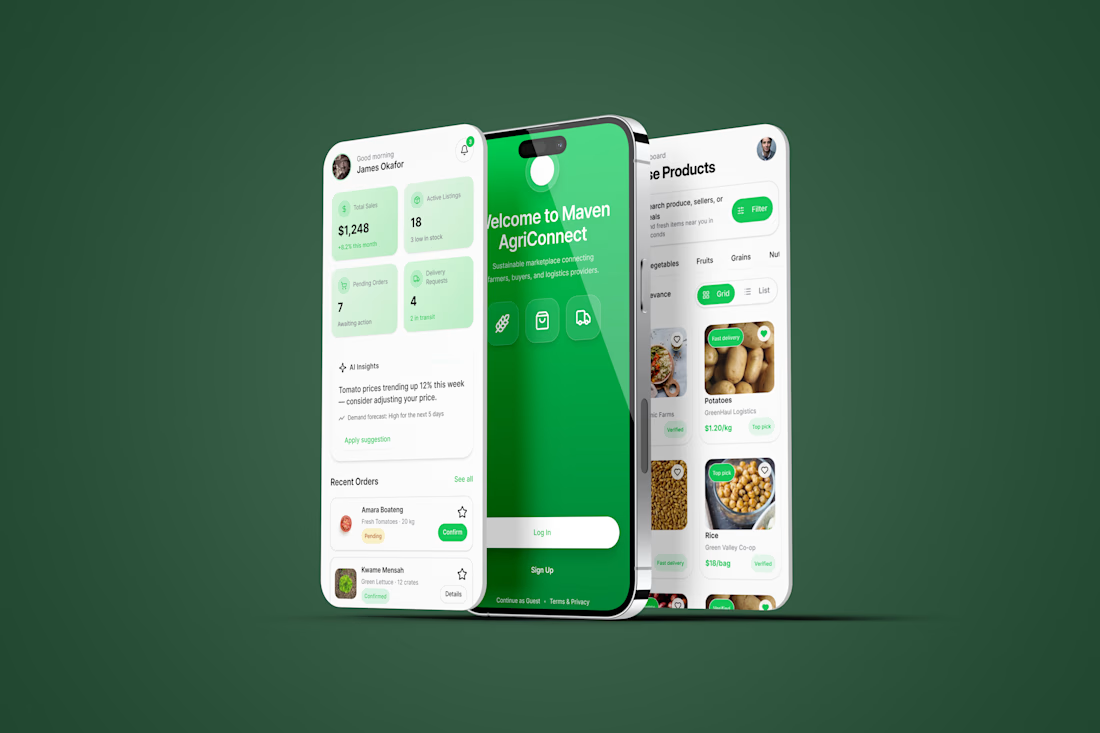
Excited to share my submission for the #FlowstepChallenge!
I designed Maven AgriConnect, a mobile marketplace that connects farmers, buyers, and logistics providers in one seamless experience. Starting with Flowstep AI, I refined the concept in Figma to create a role-based product focused on usability, trust, and efficient agricultural commerce.
Tools: Flowstep AI • Figma
@flowstep_ai
#UIDesign #Figma #ProductDesign #Marketplace #MobileApp




Nice work

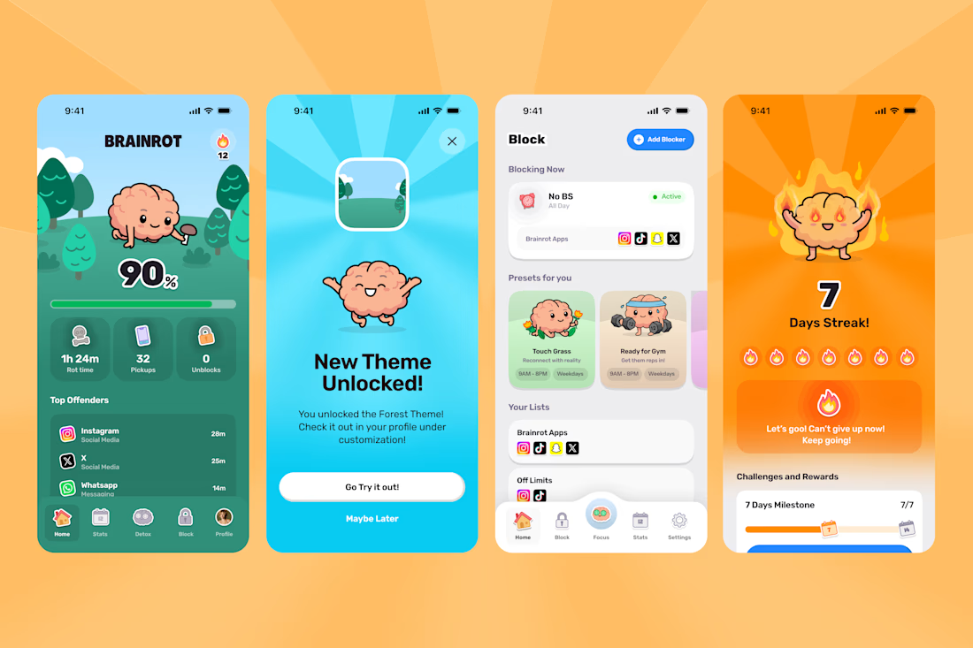
A few highlights from the Brainrot Project!
In 3 months we delivered:
100+ app screens
60 + Illustrations
70 + animations
+ Branding, Appstore Screens, Website and hundreds of Slack jokes.
Couldn't have done it without the legends Mary Delaney and Arsen Airyan!
If your brand or app needs a substantial facelift to stand out in the AI Slop age, let me know!



Congrats man!