The network for creativity
Join 1.25M professional creatives like you
Connect with clients, get discovered, and run your business 100% commission-free
Creatives on Contra have earned over $150M and we are just getting started
Back to feedPost

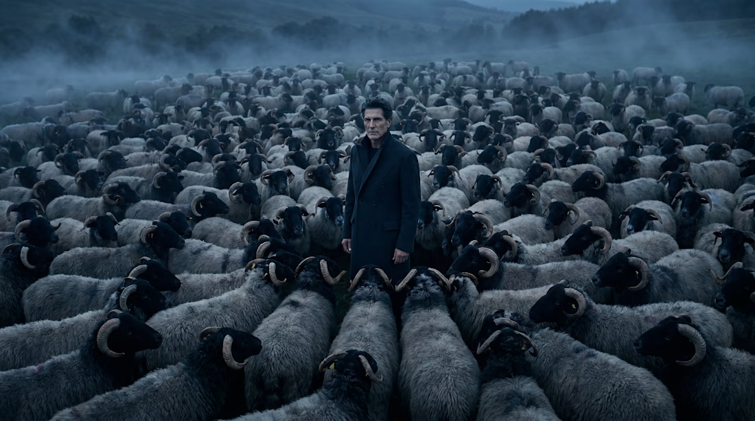
Some things don't need to be seen to be felt.
ORIGIN is a luxury fragrance campaign built on a biological truth: sheep have poor eyesight but an extraordinary sense of smell. They don't follow what they see. They follow what they feel.
The man at the center does nothing. He simply exists. And everything gravitates toward him.
Every element of this campaign was built from the ground up. The bottle, the landscape, the character, the visual language. From concept to final image, nothing was borrowed. Everything was created.
A campaign about the kind of presence that doesn't announce itself. It arrives. And stays.
Visual Direction and AI Production by Milla Cabral Studio.


The network for creativity
Join 1.25M professional creatives like you
Connect with clients, get discovered, and run your business 100% commission-free
Creatives on Contra have earned over $150M and we are just getting started







Related posts

Latest backgrounds created with Midjourney


Always got the vibes brother!

Designers, a client is buying into your taste, not just your ability to execute.
This project was about extending an existing brand into a new tech product, without losing the visual DNA that already made it distinctive.
The moodboard became part of the sell: proof that I understood the brand, but also that my own aesthetic judgment was refined enough to carry that legacy forward.
I can’t share the full moodboard yet as the project is not public, but this part of the process reflected an important part of my design philosophy. And I wanted to share it with you.
Because, that’s what I believe moodboards really do in design bussiness. They make taste visible, and show what to preserve, what to evolve, and how far to push.
As execution becomes faster, taste and creative judgment only become more valuable.
#BrandDesign #CreativeDirection #VisualIdentity #BrandStrategy #ArtDirection


The idea of making taste visible through the moodboard really lands here—the restrained type and orange mark feel like a clear bridge between legacy and future. I especially like how the motion piece turns that visual DNA into a living system.

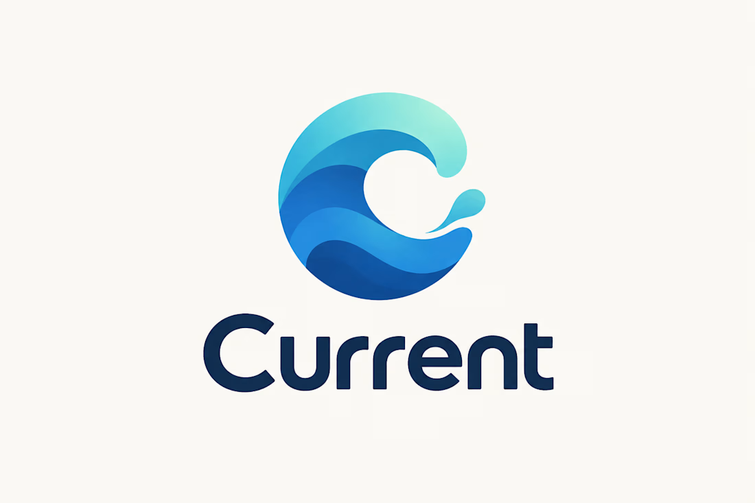
Logo & Brand Identity Concept
A modern logo concept designed for Current, using a flowing “C” symbol inspired by movement, waves, and continuous flow.
The layered blue and turquoise forms create a sense of motion, energy, and connectivity, while the clean wordmark gives the identity a professional and contemporary character.
The concept was developed with versatility in mind, allowing the logo to work across digital platforms, websites, social media, marketing materials, and branded assets.
Focus: Logo Design • Brand Identity • Visual Identity • Typography • Graphic Design
Style: Modern • Minimal • Fluid • Professional
Tools: Adobe Illustrator • Adobe Photoshop • Figma
#LogoDesign #BrandIdentity #BrandDesign #VisualIdentity #GraphicDesign #Typography #LogoConcept #ContraPortfolio