The network for creativity
Join 1.25M professional creatives like you
Connect with clients, get discovered, and run your business 100% commission-free
Creatives on Contra have earned over $150M and we are just getting started
Back to feedPost


The network for creativity
Join 1.25M professional creatives like you
Connect with clients, get discovered, and run your business 100% commission-free
Creatives on Contra have earned over $150M and we are just getting started

Challenges
View all


Related posts


New cover, new visual taste test.
As a visual director, the hardest choice is choosing between your own creations.
Two covers. Two directions. One choice.
Which one gets your vote?

34 voted
79%
9 voted
21%
43 votes
Closed


the blue background makes the orange shapes pop

Generated these looks in Midjourney — but the layout is what really pulls it together.
Grid, crosshairs, typography, detail callouts: same images, but the presentation makes them read like an actual editorial spread instead of just pretty pictures.
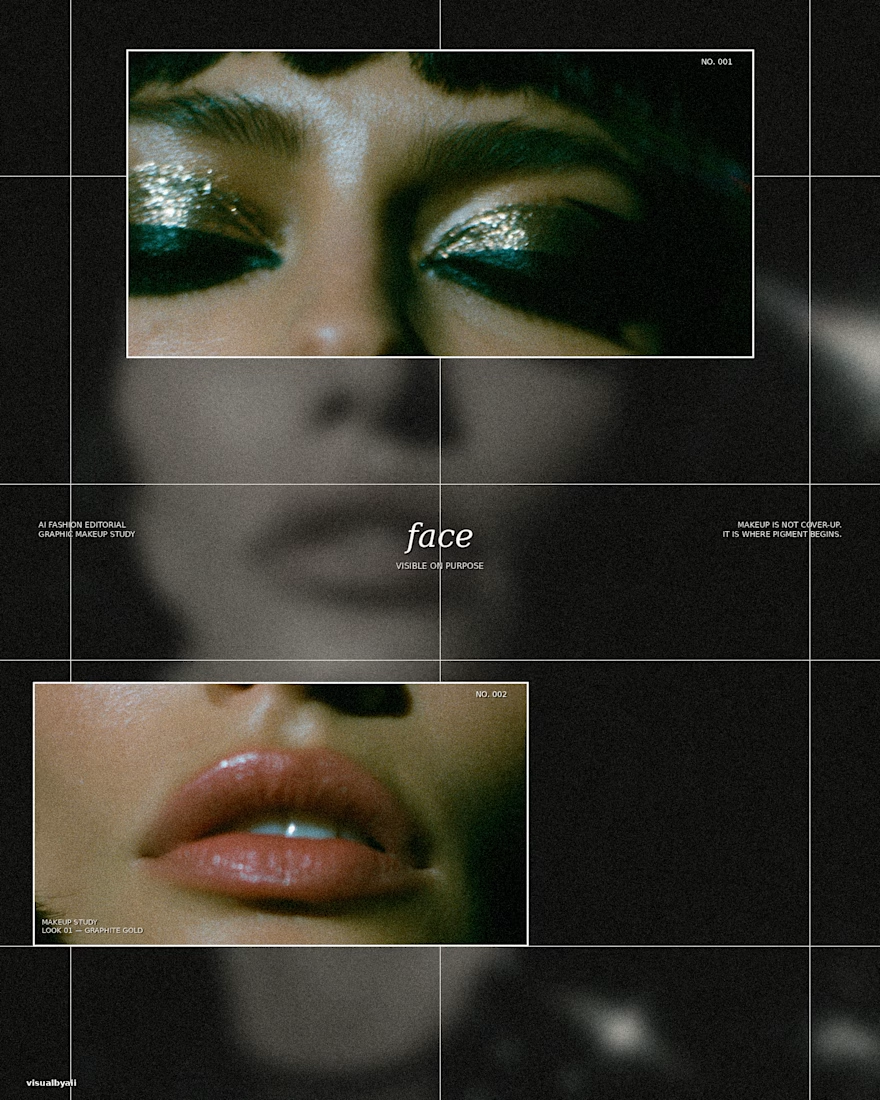
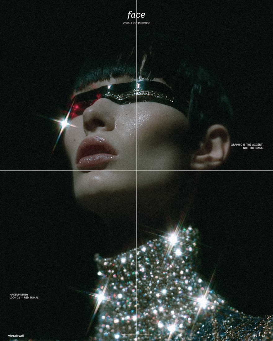
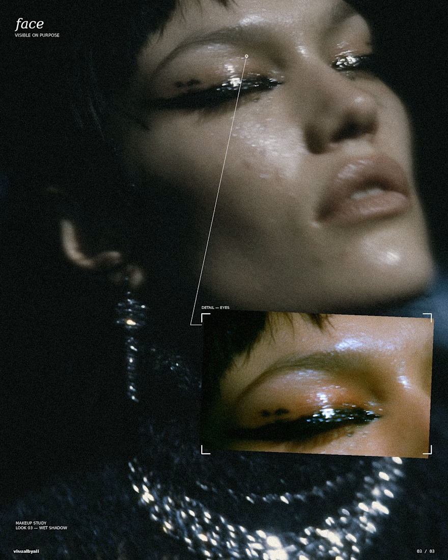

The grid, crosshairs, and detail callouts do more than decorate the Midjourney output—they turn it into an editorial system. Great example of how art direction can make a set feel like a coherent campaign.

New fashion visuals are live.
Some of my latest explorations in fashion, art direction and AI.
See the full projects → https://exot.es/fashion

