The network for creativity
Join 1.25M professional creatives like you
Connect with clients, get discovered, and run your business 100% commission-free
Creatives on Contra have earned over $150M and we are just getting started
Back to feedPost


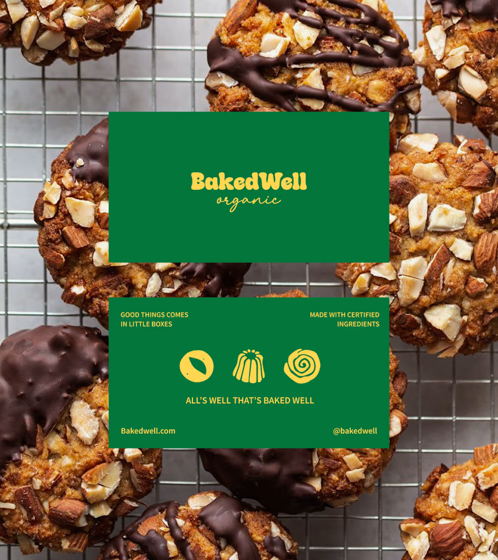
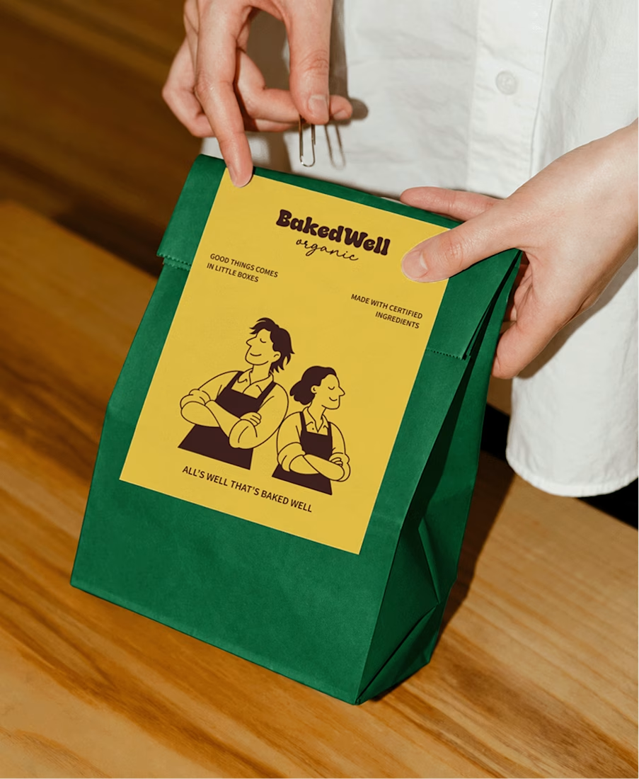
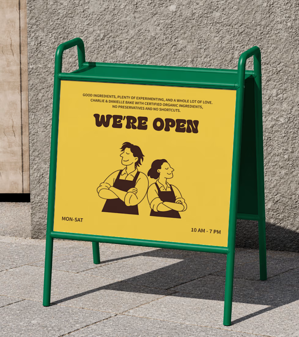
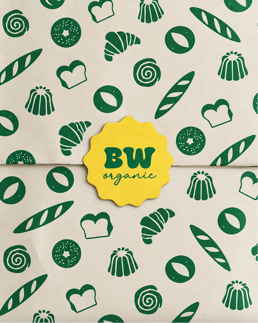
The idea was to create an identity that feels as warm and honest as the people behind the brand, while still standing out on the shelf.
The visual direction brings together bold colours, playful founder illustrations, and a touch of nostalgia to make organic baking feel approachable rather than overly serious.
Every element is designed to reflect brand’s philosophy: real ingredients, no shortcuts, and desserts worth coming back for.



The network for creativity
Join 1.25M professional creatives like you
Connect with clients, get discovered, and run your business 100% commission-free
Creatives on Contra have earned over $150M and we are just getting started
Related posts


Keeping the Halloween-inspired concepts coming! 🕯️✨
This time, we're sharing Ovelle — a luxury candle e-commerce website with warm tones, elegant typography, and a moody editorial aesthetic. Would love to hear your thoughts! 🎃


What if your biggest streaming platform got a Halloween makeover? 🕸️
As Halloween is closing by, I decided to do a short campaign teaser for one of the biggest streaming platforms.
I redesigned their logo and played with the wording as part of their brand messaging in a spooky theme for the upcoming Halloween event.
I retained the brand consistency across the typography and overall logo shape and changed few details within.
Any twitch streamers, viewers or halloween celebrants here?


Fun concept and perfect timing. The spooky wordmark twist still feels on brand, nice one.


