The network for creativity
Join 1.25M professional creatives like you
Connect with clients, get discovered, and run your business 100% commission-free
Creatives on Contra have earned over $150M and we are just getting started
Back to feedPost

I get asked this weekly:
“Why FlutterFlow instead of writing Flutter from scratch?”
Short answer: speed to market.
Long answer? Most early-stage startups do NOT fail because of bad code architecture. They fail because they spend 6–12 months building before validating anything.
A recent example was Aura Fem — a wellness platform tailored for women with features like guided meditation, emotional wellness flows, journaling, and personalized experiences.
The goal wasn’t to impress developers.
The goal was to:
• launch fast
• iterate quickly
• test user behavior
• refine the experience in real time
Using FlutterFlow allowed us to:
→ visually build complex UI flows faster
→ connect backend logic without weeks of boilerplate
→ deploy cross-platform from one codebase
→ make product iterations in hours instead of days
And when custom functionality was needed?
We extended it with custom actions and Flutter code where necessary.
That’s the part people miss:
FlutterFlow is not “either/or.”
The best teams use it strategically.
For MVPs, startups, internal tools, marketplaces, booking apps, wellness platforms, and communities… speed + iteration usually beats perfection.
The question is no longer:
“Can no-code scale?”
The real question is:
“How much time and money are you burning before getting user feedback?”
Curious where I think FlutterFlow works best — and where I’d avoid it completely?

The network for creativity
Join 1.25M professional creatives like you
Connect with clients, get discovered, and run your business 100% commission-free
Creatives on Contra have earned over $150M and we are just getting started





Related posts

Technical performance engineering and Core Web Vitals optimization for comoimportarmicoche.es.
Achieved 92+ performance scores on mobile alongside 100/100 ratings in SEO, Best Practices, and Accessibility on a live production WordPress site by streamlining front-end asset delivery and eliminating backend execution bottlenecks.
Key Engineering Highlights:
• Asset Optimization: Minified, combined, and deferred non-critical CSS/JS, significantly reducing render-blocking resources and critical path latency.
• Next-Gen Media Pipeline: Implemented WebP image conversion, explicit aspect ratio dimensions to eliminate Cumulative Layout Shift (CLS), and native lazy-loading.
• Clean Architecture: Optimized dynamic database queries and custom PHP scripts to maintain near-instant Server Response Time (TTFB) without relying on heavy caching plugins.
• Core Web Vitals Targets: Focused on Largest Contentful Paint (LCP) and Interaction to Next Paint (INP) to deliver sub-1.5s real-world loading times on mobile devices.
Search Engine OptimizationWeb DevelopmentWordPress DevelopmentGoogle Search ConsoleJavaScriptWordPress


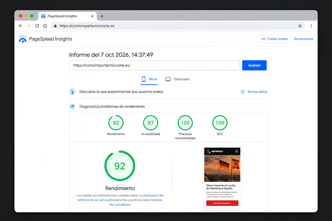
Yeah, this was a cold run in PSI. The DB cleanup was actually huge for TTFB—dropped uncached server response under 200ms, mostly by clearing bloated wp_options and fixing custom loops. Caching handles repeat hits, but the backend fix was the main win.

AI didn't take my job. It became my business partner.
Every designer I know is asking the same question right now: what's left for us when AI can make something pretty in 10 seconds?
Here's my honest answer, from branding and from product.
The way I work has completely changed. Moodboards, variations, mockups, even clickable prototypes: what used to take days now takes hours.
But here's what nobody says out loud: people are making a lot of pretty things. And pretty doesn't build a brand.
Pretty doesn't tell a stranger why they should trust you.
Pretty doesn't make your offer clear in 5 seconds.
Pretty doesn't fix the screen where users give up.
That part is still on me. It's actually most of my job now.
So I stopped seeing AI as a competitor. It does the drafts, I do the thinking, and my clients get both, faster.
Designers, how has AI changed the way you work this year?
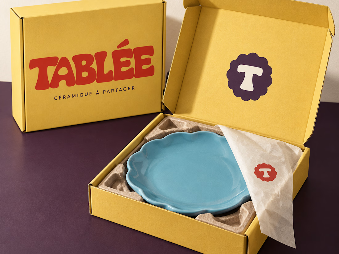

Wonderful presentation and I like your thought you shared

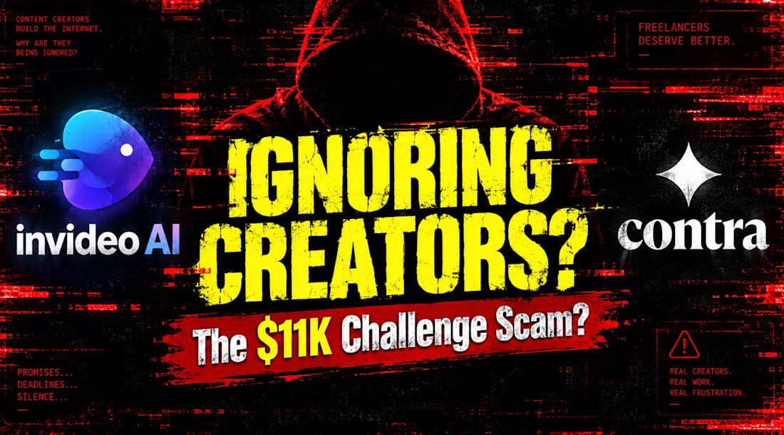
Headline: Dead silence from support while the Oct 12 deadline ticks away
How are creators supposed to enter the #invideocontrachallenge if we aren't being given the tools promised in the guidelines?
I applied for the Max plan upgrade days ago, submitted my workspace ID, and filled out the support forms. Zero response. Total ghosting.
You are dangling an $11K prize pool to get people to join the platform, but leaving participants locked out of the AI editing features needed to actually complete the brief. Time is running out before October 12.
Please unlock my workspace ID so I can actually do the work:
@Invideo AI @Contra

I talked with the customer support for two days and I got the max plan. they were very supportive. Stop spreading misinformation.