The network for creativity
Join 1.25M professional creatives like you
Connect with clients, get discovered, and run your business 100% commission-free
Creatives on Contra have earned over $150M and we are just getting started
Back to feedPost

KD Momo Hub — Brand Identity & Motion Showcase (Client Project)
Project Overview / Caption:
Bringing a Modern Street-Food Brand to Life: Brand Identity & Cinematic Presentation for KD Momo Hub
Here is a 30-second cinematic brand presentation reel created for KD Momo Hub, a contemporary street-food and dumpling brand.
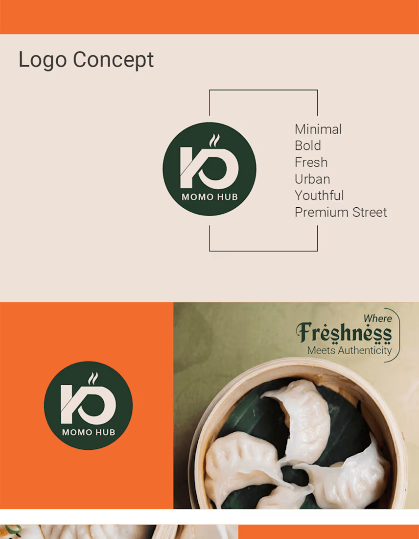
As part of this complete brand design project, the client wanted a visual identity that felt youthful, premium, and authentic—breaking away from generic fast-food aesthetics.
Key Highlights of the Project:
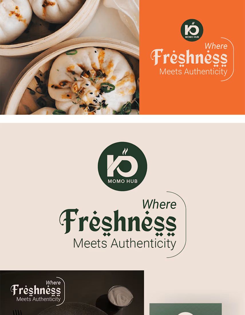
Visual Identity & Logo Design: Crafted a minimalist monogram combining the letters "K" & "D" with rising steam geometry, paired with clean typography.
Palette & Tone: Designed a fresh, warm color scheme (Cream, Forest Green, and Energetic Orange) reflecting organic warmth and vibrancy.
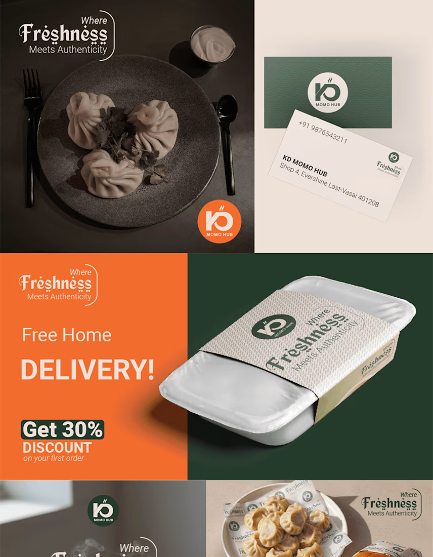
Packaging & Collateral: Developed sustainable packaging mockups, patterns, takeaway wraps, and ambient signage.
Motion & Presentation: Scripted, art-directed, and rendered this cinematic motion video to showcase real-world brand applications—from macro food textures to stadium lightbox activations.
My Role in this Project:
Brand Identity & Logo Design
Packaging & Merchandising Layouts
Motion Graphics & Cinematic Brand Presentation (3D/Video)
Art Direction & Storyboarding


The network for creativity
Join 1.25M professional creatives like you
Connect with clients, get discovered, and run your business 100% commission-free
Creatives on Contra have earned over $150M and we are just getting started



Related posts

Brand work for HauntChain
I'm loving building this brand and the results so far
A deFi platform with some gamification


That's cute ❤️


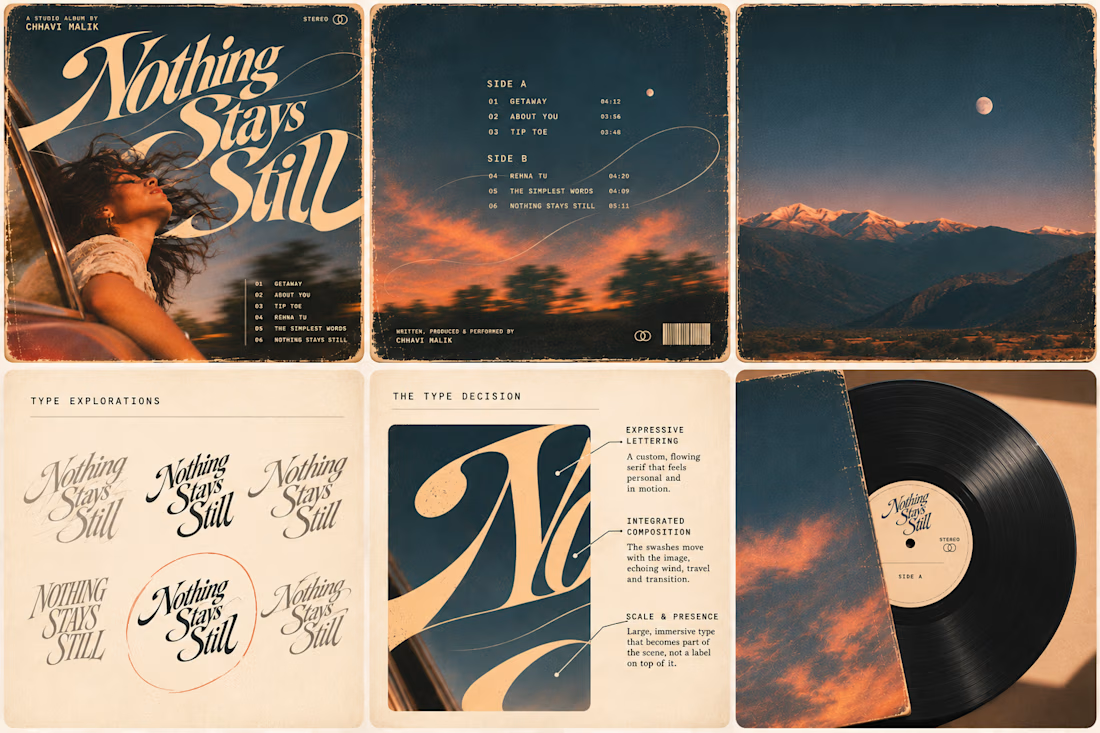
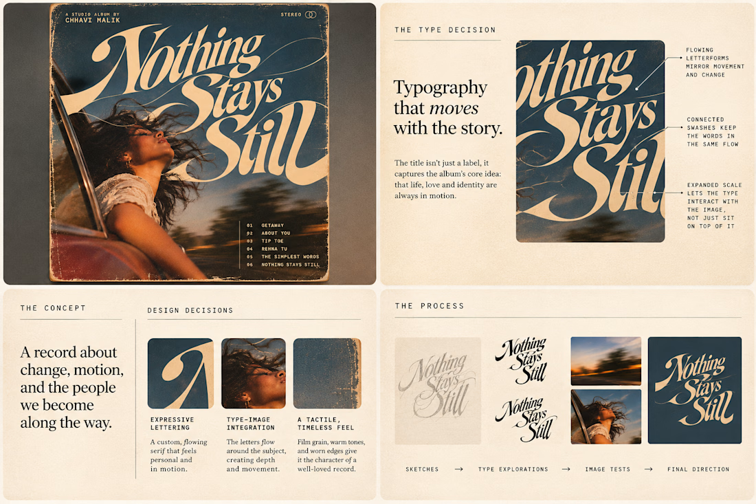
Is text on album covers really tacky?
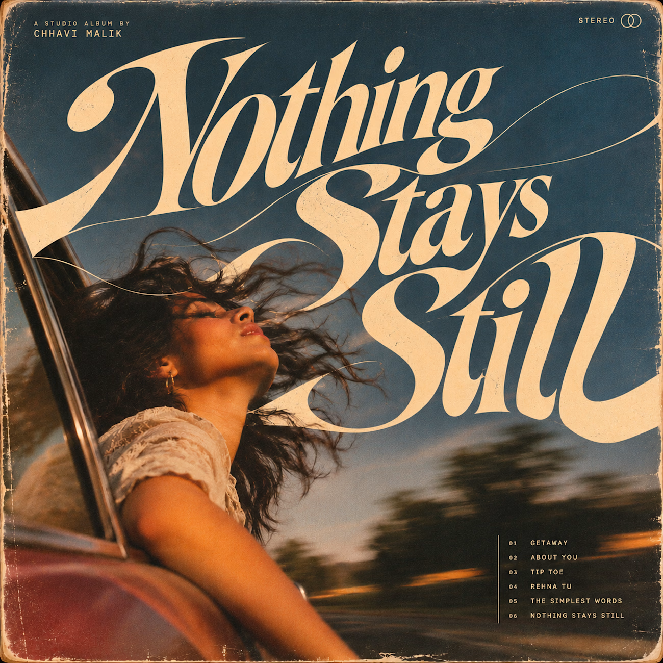
This question has been doing the rounds on X and I have to say, I'm firmly on the other side of that argument. I've always loved seeing typography become part of the artwork rather than just a title sitting on top of it.
So I wanted to put that idea to the test with an imagined album called Nothing Stays Still, inspired by change, fleeting moments and everything in between:)
I played around with the lettering until it felt expressive, a little restless, and inseparable from the photograph.
Because I think badly considered typography is tacky. Typography itself? Give it a chance :)
What's an album cover where the type really makes it for you?


Behind the wall: a homepage concept for Studio Cesare
I’m testing a new landing page for my studio, made with Brik.
A pixel-brick grid covers the screen. Move through it and the bricks fall away to reveal the person behind the work, mid-coffee, slightly off balance. Then the wall closes again.
It’s a small metaphor for how I approach next-generation branding: a strong system on the surface, with a real person and a real point of view underneath.
Exploring this for the studio site launch. Open to feedback, and to new projects 🤝🏼

This is amazing!!