The network for creativity
Join 1.25M professional creatives like you
Connect with clients, get discovered, and run your business 100% commission-free
Creatives on Contra have earned over $150M and we are just getting started
Back to feedPost
A useful first answer to “How much for a website?” separates a base package, add-ons, and timeline instead of dropping a single unexplained number.
I built QuoteKit for freelancers and small studios who want to show that estimate before the discovery call. Visitors choose a package, extra pages and services, and a timeline; the indicative price updates in the browser. It is bilingual (EN/FR) static HTML/CSS/JS, with rates edited in one config file. The email button prepares a draft in the visitor’s own email app; there is no backend or automatic data collection.
The editable source template is $12 USD, with the ZIP delivered by email within 24 hours of purchase: https://buy.stripe.com/6oU4gA6SE9KPawh7hu4gg00
If you quote small websites, what input would make an estimator actually useful for your process?


Quick update: QuoteKit is now available directly on Contra at $12 USD: https://contra.com/products/57rAWFjr-quote-kit-bilingual-estimate-page-htmlcssjs . Purchases through that page include automatic access to the ZIP after payment. The Stripe link in my original post remains...

The package/add-on/timeline breakdown makes the estimator feel honest and actionable; I especially like that the number updates in-browser instead of hiding the logic. Asking which inputs make estimates useful is a smart next step for refining the flow.
The network for creativity
Join 1.25M professional creatives like you
Connect with clients, get discovered, and run your business 100% commission-free
Creatives on Contra have earned over $150M and we are just getting started

Challenges
View all


Related posts

Designed for people who want the journey to feel as good as the destination.
Created a premium travel website concept for Wanderly, combining cinematic imagery with an editorial-style digital experience.
The goal was to make the website feel less like a typical travel booking platform and more like a luxury travel magazine you can interact with.
What I focused on:
• Premium travel brand direction
• Cinematic hero experience
• Editorial typography
• Destination and experience cards
• Strong visual storytelling
• Clear booking-focused CTA
• Social proof and traveler ratings
• Responsive web layout
• Luxury hospitality-inspired UI
The design uses warm neutrals, deep shadows, soft typography, and immersive imagery to create a sense of escape before the user even starts planning the trip.
Designed with a strong Figma + Framer-style approach, focusing on visual hierarchy, interaction, and conversion.
#WebDesign #TravelDesign #Figma #Framer #UIUX #LandingPage #LuxuryTravel #BrandDesign #WebDesignInspiration #Contra


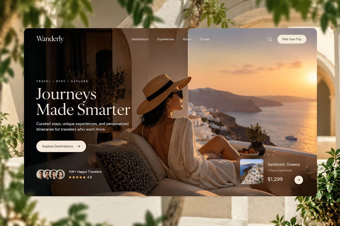

Elegance hero

Hi Contra people! I'm new here and would love to interact with other designers.
Web, Motion, Logo, Brand, UI/UX... if you are any kind of designer let's connect!
Here's a snippet of a new portfolio template I've been working on:


welcome in. that portfolio template scroll is smooth, framer?

Static designs can't always showcase their full potential. That's why your architecture projects need a website that helps them reach their full potential.

I love this really much