The network for creativity
Join 1.25M professional creatives like you
Connect with clients, get discovered, and run your business 100% commission-free
Creatives on Contra have earned over $150M and we are just getting started
Back to feedPost

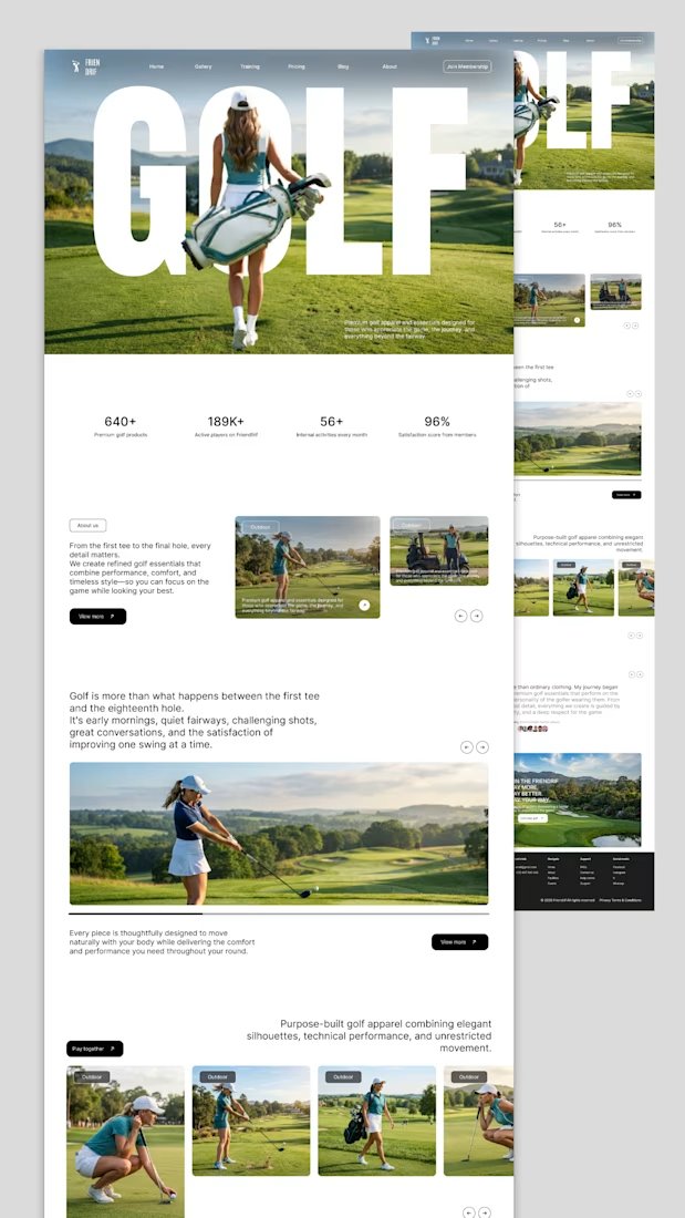
Friendrif; Golf Membership & Apparel Website
A premium website design for Friendrif, a golf membership platform and apparel brand built for players who appreciate the game beyond the scoreboard.
The design brief called for something that felt as refined as the sport itself: editorial, confident, and performance-driven. The hero section leads with large typographic display text layered over full-bleed photography, immediately communicating the brand's premium positioning without a single extra word.
Every section was designed to build trust progressively; social proof stats up front (640+ products, 189K+ active players, 96% satisfaction), followed by a content-rich product and lifestyle section that speaks to both the emotional and functional side of golf apparel.
Key design decisions:
Oversized display typography anchored to full-bleed hero imagery for instant brand impact
Clean white content sections to balance the visual weight of photography
Card-based product gallery with category tags for easy browsing
Stats bar to establish credibility above the fold
Warm, editorial photography direction that captures the lifestyle, not just the product
Deliverables:
Full homepage design (desktop + responsive)
Product gallery and collection sections
About / brand story section
Membership CTA and pricing navigation
Footer with navigation, support, and social links


The network for creativity
Join 1.25M professional creatives like you
Connect with clients, get discovered, and run your business 100% commission-free
Creatives on Contra have earned over $150M and we are just getting started





Related posts

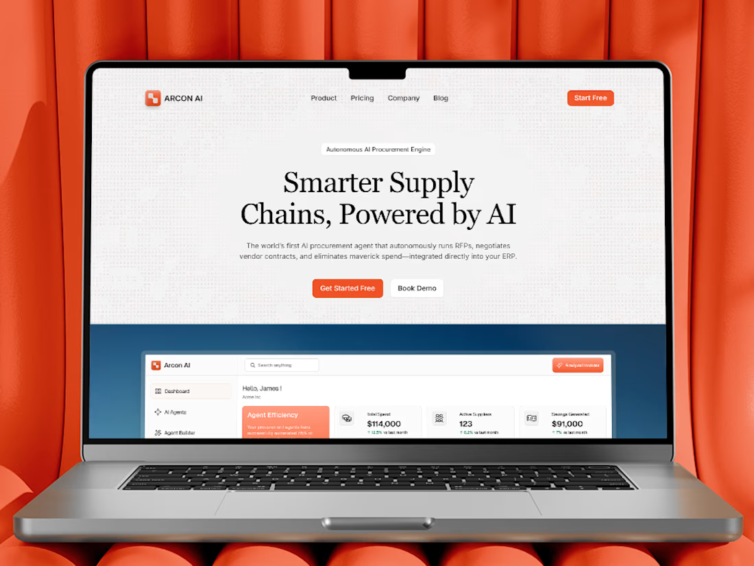
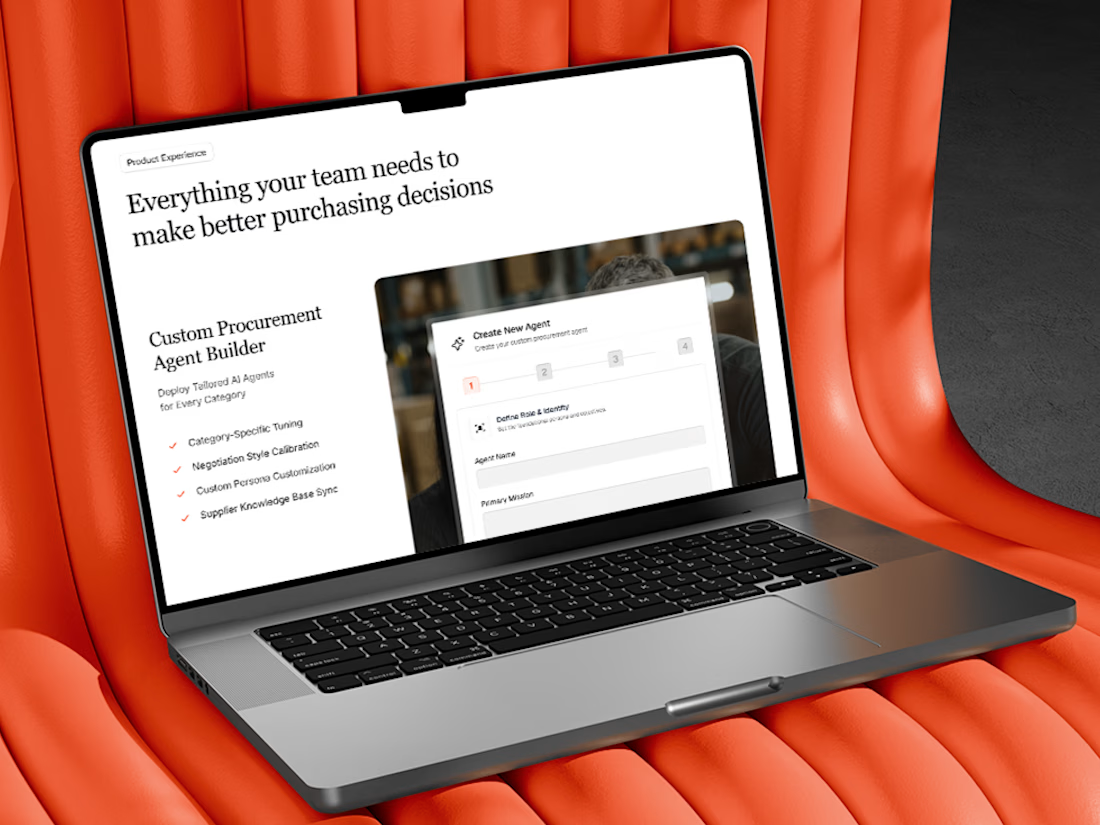
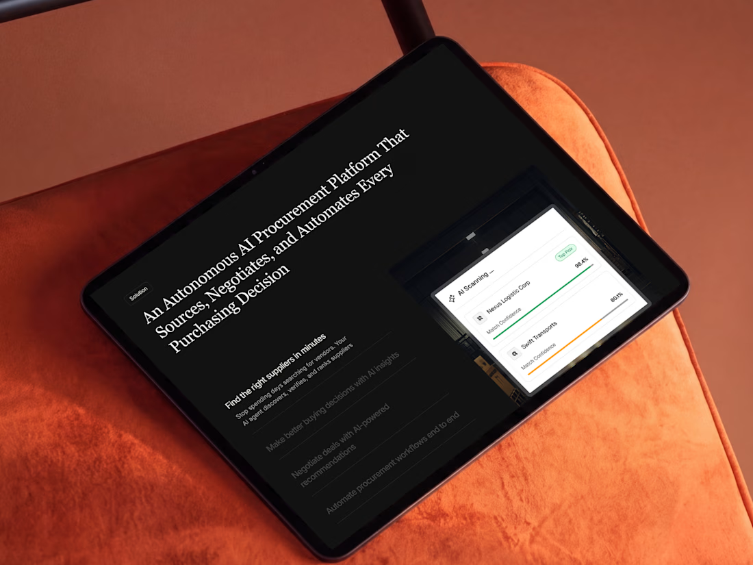
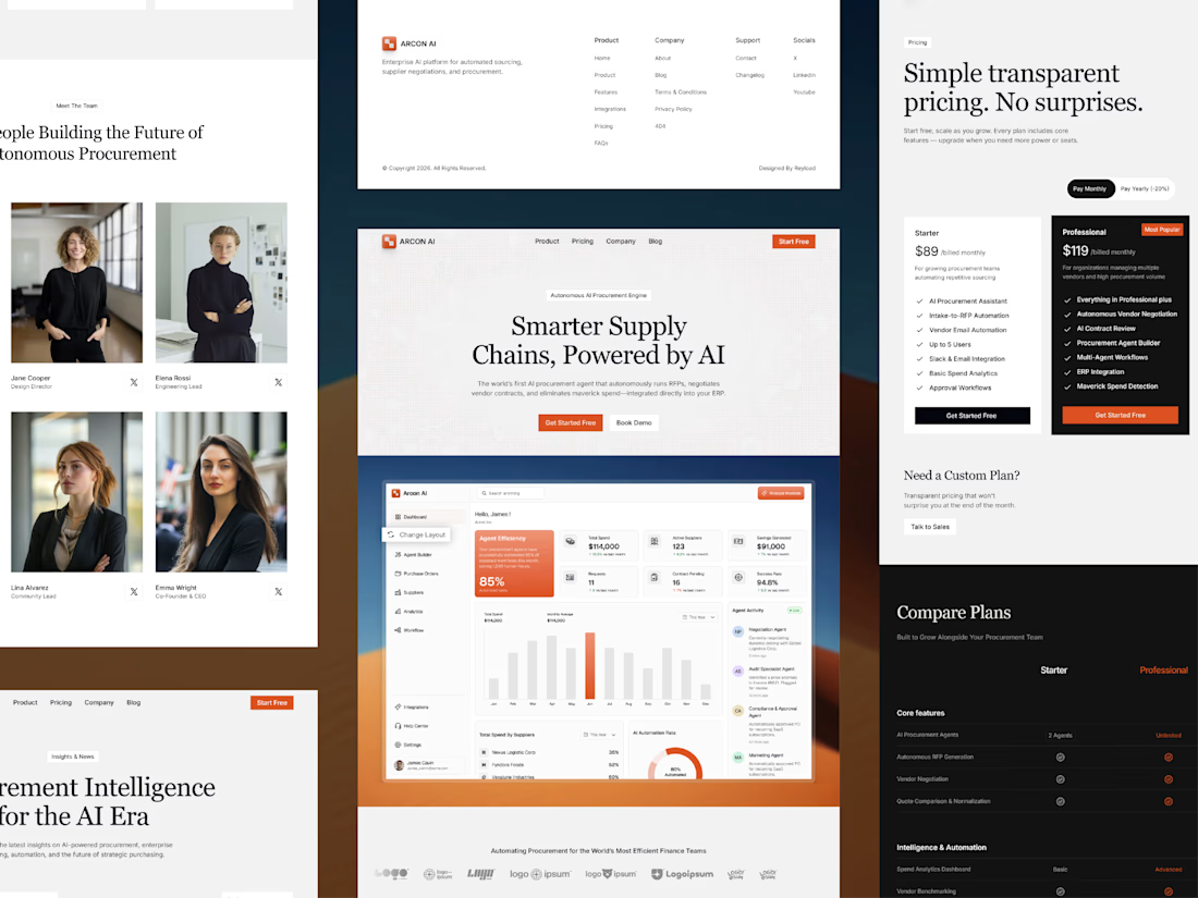
Free AI Framer template we designed for B2B SaaS.
Arcon AI is a premium Framer template built for AI startups, procurement platforms, enterprise SaaS, AI agents, workflow automation, supply chain technology, and B2B software. Designed with a modern enterprise aesthetic, it helps you launch a professional website that builds trust, showcases your product, and drives conversions.
Get it for free: https://www.framer.com/marketplace/templates/arconai/

Lovely work

Hero section of one my new templates. Preview it live to see the animations.
Relay is HTML or React you actually own.
Hand it to your AI assistant and it already knows how the thing is built.
Starting at $29
https://no-code.supply/templates/relay
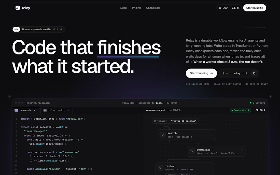

"Code that finishes what it started" is a great headline. Love that it's real HTML/React you own and not locked into a builder.

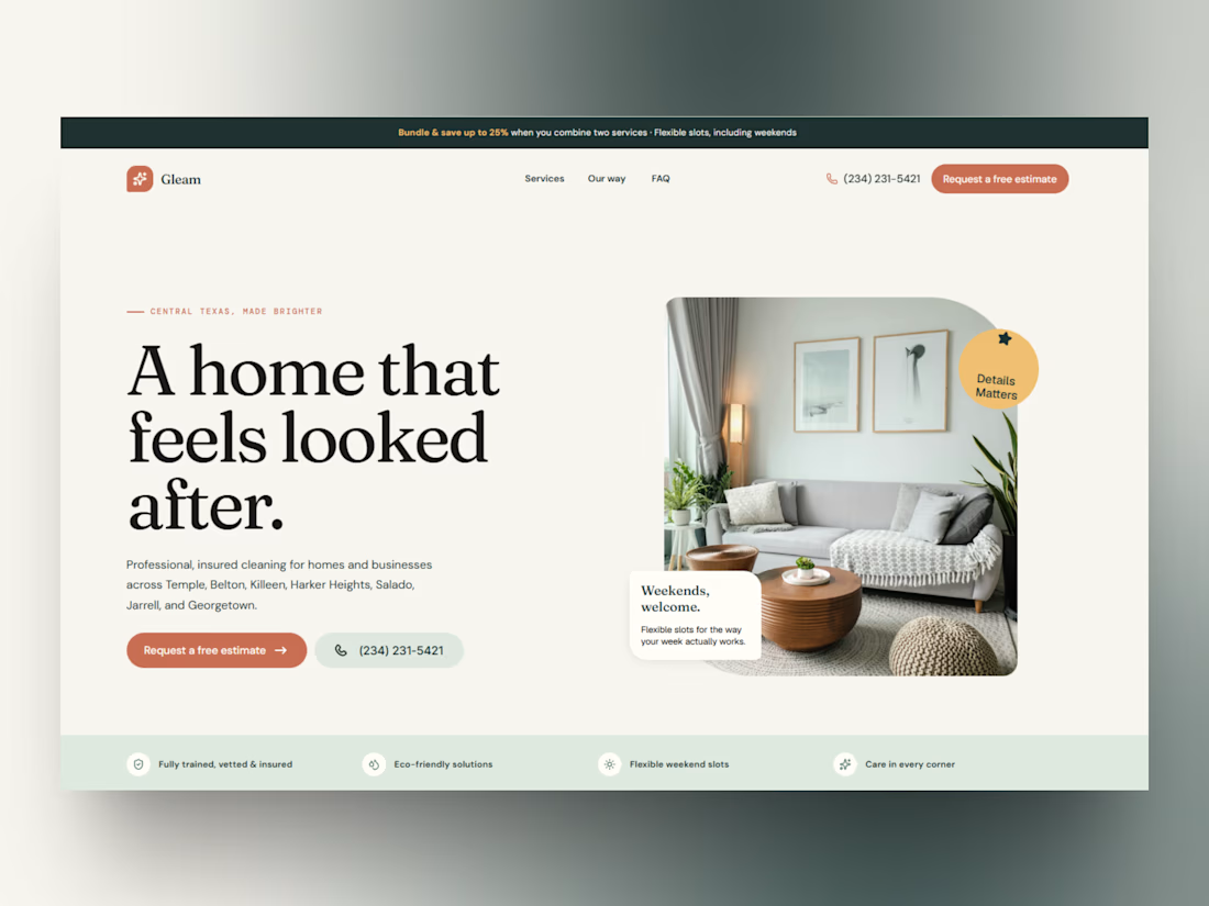
Hero section - "Gleam" Cleaning Service Framer Template 🧽
This pass focused on making the hero feel warm and trustworthy instead of clinical. A few things I leaned into:
Large serif headline ("A home that feels looked after") paired with a clean sans body for contrast
A promo bar up top for bundle discounts - easy to reuse for any offer
Floating micro-cards over the hero image ("Details Matters," "Weekends, welcome") to sneak in extra selling points without cluttering the copy
Trust bar at the bottom (insured, eco-friendly, flexible slots) so credibility shows immediately
Cleaning businesses live or die on trust - this hero is built to earn it in the first scroll.
More sections coming as the template comes together.