The network for creativity
Join 1.25M professional creatives like you
Connect with clients, get discovered, and run your business 100% commission-free
Creatives on Contra have earned over $150M and we are just getting started
Back to feedPost

I’m always impressed by the polished, high-quality content that creators and influencers produce. Then I visit their link-in-bio and wonder how much stronger it would feel if it matched the cinematic quality of their videos.


The network for creativity
Join 1.25M professional creatives like you
Connect with clients, get discovered, and run your business 100% commission-free
Creatives on Contra have earned over $150M and we are just getting started

Challenges
View all


Related posts


Which 404 page design for a world-class film production studio would you choose - Pink or Black? ✨👠
404pagecreativedesignfashionwebsiteCreative Design Frontend DevelopmentWeb DesignFigmaJavaScriptWebflow


31 voted
40%
46 voted
60%
77 votes
Closed

Black version looks more editorial, tho the pink one is rly eye-catching

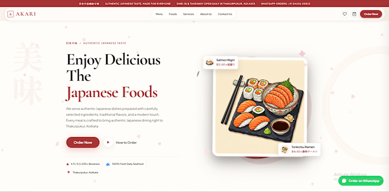
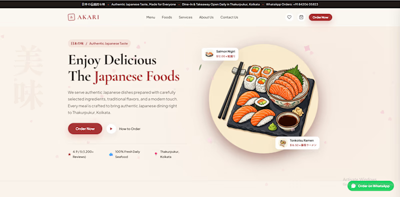
Which AKARI Design Looks Better? 🍣
I’ve been working on AKARI (あかり) — a Japanese food restaurant website that I’m building both as a real-shop-ready concept and as a showcase of my web design & development work.
I’ve made two different versions of the design, and I want the Contra community to decide which direction looks better.
🅰️ Option A
Design 1 — More bold, structured and brand-focused.
🅱️ Option B
Design 2 — More minimal, clean and modern.
🅲️ Option C
Neither? 😅
Tell me what you would change, add, or completely redesign. I’m open to ideas!
👇 Vote A, B, or C in the comments.
Which one would you choose for a Japanese restaurant?
🍣 AKARI — あかり
Authentic Japanese Taste, Made for Everyone.
6 voted
46%
7 voted
54%
13 votes
Closed

I’d lean toward Design A—the bolder structure gives the restaurant a clearer point of view, while the centered dish still keeps the page inviting. The restrained palette and generous whitespace make the food do the talking.

Premium handloom saree storefront focused on heritage weaving, curated collections, product discovery, search, shopping bag and luxury fashion presentation.

Hey Ansuman, You really did the great Job. Just minor correction are there which make this website from 6/10 to 8-9/10.
You can make your hero section in split screen and if possible use polygonal layout.
Add Slow Transition + Hover + 0.5 sec animations.
Where Also Focus on Negative spaces which giving emptiness vibe.