The network for creativity
Join 1.25M professional creatives like you
Connect with clients, get discovered, and run your business 100% commission-free
Creatives on Contra have earned over $150M and we are just getting started
Back to feedPost

Rō - Japanese Perfume Creative Concept


The network for creativity
Join 1.25M professional creatives like you
Connect with clients, get discovered, and run your business 100% commission-free
Creatives on Contra have earned over $150M and we are just getting started











Related posts

A flower that inflates arrives in the mail.
Next month, a phone made of shell.
STILL LIFE SERVICE. Case study dropping soon.
Which object earns your shelf? Reply below.
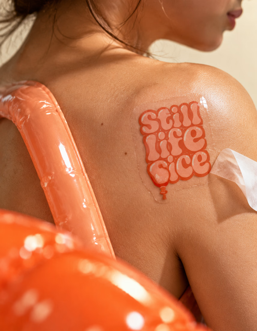

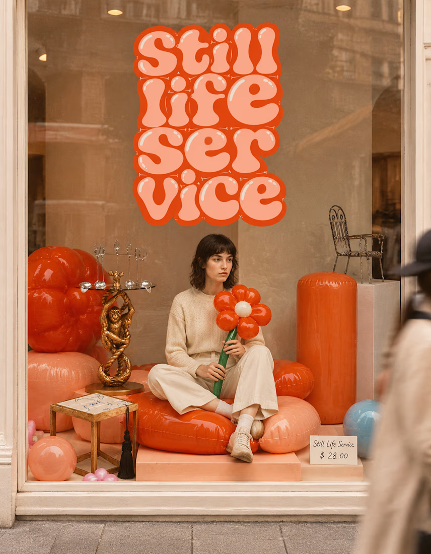

The inflatable flower. Only houseplant I'm guaranteed not to kill. Also, a new object every month is a sneaky good retention hook, people will stay subscribed just to see what's next.

Built this in Framer as a concept project. Goal was to make it feel run by ex-journalists. Choices: editorial serif (Libre Baskerville), a dark photo with one color accent, and copy that positions against blast-style PR.
Where I’m unsure: text legibility over the photo and whether the two CTAs compete. What would you change?



That's great design it feels professional I like how the background mixed with interface ❤️❤️
Great job Cheree🎉🎉

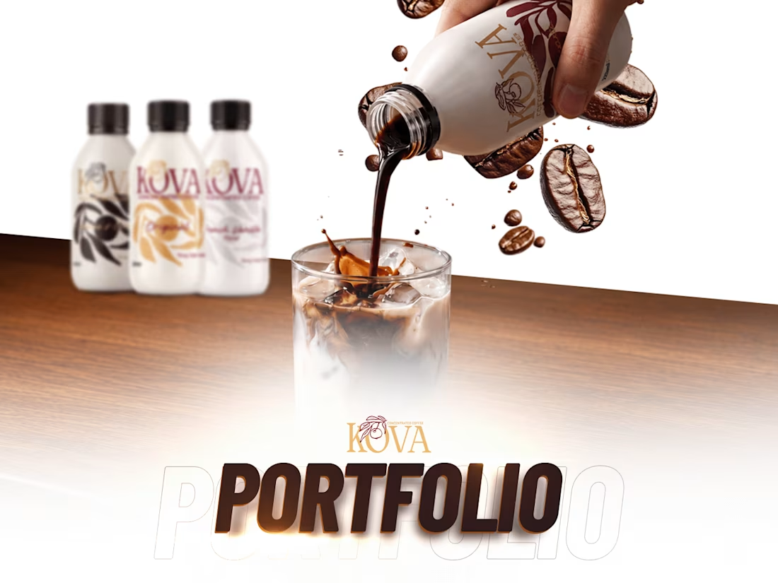
KOVA is a coffee concentrate made for busy mornings and long workdays: rich, smooth coffee that's quick to make and easy to enjoy.
I brought KOVA to life online, with one consistent look across every channel:
Website: designed and managed on Shopify, built around the product and easy to buy from
Social media: content and reels that keep the feed fresh and on brand
Ads: campaigns that put KOVA in front of the people it's made for
Need a website, content and ads that work together? Message me here on Contra. Which part of this project would you like to see in more detail?

Oh that's unique great job Awais 🎉🎉🎉
The visuals and motion effects are great ❤️❤️