The network for creativity
Join 1.25M professional creatives like you
Connect with clients, get discovered, and run your business 100% commission-free
Creatives on Contra have earned over $150M and we are just getting started
Back to feedPost

What I Built
Ikigai Path is a mobile-first discovery app which helps users discover their life purpose and career alignment within 1 minute. Developed from scratch on Bubble, it helps the user navigate through a well-defined 5-step process (Life Stage, Passions, Skills, Mission and Market) and then uses Google Gemini AI, via API connector, to collate the responses and provide them a beautiful formatted Ikigai Result Card.
Why I Built It
Discovering your purpose or finding your 'Ikigai' (reason of being) in career shifts can be abstract and time-consuming. I have made this philosophical concept into a fun, mobile-first application which helps people discover themselves.
Technical Details
Mobile First UX/UI: Developed on responsive mobile layouts with button-press interactive feedback states and transitions during loading screens.
AI Integration at the backend: Integrated with Google Gemini API to help analyze qualitative inputs and create purpose statements in real time.
Dynamic Data Formatting: Uses asynchronous workflow and dynamic parsing to help get a well-formatted output in form of a heading and typography.
I hope you like it.😊


The network for creativity
Join 1.25M professional creatives like you
Connect with clients, get discovered, and run your business 100% commission-free
Creatives on Contra have earned over $150M and we are just getting started





Related posts

Just wrapped up a new redesign, and I’m really happy with how it turned out. 💻
Can’t wait to share more details and the live site soon...



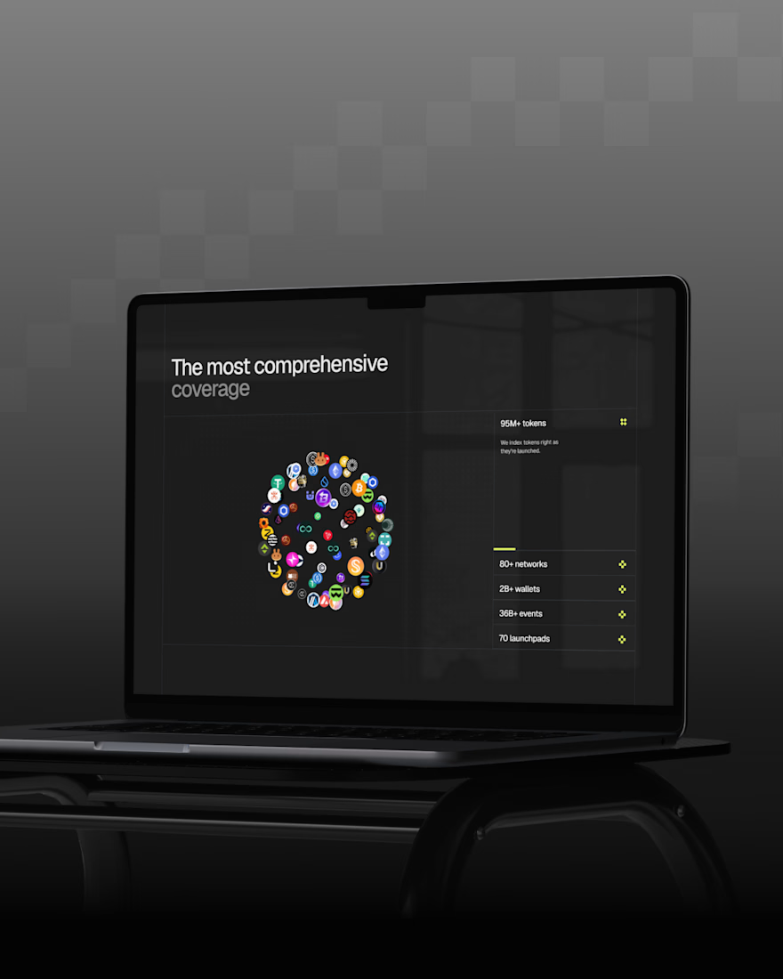

Sitting on this before the reveal instead of rushing to post it says you're already happy with how it landed, so now I'm curious what part of the redesign you're most excited for people to see once the site goes live.

New case study: the landing page for REVAI, a concept AI sales platform.
The brief I gave myself was structural, not decorative: design a page where every section earns the next one. Hero makes one claim and gets out of the way. The value proposition comes before any feature gets named — because a feature nobody understands yet is just noise. Proof (testimonial, logos) sits right before the final ask, not scattered earlier where it does nothing.
Art direction followed the same logic — high contrast where the page needs to make a claim, quieter and more editorial where it needs to build trust. The layout isn't there to look good in isolation. It's there to move someone from "what is this" to "I trust this" in one scroll.

Love the colors dude! Hell of a work🔥

I built MobiFix Nairobi : A Mobile auto care company.
I rebuilt the moment an inbound “Can I book with you?” becomes “You’re booked.”
MobiFix Nairobi is a fictional mobile automotive service business built around one simple problem: booking vehicle services often means back-and-forth messages, checking availability, coordinating technicians, confirming locations, and handling payments manually.
I designed the experience so the customer can:
→ Choose a service
→ Select their vehicle
→ Enter their location
→ Pick an available date and time
→ Add their details
→ Review the booking
→ Complete payment
→ Receive a booking confirmation and code
Behind the scenes, the business gets a real dashboard with bookings, calendar, customers, services, technicians, availability, analytics, and website management — all backed by real data.
The goal was to make the entire journey feel less like “requesting an appointment” and more like simply getting booked.
Built with Lovable and Lovable Cloud.
MobiFix: https://carmobifix.lovable.app
(I haven't submitted the actual project link because of the environment variables, I'm using Lovable Cloud.)

Looking great...