The network for creativity
Join 1.25M professional creatives like you
Connect with clients, get discovered, and run your business 100% commission-free
Creatives on Contra have earned over $150M and we are just getting started
Back to feedPost


This is my first Framer template. It's called Kamayari.
"Kamay" means hand. "Yari" means made. Made by hand.
It's for furniture, homeware and craft shops that don't sell through a checkout. Their customers want to see the piece, ask about it, and talk to someone before they buy.
So the whole site follows one rule. Show the product first. The enquiry follows.
This one has a few firsts for me:
1. My first try at micro interactions inside the Framer canvas
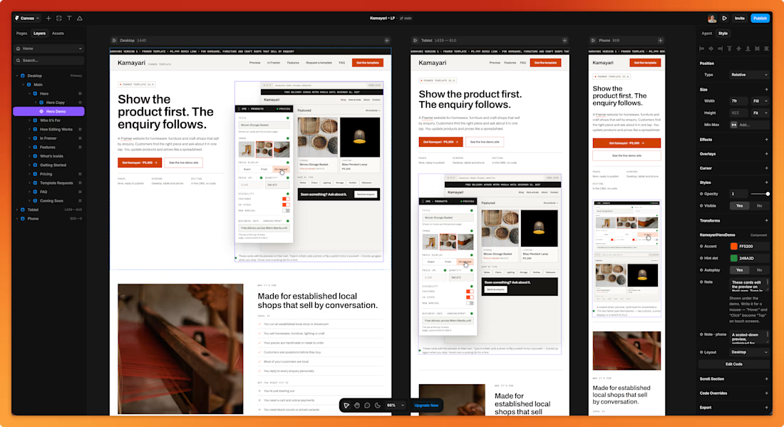
2. My first dynamic visual elements. The editing previews on the page aren't videos. They're actual elements built in the canvas.
3. The owner runs the site from the CMS. Products, prices, photos, hours, brand color, dark mode. No code.
It has 9 pages, 39 sample products, filters, and layouts for desktop, tablet and phone.
I'm not someone who keeps a template as-is. This one is a starting point for shops that aren't ready for a custom build yet.
Heads-up:
The template itself works, but the checkout links and some of the forms are still in testing. So it's not fully functional yet.
Here's what I'd like your read on.
Open the page and the demo. Can you tell who it's for in the first few seconds? When you hit enquire, is it clear what happens next?
Page: kamayari.framer.website


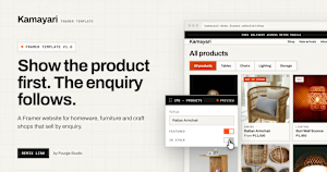
kamayari.framer.website
Kamayari — Framer template for shops that sell by enquiry
A Framer website template for homeware, furniture and craft shops that sell by enquiry. Customers find the right piece and ask about it in one tap.
Open to hear your feedback.
Here's a quick preview inside the Framer Canvas.
The network for creativity
Join 1.25M professional creatives like you
Connect with clients, get discovered, and run your business 100% commission-free
Creatives on Contra have earned over $150M and we are just getting started











Related posts

A little peek at the brand work we did for Elio Mortgage.
A warm, approachable identity full of warm vibrant colors paired with soft sun rising inspired gradients, inner glows and custom illustrations & more. Loved this direction!
Full case study coming soon, from process to final identity.
Plenty of logo explorations to share too!


That color palette takes the whole identity to a different level!! I loove it.

🍏 Botella - my latest template, now live on the Framer Marketplace 🍇
🍷 Designed for cans, wineries, vineyards, and premium beverage brands. Soooo, Botella combines elegant typography, refined layouts, and immersive visuals to create a sophisticated digital experience 🍾
🌎 Preview it: https://www.framer.com/marketplace/templates/botella/

Amazing

