The network for creativity
Join 1.25M professional creatives like you
Connect with clients, get discovered, and run your business 100% commission-free
Creatives on Contra have earned over $150M and we are just getting started
Back to feedPost

Home Renovation Website Design & Local SEO
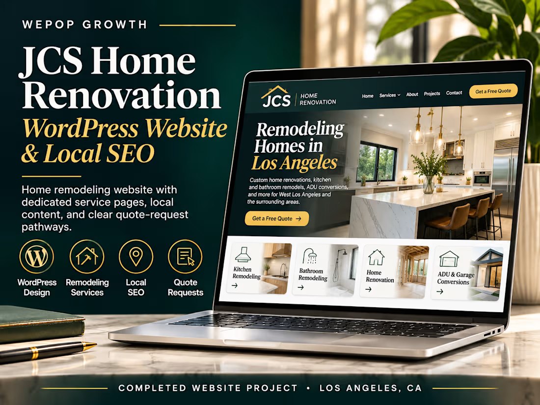
I designed and developed a WordPress website for JCS Home Renovation, a residential remodeling and general construction company serving Los Angeles and surrounding communities.
The project focused on building a professional online presence that showcases the company's remodeling expertise, organizes its services, and makes it easier for homeowners to request estimates.
What I Built
WordPress Website Design: Professional layouts, organized navigation, and mobile-responsive design.
Dedicated Service Pages: Content for kitchen remodeling, bathroom renovations, home improvements, and ADU/garage conversions.
Local SEO Structure: Location-focused pages targeting relevant communities throughout the Los Angeles area.
Lead Generation: Prominent quote request buttons and customer contact pathways.
Content Organization: Clear service descriptions, company information, and project-related content.
On-Page SEO: Structured headings, service-specific content, and internal links to help search engines understand the website.
Responsive User Experience: Layouts designed to help visitors navigate services across desktop and mobile devices.
Project Outcome
A completed home renovation website combining professional presentation, service-specific content, local SEO structure, and accessible quote request options.
Live Website: https://jcshomerenovation.com/


The network for creativity
Join 1.25M professional creatives like you
Connect with clients, get discovered, and run your business 100% commission-free
Creatives on Contra have earned over $150M and we are just getting started



Related posts

🎨 Brand and web design for Nura, the AI tool for real estate
See Case Study here


Amazing work



Looks great! What about readability though?
Text seems low contrast to me. Although I have a poor vision and most things seem too small and low contrast to me.
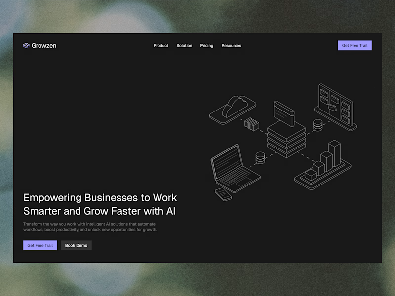
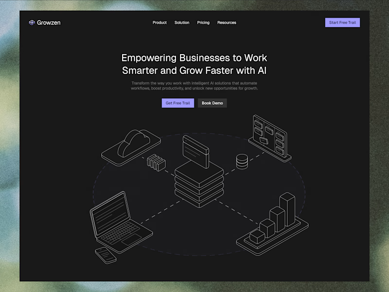
Designed a website concept for AI powered platform.
I wanted to give it a clean, minimal with a custom isometric illustration in the hero section.
Which version do you like better?
19 voted
59%
13 voted
41%
32 votes
Closed
