The network for creativity
Join 1.25M professional creatives like you
Connect with clients, get discovered, and run your business 100% commission-free
Creatives on Contra have earned over $150M and we are just getting started
Back to feedPost

I design products where brand, UX, and storytelling function as one system.
This concept reimagines interior staging as intuitive and composition-driven. I built it end-to-end: brand identity, UI/UX, and AI video to bring the experience to life.
The interface is simple—tap, select, compose. No friction, no guesswork. A clean, spatially-aware system that lets users build fully realized spaces in seconds. Every detail, from hierarchy to motion, is designed to feel natural and inevitable.
The brand leans into restraint: warm, minimal, editorial. It’s not trying to impress—it just works.
To demonstrate the product, I created a cinematic 9:16 reel using AI workflows, blending real timelapse staging with UI to show the transformation.
Clear thinking, strong taste, full-stack execution—from idea to final output.


The network for creativity
Join 1.25M professional creatives like you
Connect with clients, get discovered, and run your business 100% commission-free
Creatives on Contra have earned over $150M and we are just getting started





Related posts

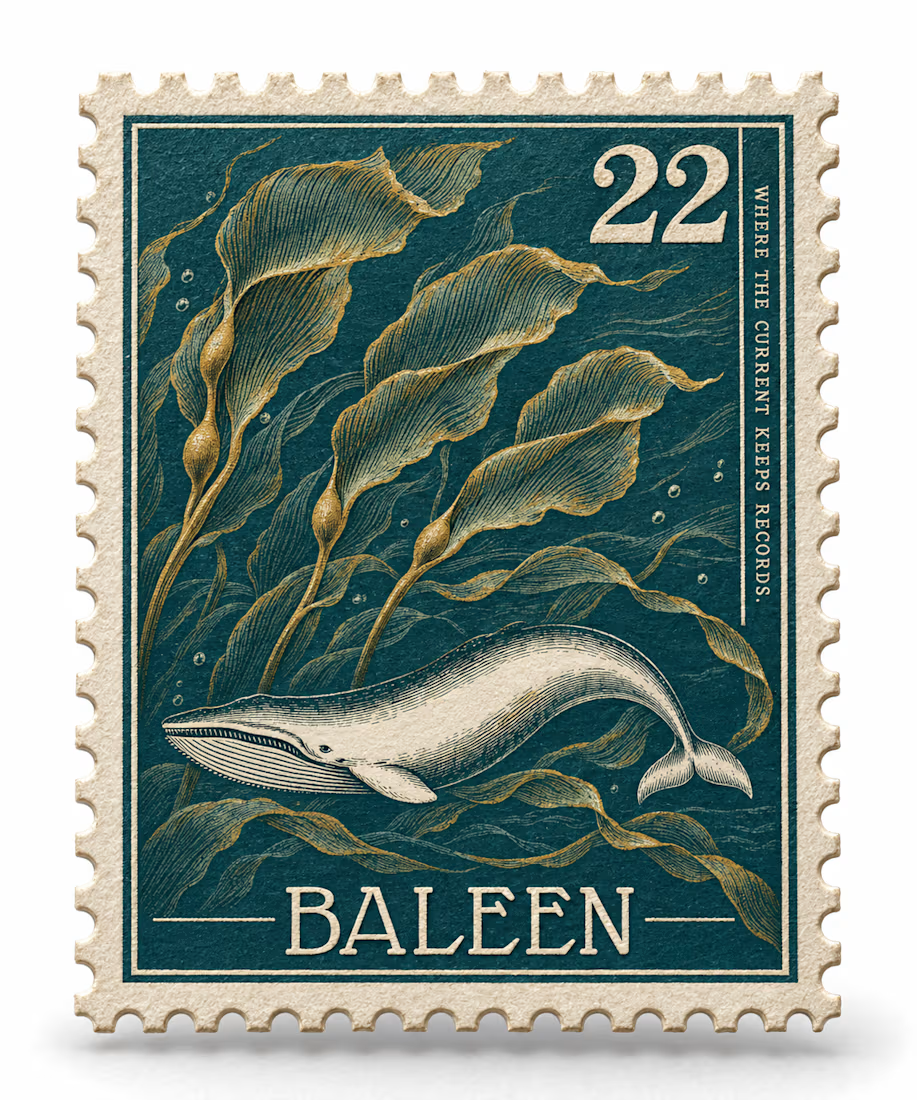
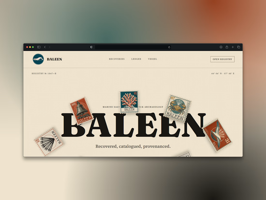
What if a salvage company's brand looked like it belonged in a stamp album, not a treasure map?
Introducing BALEEN — marine salvage & shipwreck archaeology, built on vintage natural-history stamp DNA. Every object recovered, catalogued, provenanced.
Website here


Which hero direction feels right for this founder-focused brand?
While working on the homepage for Sean Parsons, a brand focused on empowering non-technical founders to launch tech startups, I explored two different visual directions for the hero section. Same message, same structure, just a different mood and color system.
Option 1 - Warm Olive. Dark, grounded, and editorial, giving a warm, established, expert feel.
Option 2 - Light Purple. Clean, modern, and vibrant, giving a fresh, SaaS-like, approachable feel.
Would love your honest UX/UI take, which direction feels more trustworthy, engaging, and aligned with a founder-focused brand, and why?
25 voted
69%
11 voted
31%
36 votes
Closed

I like worm Olive most because it has different personality

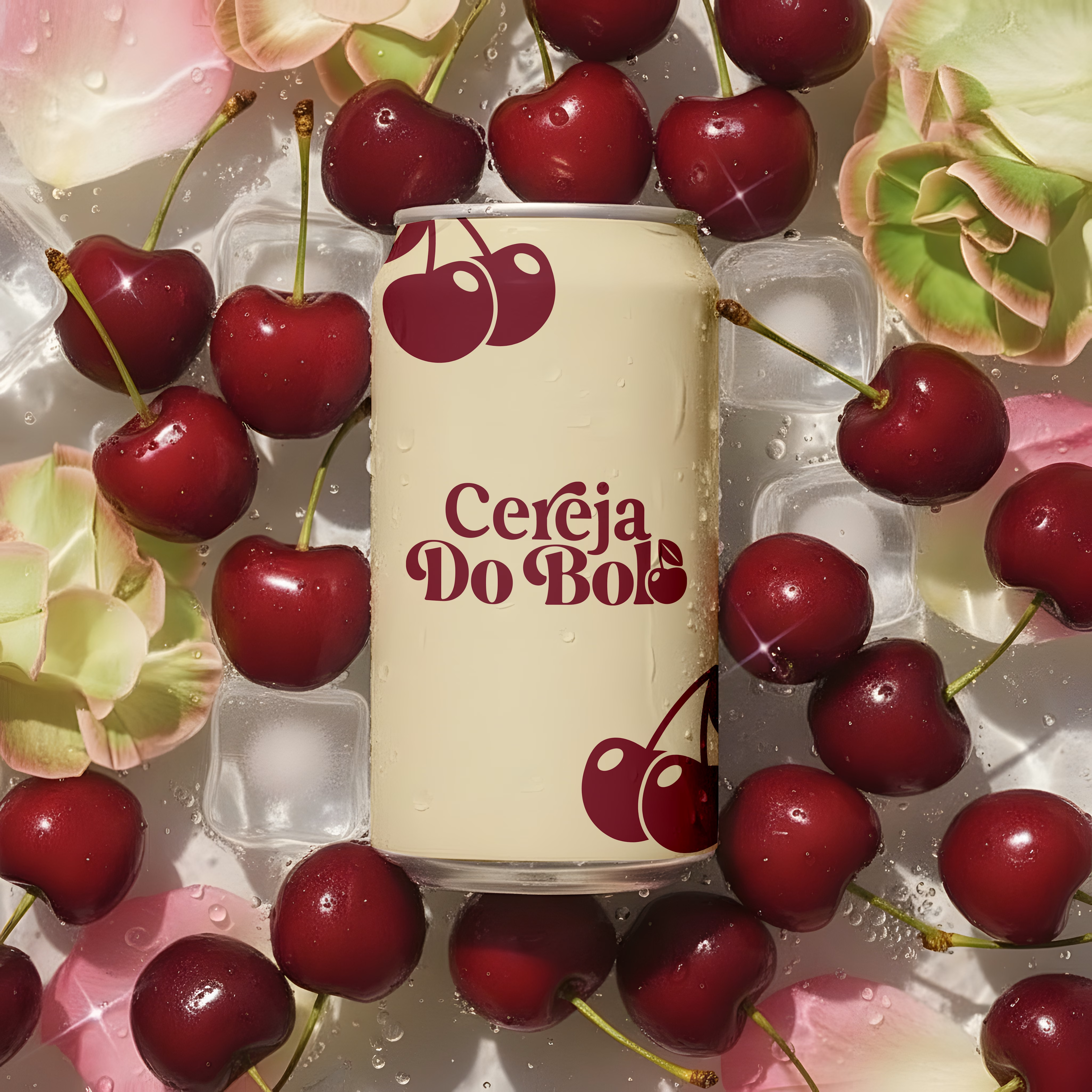
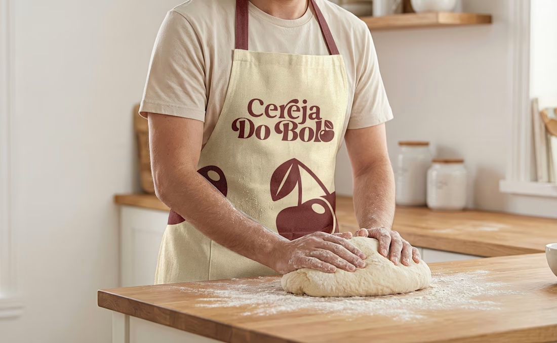
Brand Identity & Packaging Design
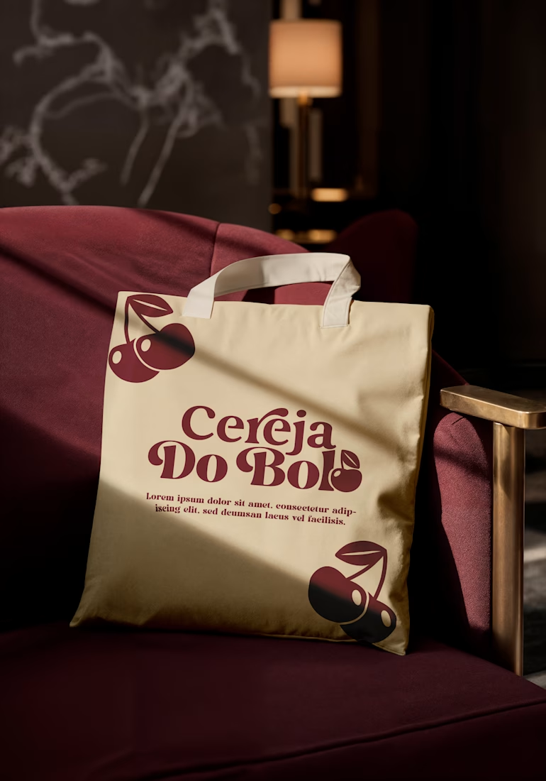
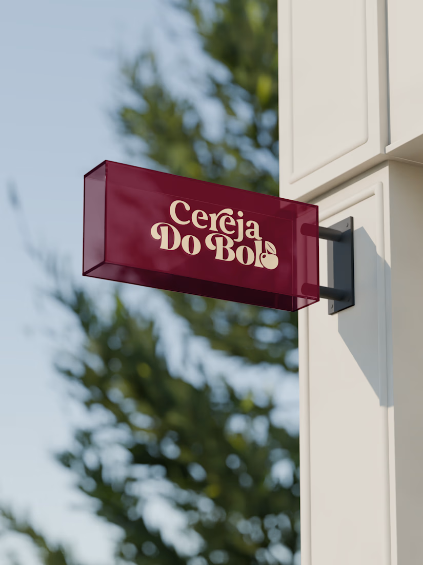
A complete visual identity and packaging concept for Cerveja do Bolo, including branded packaging, merchandise, and outdoor signage. I developed the visual direction and applied the brand consistently across multiple touchpoints to create a cohesive and recognizable identity.



Wow, love it