The network for creativity
Join 1.25M professional creatives like you
Connect with clients, get discovered, and run your business 100% commission-free
Creatives on Contra have earned over $150M and we are just getting started
Back to feedPost

Most SaaS products fail for one reason, they're built for the developer, not the user.
When I designed the BitTech, I had one goal: make a data-heavy interface feel effortless to navigate, even for non-technical users.
Here's what I focused on:
→ Simplified the core workflow to 3 steps
→ Kept the analytics view clean and scannable
→ Built a full component system so the team could scale without breaking the design
The result: a product that looks premium and actually makes sense to use.
If your SaaS product needs a design that works as hard as your product does — let's talk.
#UIUX #SaaSDesign #ProductDesign #StartupDesign #Figma #UIDesign


The network for creativity
Join 1.25M professional creatives like you
Connect with clients, get discovered, and run your business 100% commission-free
Creatives on Contra have earned over $150M and we are just getting started
Related posts




Awesome dude

AI can generate a dashboard. But can it give a product its own identity?
The first design was created by my client using AI a familiar dashboard style you've probably seen across countless AI-generated products.
I redesigned it to feel less generic and more intentional, with a distinctive visual identity, clearer hierarchy, and an experience built around meaningful celebrations.
The goal wasn't just to make it look better. It was to make it feel like its own product.
What do you think is missing from most AI-generated interfaces?
#ProductDesign #UIDesign #AI

5 voted
23%
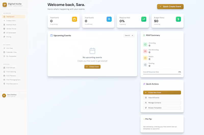
17 voted
77%
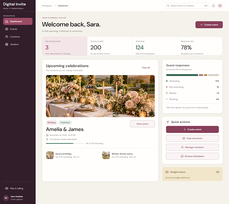
22 votes
Closed

I think personality is what makes a product stand out. A clean design is good, but it should also feel unique and memorable. 👏

Business data often lives across payment, analytics, CRM, advertising, and inventory platforms. Metrik brings those signals together in one dashboard built for startups and small businesses.
See revenue, orders, customers, and business health at a glance. Compare advertising spend and ROAS across channels, explore visual KPI cards, and use smart alerts to spot unusual changes and potential risks.
The interface pairs a clean layout and rounded components with soft gradients, colorful analytics, and clear visual hierarchy, helping make business performance easier to follow.