The network for creativity
Join 1.25M professional creatives like you
Connect with clients, get discovered, and run your business 100% commission-free
Creatives on Contra have earned over $150M and we are just getting started
Back to feedPost
Taste Test





Option 2 is more attractive ❤️❤️

Option 2. The drop shape in the D reads clearly as a body oil brand.

I’d go with Option 2. The shape feels more distinctive and memorable.

cool
The network for creativity
Join 1.25M professional creatives like you
Connect with clients, get discovered, and run your business 100% commission-free
Creatives on Contra have earned over $150M and we are just getting started



Related posts

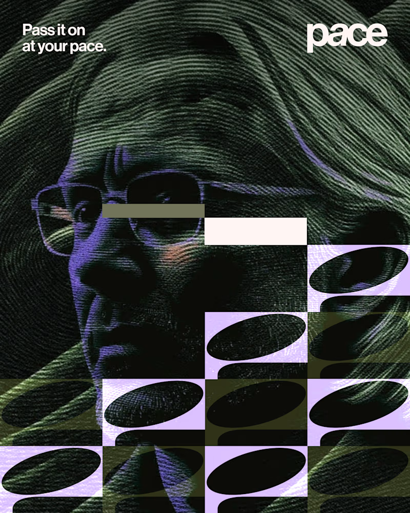
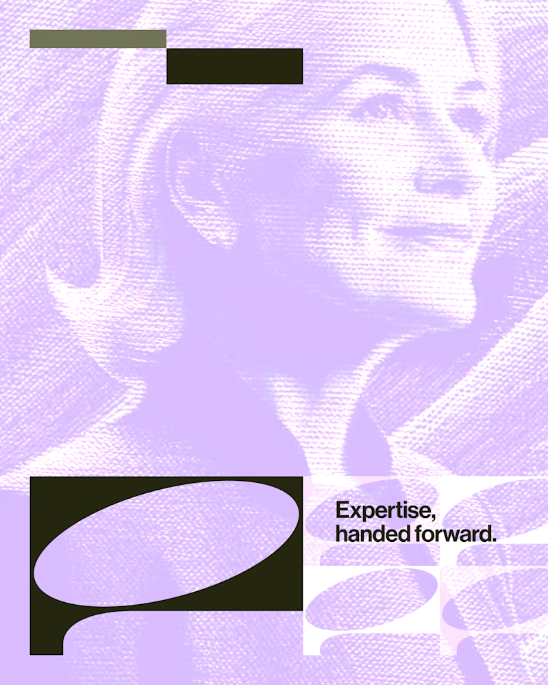
Experimental layouts for Pace. Which one do you like?
23 voted
52%
21 voted
48%
44 votes
Closed

Looks cool.

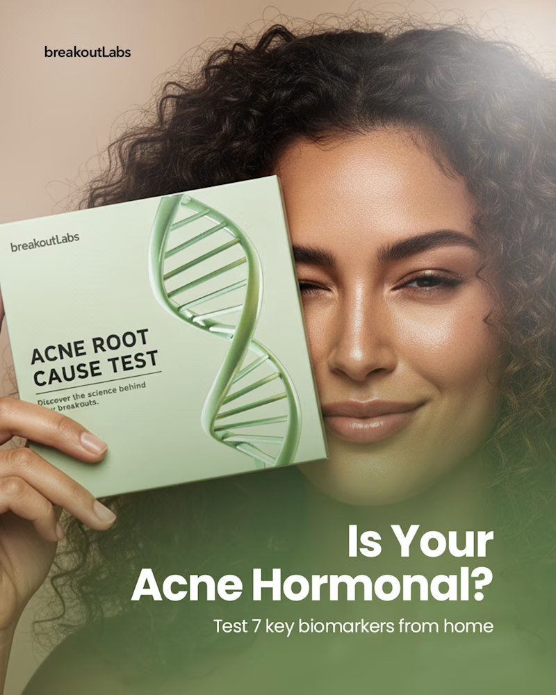
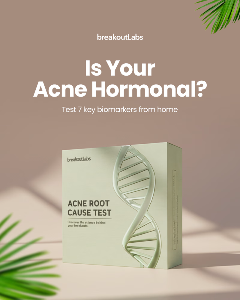
Same headline, same offer, two completely different approaches. Which one would make you stop and tap on an ad for a home hormone test?
Option A puts a real face behind the product.
Option B lets the product do all the talking.
Vote below and tell me why, I’m collecting honest feedback on what feels most trustworthy and clickable.


8 voted
89%
1 voted
11%
9 votes
Closed

Real Face for me. The model holding the box next to the headline feels more trustworthy, and her look leads straight to the question. The product only version reads like a catalog shot.

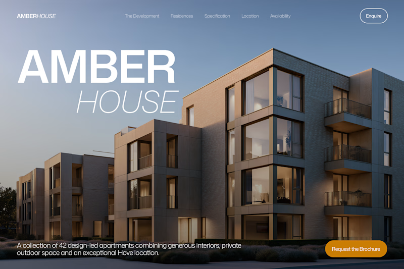
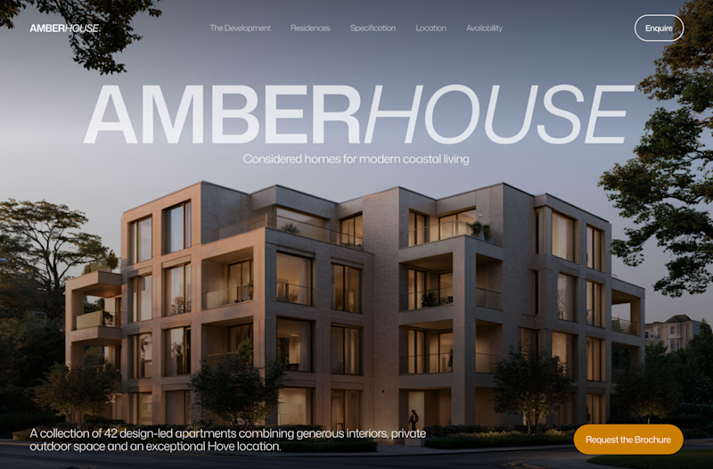
Which hero would you choose — 1 or 2?
Two directions for Amber House, my real estate website template. The first pairs a closer architectural crop with an asymmetric layout. The second gives the building more breathing room, with a wide view and a centered headline.
Same template, two different first impressions. Which feels stronger to you, and why?
24 voted
59%
17 voted
41%
41 votes
Closed

I will go with Bold & Asymmetric!