The network for creativity
Join 1.25M professional creatives like you
Connect with clients, get discovered, and run your business 100% commission-free
Creatives on Contra have earned over $150M and we are just getting started

The network for creativity
Join 1.25M professional creatives like you
Connect with clients, get discovered, and run your business 100% commission-free
Creatives on Contra have earned over $150M and we are just getting started






Related posts


Am I the only one, or are the comments here on Contra being written by an AI?
TBH, it really bothers me (a looottt); if you’re interested in someone else’s work, the least you could do is show some respect in the comments.

For real? Haven't thought about that but I guess it's pretty normal these days 🤷🏻♂️


Do we have a Contra application for iOS?


Not as of now and i really miss that

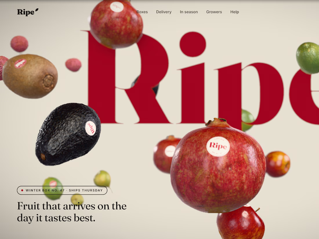
Landing page for a tree-ripened fruit subscription brand, in four languages, with a real-time 3D hero. Art direction, design and front-end development.

Cropping the wordmark off the frame while the fruit floats in front makes Ripe feel editorial rather than grocery. With the site in four languages, did the oversized serif hold up across the different scripts, or does the 3D hero end up carrying the brand on its own?