The network for creativity
Join 1.25M professional creatives like you
Connect with clients, get discovered, and run your business 100% commission-free
Creatives on Contra have earned over $150M and we are just getting started
Back to feedPost

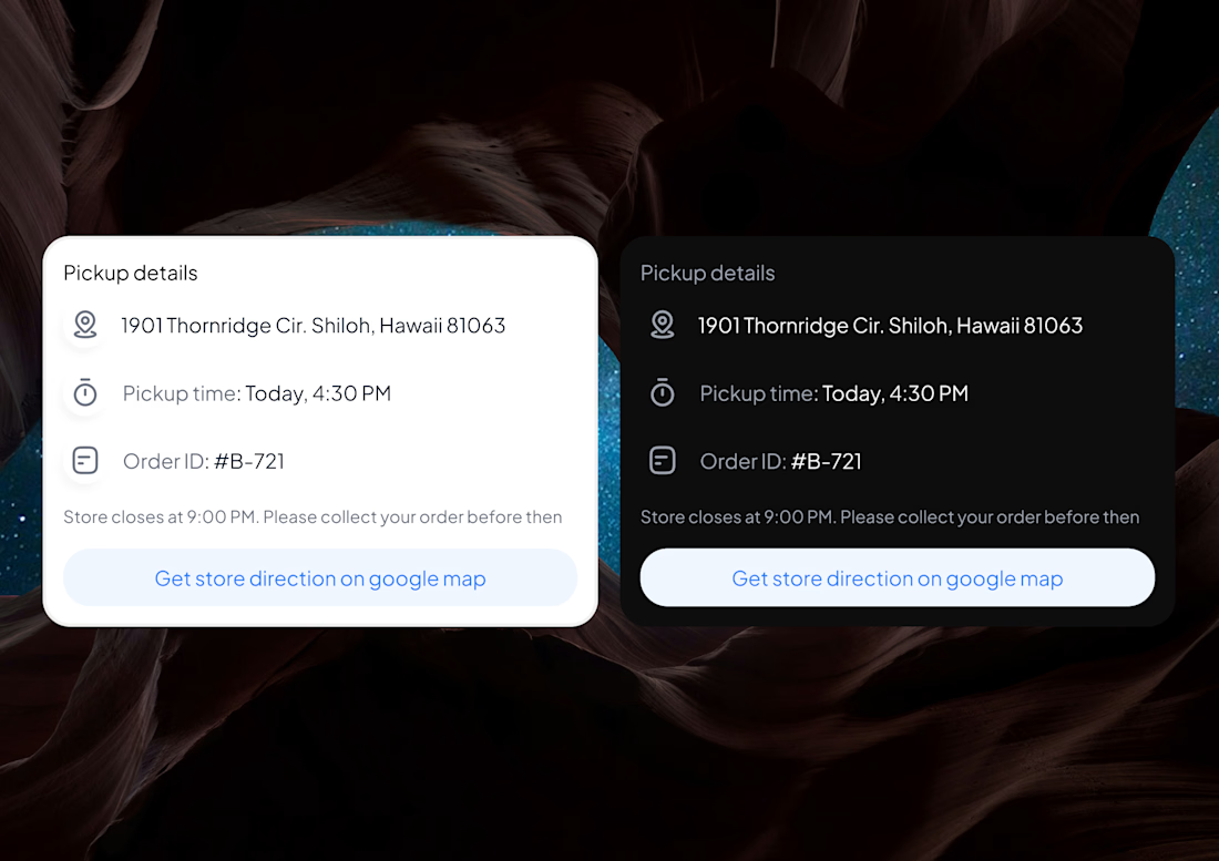
Day 7 of sharing my design
One thing I keep noticing while designing:
Clarity vs Aesthetics
A design can look beautiful, but if users don’t understand what to do next… the design has failed.
Clean visuals are important.
Nice colors and layouts matter.
But clarity should always come first.
Users should instantly know:
• what this screen is about
• what action they can take
• where to click
Aesthetic makes people stay.
Clarity helps them move.
Good design finds the balance between both.
Got a product idea you want to build?
Or a website that isn’t converting or retaining users?
Let’s fix that.
Send me a DM — I help founders design products that attract users, convert better, and scale faster with AI-powered workflows.


The network for creativity
Join 1.25M professional creatives like you
Connect with clients, get discovered, and run your business 100% commission-free
Creatives on Contra have earned over $150M and we are just getting started
Related posts

A bit of a self-flex today. I am still pretty proud of my own portfolio website, although its been a year already its almost time to redesign it again xD
check it out on www.dario.io


Playful but clean! Man, I absolutely love your 'Detach' project


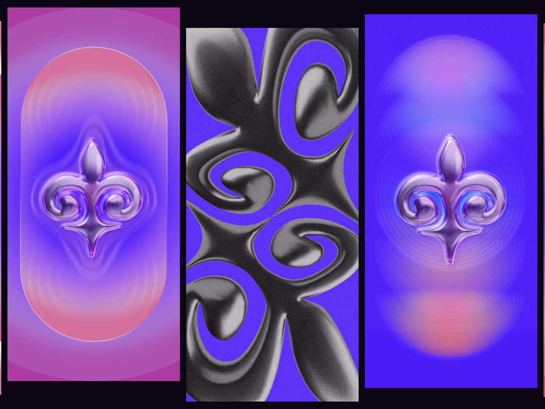
Some experiments with liquid metal, radial gradients, and the line between ornament and abstraction.


Fellow Contramaxxer 🤝🏻


Trending
aivideo
AI video tools are moving at warp speed. Which ones are you experimenting with?
illustration
Handcrafted illustration is bubbling up across the web. What are you drawing lately?
aidesignflow
AI tools are redefining design work. What's your current workflow?
returntonature
Spring is a reset for creativity. What’s inspiring you outside the screen right now?
freelancerlife
Freelancer life is wins, pivots, and everything in between. What’s yours right now?