The network for creativity
Join 1.25M professional creatives like you
Connect with clients, get discovered, and run your business 100% commission-free
Creatives on Contra have earned over $150M and we are just getting started
Back to feedPost

The most dangerous brief a developer can get from a founder usually boils down to four simple words: give me a site
Founders are swamped and struggling to grow their business while working 12-hour days. They don't want to debate page structure or content flow
They want an architect who can handle the entire problem from A to Z. I saw this exact dynamic on a recent project for luxury golf simulators
The CEO had tried to build a platform himself, couldn't make it work, and told me to skip the wireframes. If you bypass planning here, you end up rebuilding the layout three times
I ran my standard research and wireframing process anyway. I simply presented the work differently
Instead of asking for a strategy review, I showed him the wireframe and asked if it matched what he imagined. We finalized the architecture immediately
I also optimized the booking flow so visitors stop abandoning it halfway. The platform launched with seven fully custom pages in under two weeks
When clients are overwhelmed, you don't force them to learn your workflow. You just do the heavy lifting behind the scenes

The network for creativity
Join 1.25M professional creatives like you
Connect with clients, get discovered, and run your business 100% commission-free
Creatives on Contra have earned over $150M and we are just getting started







Related posts

I built MobiFix Nairobi : A Mobile auto care company.
I rebuilt the moment an inbound “Can I book with you?” becomes “You’re booked.”
MobiFix Nairobi is a fictional mobile automotive service business built around one simple problem: booking vehicle services often means back-and-forth messages, checking availability, coordinating technicians, confirming locations, and handling payments manually.
I designed the experience so the customer can:
→ Choose a service
→ Select their vehicle
→ Enter their location
→ Pick an available date and time
→ Add their details
→ Review the booking
→ Complete payment
→ Receive a booking confirmation and code
Behind the scenes, the business gets a real dashboard with bookings, calendar, customers, services, technicians, availability, analytics, and website management — all backed by real data.
The goal was to make the entire journey feel less like “requesting an appointment” and more like simply getting booked.
Built with Lovable and Lovable Cloud.
MobiFix: https://carmobifix.lovable.app
(I haven't submitted the actual project link because of the environment variables, I'm using Lovable Cloud.)

Looking great...

New case study: the landing page for REVAI, a concept AI sales platform.
The brief I gave myself was structural, not decorative: design a page where every section earns the next one. Hero makes one claim and gets out of the way. The value proposition comes before any feature gets named — because a feature nobody understands yet is just noise. Proof (testimonial, logos) sits right before the final ask, not scattered earlier where it does nothing.
Art direction followed the same logic — high contrast where the page needs to make a claim, quieter and more editorial where it needs to build trust. The layout isn't there to look good in isolation. It's there to move someone from "what is this" to "I trust this" in one scroll.


Love the colors dude! Hell of a work🔥


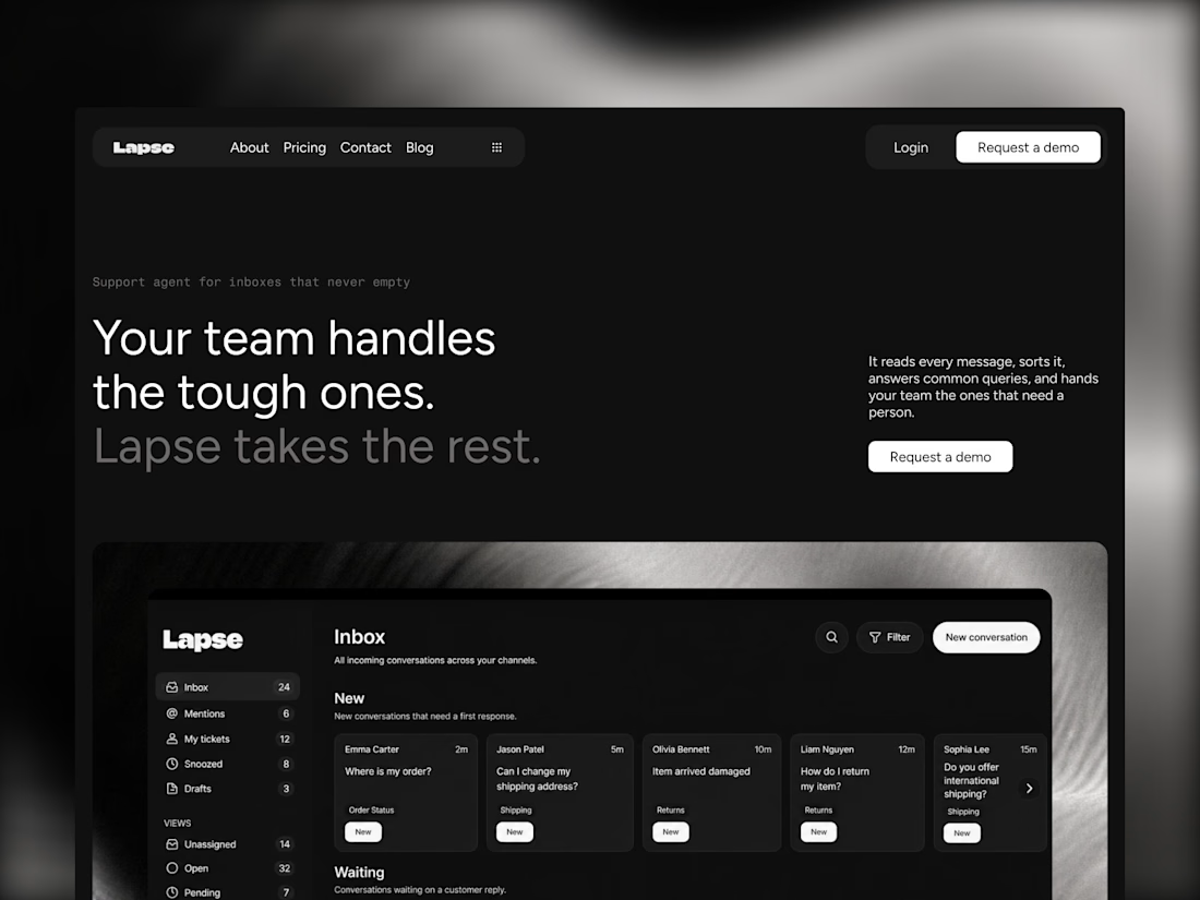
Lapse is our 10th Framer template, and it's free. It's the dark counterpart to Parley, our most remixed template: a nine-page site for AI and SaaS products with pricing, a CMS blog and a lot of custom components, like a particle footer that reacts to the cursor and scroll-pinned sections.
Free to remix: lapseai.framer.website

Amazing work